Elasticity is one of the most important terms in economics, and has a plethora of uses.  Economists define elasticity as the ratio of the percent change in one variable to the percent change in another valuable.

Its purpose is to measure how one variable responds to changes in another variable.

As an example, consider a company that sells 100 units of a product for $20 each. Elasticity is used to explain what will happen to sales, if the price of the product is increased to $21 a unit.

An “Elastic” variable is when a variable (sales of the newly priced unit) responds “a lot” to small changes in the other parameter (price.)

Contrary, an “inelastic” variable is when a variable (again, sales) responds “very little” to changes in the other parameter (price).

This article will showcase examples to illustrate the formulas provided.
 

Price Elasticity of demand

Price elasticity of demand measures the change in percentage of demand caused by a percent change in price.

If the elasticity is between 0-1, demand is said to be inelastic (little change).

Greater than 1, demand is said to be elastic (great change).

As a note, it is common that the formula will yield a negative value, thus we concern ourselves with its positive value (i.e absolute value).

Elasticity (Ed) can be calculated as follows:

             % change in quantity demanded
Ed  = __________________________
             % change in price

Example: A company has conducted a survey that indicates consumer responses to a hypothetical increase in their price.  The company has discovered that if the price is increased from $100 to $106 (representing a 6% change), the quantity demanded will decrease by 8% (from 100 units sold to 92 units.)

Ed = (-8% / 6%) = -1.33

Since 1.33 is greater than 1, we can conclude that the demand is elastic, meaning that the change in demand caused by the change in price is considered “a lot.”

We can also calculate the effect of the change on price on revenue to get another view of what the Elasticity of demand means:

Old price, total revenue = 100 units sold at $100 = $10,000

New price, total revenue = 92 units sold at $106 = $9,752


Income Elasticity of Demand

Income elasticity of demand (IEOd) measures the response of a given good to a change in the income of its existing clients.  It is calculated as follows:

                  % change in quantity demanded
IEOd  =  _____________________
                  % change in real income

Example:  A company has conducted marketing surveys and discovered that if a consumer group’s income increases by 15%, the demand for the given good increases by 25%.

                  25%
IEOd = _____   = 1.66
                  15%

A negative Income Elasticity of Demand is generally associated with “inferior goods.”  The increase in income results in a decrease in demand for these products that are deemed to be of an inferior quality.  Examples of such products may be bus services, hamburger meat or generic brand soda.  When income rises, the consumer may opt to purchase an automobile, steak, and brand name cola, since they can now afford these extra luxuries.

A positive Income Elasticity of Demand is associated with “normal goods.”  An increase in income will lead to an increase in demand, for example tobacco has been calculated to have an elasticity of demand of 0.64.  An elasticity of greater than 1 is considered a “luxury good” for example a Mercedes Benz automobile or an Armani suit

A zero income elasticity occurs when an increase in income does not associate with a change in the demand for a good.  For example these are products that are essential to live, such as fresh vegetables and milk.

 
Conclusion

Elasticity is a widely used economic theory that has an extremely large range of uses and applications.  Other examples of how elasticity is used include its effect on international trade, analysis of advertising on consumer demand and analysis of future consumption patters.

If you own a bond or manage a bond portfolio, chances are that will you be following daily interest rates. You know that bond prices increase when rates rise, and decrease when rates fall. But how do you measure the bond’s price sensitivity to such rate fluctuations? The answer is duration.

Duration measures the percentage change in the price of a bond (or value of a bond portfolio) due to a change in market interest rates (also known as the yield).

Originally developed by Frederick Macaulay in 1938, it has become the standard measure of interest rate risk amongst practitioners in the fixed-income portfolio management profession, and has evolved into several variations used in the industry. Duration also plays an important role in bond immunization strategies.

Duration measures include Macaulay Duration, Modified Duration, Key Rate Duration, and Effective Duration.


Macaulay Duration

Being the first duration measure developed, it was defined by Frederick Macaulay as the present value of the weighted average term to maturity of cash flows from a bond, and as such was interpreted in temporal terms (number of years).

Formula

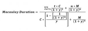
Macaulay Duration


Where,

 n      =     frequency of Coupon Payments
t       =       time to maturity
C      =     Coupon Payment
y      =     required yield
M     =    Maturity (or Par) Value
P      =    Bond’s Price

Note that the denominator in the above equation is the formula for determining the present value or price (P) of the bond.

Example

Assume a 5-Year bond paying a 6% annual coupon, and yielding 5%.Using the formula above, the bond’s Macaulay duration can be calculated as:

Macaulay-Duration-Example


Modified Duration

Essentially an extension of Macaulay duration, modified duration is the predominant duration measure used in the fixed income industry, and is defined as the % price change (or price-sensitivity) of a bond to a 100 basis point change in yield.

Formula

Modified Duration

where,

V0 = Bond’s Initial Price
V+ = Bond’s price if yields decrease by
V = Bond’s price if yields increase by
= Change in yield (expressed in decimal)
YTM = Yield to Maturity (or Yield)

Example

To illustrate its calculation, a hypothetical bond will be used:

Term to Maturity

10

Coupon Rate (annual)

9%

Yield

6%

Face Value

$100

Initial Bond Price

$122.08

If we assume a 20 basis point change in yield modified duration can be calculated as:

Modified-Duration002

Modified-Duration003

 
Remember that this is the % price change for a 100 bps change in yield. Next, we show how to use this result to estimate the % price change for a yield shift of any magnitude.

Formula and Example for Estimating % Price Change Using Modified Duration

Modified-Duration004

For example, assume that the yield for the bond above shifts from 6% to 8% (an increase of 200 basis points):

Modified-Duration005

Therefore, a 200 bps increase in the yield will cause the price of the bond to approximately drop by 13.8%

Limitations of Modified Duration

We can see the first limitation of modified duration with the following graph:

Large shifts in yield will cause modified duration to be significantly inaccurate. Moreover, duration (as represented by the tangent line above), will underestimate bond prices with respect to yield shifts.

Another disadvantage is that modified duration does not account for option-embedded features in certain fixed-income securities (e.g., convertible bonds or mortgage-backed securities) which may cause future cash flows to change with shifts in yields.

Key-Rate Duration

Key-Rate Duration is computationally similar to Modified Duration, except that it accounts for non-parallel shifts in the yield curve. For example, the magnitude of a yield shift will differ for a 1-Year treasury compared to a 10 Year bond. Using key rate duration, we can assume non-parallel yield shifts across different maturities, thus obtaining a more accurate (and realistic) measure of interest rate exposure to a bond portfolio.

Effective Duration

This duration measure accounts for the embedded option features in certain fixed-income securities such as convertible securities or mortgage-backed securities, whose future cash flows could change with shifts in interest rates.

Conclusion

Duration measures the price-sensitivity of bonds due to changes in interest rates. It plays an important role in managing interest rate risk exposure. However, due to convexity issues, care must be taken when interpreting its results when assuming large shifts in the yield. Furthermore, when dealing with option-embedded bonds or an assumption of non-parallel yield shifts, effective duration and key-rate duration can provide better estimates of price sensitivity.

Dupont Analysis breaks the Return on Equity into several different components in order to analyze where the returns are coming from.

Return on Equity (ROE) is one of the most important pieces of data that investors and creditors use to evaluate a company’s potential to grow and profitability.

ROE is typically calculated as net income divided by shareholder’s equity.

The company’s net income can be found on the income statement, while shareholder’s equity is found on the balance sheet.

ROE reveals how much profit a company has generated using the cash that shareholder’s have invested in the company.  In the 1920s,

DuPont Corporation, one of the world’s largest chemical companies, developed a twist on ROE and breaks it further down in to three components: net profit margin, asset turnover and the equity multiplier.


DuPont Formula

The DuPont Model is calculated by multiplying all three components as follows:

DuPont Return on Equity = (Net Profit Margin) * (Asset Turnover) * (Equity Multiplier)


Net Profit Margin

The net profit margin is the after tax profit a company generates for each dollar of revenue.

A higher net profit margin is usually preferable as this indicates that the company is able to generate a higher profit per dollar.

Net profit margin is calculated using the income statement as follows:

Net Profit Margin = Net Income / Revenue


Asset Turnover

The asset turnover ratio is a measure of how effective a company is in converting its assets into sales.

A higher ratio indicates that the company is able to better make use of assets in generating cash from sales.

The ratio is calculated as:

Asset Turnover = Revenue / Assets


Equity Multiplier

The equity multiplier is a tool to analyze what portion of the ROE is a result of debt.

It is possible for a company in terrible position sales wise to artificially increase its ROE by taking large amounts of debt.

A higher ratio indicates that the company is relying for a large part on borrowing money to finance the purchase of assets.

The equity multiplier is calculated as follows:

Equity Multiplier = Assets / Shareholder’s Equity.


Example of DuPont Model

Using data collected from Google’s investor relations site (investor.google.com) we are able to gather the following necessary information (in thousands of dollars) for Google’s year-end data 2010:

Total Revenue: $29,321,000

Net Income: $8,505,000

Total Assets: $57,851,000

Shareholder’s Equity: $46,241,000


Net Profit Margin: Net Income ($8,505,000) ÷ Revenue ($29,321,000) = 0.29

Asset Turnover: Revenue ($29,321,000) ÷ Assets ($57,851,000) = 0.507

Equity Multiplier: Assets ($57,851,000) ÷ Shareholder’s Equity ($46,241,000) = 1.251

Finally, The DuPont Model is calculated as [0.29*0.507*1.251] = 0.2068, or 20.68%


Results of DuPont Example

A 20.68% ROE is a good indication of Google’s ability to generate profit.

Stock analysts can use the DuPont Model to make a side by side comparison of two companies in a similar industry with a similar ROE.

Breaking down ROE in to three categories is especially useful in this situation.

If we were to calculate the ROE of Google without the equity multiplier, we would see how much they have earned if it was completely debt free.

In this case, the ROE would be = 0.29*0.507=0.147 or 14.7%.

This indicated that in the year 2010, 14.7% of the ROE was generated from sales, while 5.98% was due to returns earned as a result of borrowing money to finance activities.

When evaluating two companies, the more favorable of the two would obviously be the company with a higher percentage of internally-generated sales.

The Direxion Small Cap Bear 3x is a triple-leveraged ETF offered by Direxion Investments that seeks to negatively triple the returns of the Russell 2000 stock index.

About

All Direxion ETFs work on a daily timeframe; the TZA ETF’s goal is to give -300% of the return of the small-cap stocks featured in the Russell 2000; this does not mean it will negatively triple the returns over a month or over a year. For example, this particular ETF has lost about 95% of its value since inception because this index has gone up over that time frame. However, if you were to day trade, it may have still been possible to make money with TZA.

Related ETFs

  • TNA: The Direxion Daily Small Cap Bull 3x, provides approximately the opposite returns of the TZA
  • IWM: iShares Russell 2000 ETF
  • VB: Vanguard Small-Cap ETF

Straight line depreciation is the most commonly used and simplest form of depreciation. To calculate straight line depreciation, start with the purchase or acquisition price of an asset and subtract the salvage value. Then you divide by the total productive years the item/asset can be expected to be useful to the company. The expected life of an asset is called its “useful life” in accounting jargon.

Straight Line Depreciation Calculation
(Purchase Price of Asset – Approximate Salvage Value) ÷ Estimated Useful Life of Asset

Example of Straight Line Depreciation:

Lets say we buy a computer for your business at a cost of $5,000.  As of today, you can expect to sell it when it is no longer useful (salvage value) at around $200. Federal accounting rules allow computers to have a maximum life of five years. In the past, your company has upgraded computers at least every three years. Since the shorter period is more realistic and it allows you to take a bigger tax deduction, you choose 3 years for the useful life. Using that information, you would plug it into the formula:

($5,000 purchase price – $200 approximate salvage value) ÷ 3 years estimated useful life

Therefore, your business can take a depreciation charge of $1,600 annually for three years if you were using the straight line method.

Depreciation (also known as amortization) refers to the gradual and permanent decrease in value of the assets (referred to as a depreciable asset) of a firm, nation or individual over its lifetime.

An asset can depreciate for many reasons such as due to wear and tear or it has become obsolete.

Depreciation is a necessary concept because as a company buys a fixed asset (such as new equipment), management expects the asset to be useful and generate the necessary revenues over time.

Another reason for depreciation is that without it, fixed assets in the balance sheet will be overstated.  For example the market value of a 5-year-old piece of equipment is not worth the same as when it was purchased brand new.


How to calculate Depreciation

In order to calculate depreciation, four values are needed:

(i)                Initial cost of the asset;

(ii)               Expected salvage value of the asset (which refers to the value of the asset when it can no longer be used in production.  For example, an asset can be sold for spare parts or metallic contents after it is retired from its original function.)

(iii)             Estimated useful life of the asset;

(iv)             A specific method of apportioning the cost of over the life (which will de discussed below).


Different types of Depreciation Methods

(a) Straight Line Depreciation

Straight line depreciation is the most often used technique and also the simplest.

The owner of the asset estimates the salvage value of the asset at the end of its useful life and expenses a portion of the original cost in equal proportions over that period and is calculated as follows:

For example, a Pizzeria purchases a new oven that is expected to perform at an optimal level for 8 years, for a cost of $8,000.  After the 8 years, the oven can be sold for spare parts for $750.

Annual Depreciation Expense =         ($8,000 – $750) / 8 years = $906.25

The depreciation figure implies that the book value of the oven as represented in the fixed assets portion of the balance sheet loses $906.25 in value each year.

After 1 year, the owner of the Pizzeria would list the oven has having a value of $8,000-$906.25 = $7093.75.

The second year it would be $ 8000 – (2 x $906.25) = $6,187.50, and so on.

(b) Declining-Balance Method

A Declining-Balance Method is an accelerated depreciation method and implies that the asset loses the majority of its value in the first few years of its useful life, since most assets perform optimally in the first few years.

The salvage value is not used in the calculation, as the Declining Balance Method assumes that the depreciation value at the end of the life is higher than the salvage value.

The annual depreciation rate is calculated as:

Annual Depreciation = Previous year’s value

For example, the same Pizzeria has expanded its business and now offers a delivery service.

Depreciation Example

The owner brought a brand new car for $20,000, and expects to use the car for 5 years before being replaced.  The asset depreciates by a factor of 1/N as follows:

YearDepreciationYear –end Value
1[$20,000/5]=$4,000$20,000-$4,000=$16,000
2[$16,000/5]=$3,200$16,000-$3,200=$12,800
3[$12,800/5]=$2,560$12,800-$2,560=$10,240
4[$10,240/5]=$2,048$10,240-$2,048=$8,192
5[$8,192/5]=$1638.4$8,192-$1638.4=$6553.6


(c) Activity Depreciation

Activity Depreciation is based on level of activity rather than time.

When the asset is originally purchased, its lifetime use is estimated in terms of the level of activity.

Returning to the Pizzeria example, the owner assumes that their delivery car will be used for 60,000 miles, and can be sold for spare parts for $1,000.

The per-mile depreciation rate is calculated as:

Depreciation per mile = (Cost – Salvage) / Total miles

Depreciation per mile = ($20,000 – $1,000) / 60,000 miles = $0.316 per mile

If after 1 year, the car has been used for 13,000 miles the car would have depreciated by:

$0.316*13,000 = $4,108

Thus, having a book value of:

($20,000 – $1,000 – $4,108) = $14,892. 


Conclusion

The proper use of conservative and accurate depreciation rates are of concern to a company’s management.

Different accounting rules allow assets to be written off over different periods of time, and at different rates.

A public company should explain clearly which depreciation method is used in the company’s annual 10K filling (annual report of a company’s performance), as different depreciation methods result in large differences.

Consumer Price IndexThe consumer price index (CPI) is simply an indicator of changes in prices of goods and services experienced by consumers in a given country over time. The CPI in the United States is defined by the Bureau of Labor Statistics as “a measure of the average change over time in the prices paid by urban consumers for a market basket of consumer goods and services.”

The CPI is a statistical estimate using the prices of sample items whose prices are collected on a regular basis. Sub-indexes and sub-sub-indexes are computed for different categories and sub-categories of goods and services.  The annual percentage change in CPI is used to measure inflation. The CPI can be used to index the value of wages, salaries, pensions, and for regulating prices to show changes in real values. In most countries, the CPI is, along with the population census and the USA National Income and Product Accounts, one of the most closely watched national economic statistics.

The CPI is calculated at fixed intervals, usually monthly or quarterly, and is obtained by comparing the current cost of a “basket” of products to the prices seen in the past.

The products that make up a specific basket remain constant and do not change from year to year. The items that can be found in the basket are diverse, and include products as varied as garlic bread, frozen burgers, bananas, jeans, paint, dining room furniture, dishwasher tablets, DVD players etc.

The CPI is calculated as a percentage change from the base year (established in different years in different countries) when the first finding was established, and by default given a value of 100 (example will appear below.)

The CPI is sub-indexed into many categories such as Housing, Food and Beverage, Medical Care, Apparel and Entertainment for example.

What Data is needed?

Two types of data are needed in order to calculate the CPI.

  1. The first aspect is related to the price of all items in the basket,
  2. The second being weighting data, that is, what percentage of each item will be represented in the findings (for example, milk and bread is purchased more often than jeans, and as such should have a higher representation in the data.)

The price component is tabulated by taking a sample of goods and services from several different geographical regions, over several timeframes.

This is usually obtained by calling business owner to survey their prices.

Sounds complicated?  Think of it this way: it is impossible to tabulate the price of every apple sold at every grocery store in a country every day.

To simplify, the CPI simply takes a sample, which is believed to be statistically significant and representative of the entire country.

How do we determine the second aspect of the data?

The ‘weights’ of the items are typically based on results from surveys that are distributed to households.  The key is that the sample of consumers is random (where every single resident of the country has an equal chance of being included in the survey).

Thus, in our sample, we should have a mix of people from all different walks of life, and their answers put together should give us the ‘average’ consumer.

From here, we can have an excellent basis for the ‘weights’ of the products in the basket.


How is it calculated?

As previously mentioned, we need to remember that the base year was valued at 100.  We use this as a stepping-stone in our calculations.  Suppose that in the first year, economists tabulate spending habits:

15% of income is spent on food; the average value is $5,000

45% of income is spent on housing; the average value is  $15,000

10% of income on entertainment/leisure; the average value is $3,000

30% of income on everything else; the average value is $6,000

Base CPI = 0.15*$5,000 + 0.45*$15,000 + 0.10*$3,000 + 0.30*$6,000 = 9,600.

Note that 9,600 is just a number and is not a dollar value.  It is simply an index that will be used as a base to determine the change in the CPI over subsequent periods.  Since we are in

the first year our value of 9,600 is set to 100, because of the ease of understanding a base of 100 compared to a base of 9,600.

Let us assume that 20 years as passed, and the new data collected are as follows:

15% of income spent on food; the average value is $7,000

45% of income spent on housing; $21,000

10% of income on entertainment/leisure; $4,000

30% of income on everything else; the average value is  $8,000

Current CPI = 0.15*$7,000 + 0.45*$21,000 + 0.10*$4,000 + 0.30*$8,000 = 13,300


From this data, we are able to calculate our CPI increase by using the formula:

Current CPI                        13,300

CPI Increase =     __________________  =    ———–  = 1.3854

Base Year CPI                      9,600


New CPI Number = 100%*1.3854 = 138.54


Conclusion

The CPI is the most widely used indicator of price changes in many countries, and as such, it directly or indirectly affects every citizen of a country.

How is this the case? Consider a government that grants old age security pension and other welfare payments.  Proper tracking of the CPI allows the government to know how much to increase payments respectively due to an increase in the CPI.

Economists, marketing, executives and investors can all benefit from following the CPI closely to monitor trends in consumer spending and can use this data to their benefit.

For example, an investor might notice that the sub index of food is increasing at a consistent base, so it may be an indication to invest in a grocery chain by buying its stock.

As with every economic indicators, there are limitations.  The CPI does not take into account changes in taxes, educational quality, health care, air and water quality, crime levels and many other factors.  The CPI is still a widely used price index to measure spending trends and its effect on the economy.

Key Words: Consumer Price Index, Price, Spending, Income, Government, Economists

Stocks with a very small market capitalization. Small caps definition varies but generally it is a company with a market capitalization between $300 million and $2 billion.

The biggest advantage of investing in small-cap stocks is the opportunity to beat institutional investors. Most mutual funds have restrictions restricting them from buying stock in a small cap stock. Some mutual funds would not be able to give the small cap a meaningful position in the fund. To overcome these limitations, the fund would usually have to file with the SEC, which means tipping its hand and inflating the previously attractive price.

CommodityA basic material used in manufacturing or commerce that is interchangeable with other the same commodities coming from a different source.  The quality of a specific commodity may differ slightly, but it is essentially uniform across producers. When they are traded on an exchange, commodities must also meet specified minimum standards, also known as a basis grade.  Typical types of commodities are corn, gold, oranges, wheat, silver, steel, etc.

Candlestick ShadowFor a candlestick chart, the body or real body is the wide or colored part of a candle that represents the range between the opening and the closing prices over a specific time period (minute, hour, day, week or other).  They are the most basic building block for candlestick charts.
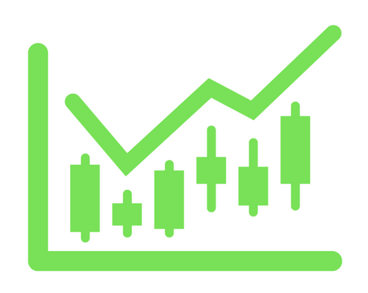
A point on a candle stick chart representing a specific time period (a day, an hour, a minute, etc) in which the underlying stock price has moved. Candlesticks will have a body and usually two wicks – one on each end. For a white (could also be green) candlestick, the bottom of the body represents the opening price and the top of the body represents the closing price.  For red candlesticks, it is just the other way around. The top and bottom tips of each wick are the day’s highest and lowest price respectively.

Candlestick ShadowA small line (like a candle wick) found at the top or bottom of an individual candle in a candlestick chart. The shadow illustrates where the price of a stock has fluctuated relative to the opening and closing prices. A shadow can be located either above the opening price (upper shadow) or below the closing price (lower shadow). These shadows illustrate the highest and lowest prices at which a security has traded suring a specific period of time. When there is a long shadow on the bottom of the candle (like that of a hammer) there is a suggestion of an increased level of buying and, depending on the pattern, potentially a bottom.

The most basic skill needed for investing is the ability to read a stock chart and then understand how that data can aid your investing success.  One of the biggest mistakes of today’s investors is overlooking this basic skill and shooting from the hip.  This article explains the importance of candlesticks which are the smallest building block of stock charts.

Candlesticks are typically one of four colors.  Sometimes you will see green candlesticks represented by hollow and black-filled candlesticks. These candlesticks represent the price closing higher than the open price. The black and red-filled candlesticks represent the price decreasing on that day.

LONG VERSES SHORT BODIES

The longer the body of a candlestick, the more the pressures for the stock to increase or decrease in price verses the opening price. A short bodied candlestick represents a consolidation of price where buyers and sellers were more in agreement on what the price of the stock should be.

LONG HOLLOW or GREEN CANDLESTICKS show STRONG BUYING PRESSURE.  The longer the body the farther the close was from the open and the more the price increased from the opening price. Often this represents strong BULLISH pressures but this is also dependent on VOLUME and the pattern that the prior candlesticks have created. If this long green or clear bodied candlestick occurs at the bottom of an extended period of price decline, it might show that the bulls have dug in and set a price that they feel is too low. If they defend this price and continue to buy at this price forcing the stock up in value, it is called a RESISTANCE PRICE.

LONG BLACK or RED CANDLESTICKS show STRONG SELLING PRESSURE.  If the long bodied candle was RED or solid black, it might show panic where those who had held on to the stock admitted that the stock would fall or it might show that an institution was ready to dump a large block of their holdings to take profits.

LONG VERSES SHORT SHADOWS. The upper and lower wick or shadows can show very valuable information about a trading session. Upper Shadows represent the day’s high price and the Lower Shadow represents the day’s lowest price. Days with short shadows indicate that most of the trading happened near the open and close prices. Candlesticks with long shadows show that buyers and/or sellers fought loosing battles to bring the price higher or lower. When the top shadow is long, it shows that the buyers (also called the bulls) fought to take the price higher and lost as the sellers (or bears) pulled the price down again. The bottom shadow represents the sellers driving the price down and the buyers helping to pull it back up again.

Economy Drives Stake in Gold which Fell 12% over Week

Over the past decade, gold seemed like the ultimate investment.  No matter what happened in world events, in the market or with the economy, it consistantly returned double digit returns for investors.  That ended last weeek. Gold is down 12% in the last week.  Silver is down 11% today.  This is a loud and clear wake up call to Wall Street that all is not well in our economy.

On Friday, gold opened below the $1,550 resistance line which tripped a massive number of stop losses.  That was just the beginning of the carnage. For the rest of the day the bulls and bears fought. The bulls twice put the bears on hold but Gold continued to trip other critical resistance lines including the ever important $1,500 line before coming to rest at $1,488 an ounce – a 5% loss. Today, we see a continuation of Friday’s action with even the $1,400 resistance line falling to the bears.

As you can tell from this analysis, momentum investors are dominating the gold market.  Gold is becoming a different asset with a very different kind of owner.  It still has very strong fundamentals.  It’s value for manufacturing continues to increase. Yet since November, as we can see from the chart, key points of support and resistance have trigger gold’s price fluctuations rather than industrial supply and demand. This clearly shows the impact of momentum investors.

The events in Europe, like the recent bank account forfeitures in Cyprus, and the out of control spending and debt in the US are prime suspects. In turn, Analysts have downgraded gold. The failing economy is pointing the direction and momentum investors are driving the price of gold.

Is the shake out done?  Will we see more gold selling?  $1,500 was a very important line of resistance for gold. Since it gave way followed by $1,400 in such quick order, this gold reversal will prabably continue with other commodities following suit in random fashion.  Oil is the most visible victim as we have seen at the pumps.  Silver dropping 11% today was even more breath taking. The clearest advise is not to catch this falling knife. Don’t try to guess the bottom as it is the easiest way to loose money.

Why have commodities been falling while the US government has been printing money like it is going out of style? Most of us would expect inflation with a rising gold price. Instead, the bleak future of the economy has more impact on gold investors. If we do not see gold emerge back above $1,500, the market will be telling us to expect the economy will not be far behind.

The qualitative and quantitative information that contributes to the economic well-being and the subsequent financial valuation of a company, security or currency. Analysts and investors analyze these fundamentals to develop an estimate as to whether the underlying asset is considered a worthwhile investment.  For businesses, information such as revenue, earnings, assets, liabilities and growth are considered some of the fundamentals.

An investment strategy that aims to capitalize on the continuance of existing trends in the market. The momentum investor believes that large increases in the price of a security will be followed by additional gains and vice versa for declining values.

A point or range in a chart that caps an increase in the price of a stock or index over a period of time. An area of resistance, resistance line or resistance level indicates that the stock or index is finding it difficult to break through it, and may head lower shortly. The more times that the stock or index tries unsuccessfully to break through the resistance line, the stronger that area of price resistance becomes.

How To Use Price-To-Sales Ratios To Value Stocks
The price-to-sales ratio (Price/Sales or P/S) provides a simple approach: take the company’s market capitalization (the number of shares multiplied by the share price) and divide it by the company’s total sales over the past 12 months. The lower the ratio, the more attractive the investment. As easy as it sounds, price-to-sales provides a useful measure for sizing up stocks. But investors need to be mindful of the ratio’s potential pitfalls and possible unreliability.

How P/S Is Useful
In a nutshell, this ratio shows how much Wall Street values every dollar of the company’s sales. Coupled with high relative strength in the previous 12 months, a low price-to-sales ratio is one of the most potent combinations of investment criteria. A low P/S can also be effective in valuing growth stocks that have suffered a temporary setback.

In a highly cyclical industry such as semiconductors, there are years when only a few companies produce any earnings. This does not mean semiconductor stocks are worthless. In this case, investors can use price-to-sales instead of the price-earnings ratio (P/E Ratio or PE) to determine how much they are paying for a dollar of the company’s sales rather than a dollar of its earnings. P/S is used for spotting recovery situations or for double checking that a company’s growth has not become overvalued. It comes in handy when a company begins to suffer losses and, as a result, has no earnings (and no PE) with which investors can assess the shares.

Let’s consider how we evaluate a firm that has not made any money in the past year. Unless the firm is going out of business, the P/S will show whether the firm’s shares are valued at a discount against others in its sector. Say the company has a P/S of 0.7 while its peers have higher ratios of, say, 2. If the company can turn things around, its shares will enjoy substantial upside as the P/S becomes more closely matched with those of its peers. Meanwhile, a company that goes into a loss (negative earnings) may lose also its dividend yield. In this case, P/S represents one of the last remaining measures for valuing the business. All things being equal, a low P/S is good news for investors, while a very high P/S can be a warning sign.

Where P/S Fall Short
That being said, turnover is valuable only if, at some point, it can be translated into earnings. Consider construction companies. They report very high sales turnover, but, with the exception of building booms, they rarely make much in the way of profit. By contrast, a software company can easily generate $4 in net profit for every $10 in sales revenue. What this discrepancy means is that sales dollars cannot always be treated the same way for every company.

Many people look at sales revenue as a more reliable indicator of a company’s growth. Granted, earnings are a complicated bottom-line number, whose reliability is not always assured. But, thanks to somewhat hazy accounting rules, the quality of sales revenue figures can be unreliable too.

Learn how to use penny stocks & beat the stock market!
Comparing companies’ sales on an apples-to-apples basis hardly ever works. Examination of sales must be coupled with a careful look at profit margins and their trends, as well as with sector-specific margin idiosyncrasies.

Debt Is a Critical Factor
A firm with no debt and a low P/S metric is a more attractive investment than a firm with high debt and the same P/S. At some point, the debt will need to be paid off, so there is always the possibility that the company will issue additional equity. These new shares expand market capitalization and drive up the P/S.

Companies heavy with corporate debt and on the verge of bankruptcy, however, can emerge with low P/S. This is because their sales have not suffered a drop while their share price and capitalization collapses.

So how can investors tell the difference? There is an approach that helps to distinguish between “cheap” sales and less healthy, debt-burdened ones: use enterprise value/sales rather than market capitalization/sales. By adding the company’s long-term debt to the company’s market capitalization and subtracting any cash, one arrives at the company’s enterprise value (EV).

Think of EV as the total cost of buying the company, including its debt and leftover cash, which would offset the cost. EV shows how much more investors pay for the debt. This approach also helps eliminate the problem of comparing two very different types of companies:

The kind that relies on debt to enhance sales and

The kind that has lower sales but does not shoulder debt.

The Bottom Line
As with all valuation techniques, sales-based metrics are just the beginning. The worst thing that an investor can do is buy stocks without looking at underlying fundamentals. Low P/S can indicate unrecognized value potential – so long as other criteria like high profit margins, low debt levels and growth prospects are in place. In other cases, P/S can be a classic value trap.

New York stock exchange facade with USA flags

Peter Lynch’s “invest in what you know” strategy has made him a household name with investors both big and small.

An important key to investing, Lynch says, is to remember that stocks are not lottery tickets. There’s a company behind every stock and a reason companies — and their stocks — perform the way they do. In this book, newly revised and updated for the paperback edition, Peter Lynch shows you how you can become an expert in a company and how you can build a profitable investment portfolio, based on your own experience and insights and on straightforward do-it-yourself research. There’s no reason the individual investor can’t match wits with the experts, and this book will show you how.

The proof is in the patterns – and so are the trading profits! Being able to precisely time your market moves by reading cycles and patterns is the key to sustained trading success. Now, the world’s foremost authority on pattern recognition and cycles and author of over 25 trading books, Jake Bernstein, guides you step-by-step through the process, as he reveals several of his preferred, most effectives pattern strategies. Leading off with his personal favorite – a high-yielding pattern for trading S&P Futures on Monday based on price action from Friday – Bernstein also features … · A key method for using moving averages with his price patterns · Tips for identifying new trends in every time frame – ideal for short-term traders and long-term investors alike · Patterns based on trader psychology · Precise entry & exit methods Thorough, fast-paced, even funny – this persuasive presentation, with full online support manual, is a “must have” for today’s active trader. See why even professional traders are raving that … “Bernstein’s approach is so simple – yet so powerful – I wish I had this video years ago.”