A bearish reversal pattern formed by two assembled upward slants is called a rising wedge. To validate rising wedge there must be oscillation between the two lines. These lines must be touched at least twice for validation.

The pattern indicates the shortness of buyers. This one is identified by a continuous reduction of the amplitude of the waves. The lowest will be reached during the first correction on the resistance of the wedge and will form the support. The second wave of increase will then occur, however with lower amplitude, which may appear the weakness of buyers. Another wave will be formed thereafter but prices will increase less and less at the contact with the support. Volumes will then be at their lowest and constantly decrease as the waves. This movement then has almost no buying power which will indicate the willingness of a bearish reversal.

The target price is given by the lowest point that resulted in the formation of the wedge.

Below is a graph representing a rising wedge:

rising-wedge

Take a look at some statistics about the rising wedge:

– In 82% of cases, there will be a downward exit.
– In 55% of cases, the rising wedge shows a reversal pattern
– In 63% of cases, the goal of the pattern is reached once the support is broken
– In 53% of cases, a pullback arises on the resistance
– In 27% of cases, false breakouts occur

Note the spacing between each contact point the lines must be important otherwise it could be a pennant.

The more that the trend lines are sloped, the more the downward movement will be violent.

False bearish breakouts provide an indication on the side of the exit because in only 3% of cases, when a bearish breakout occurs, the price will go out of the wedge by the top. The risk of running a false bearish break out is quite low.

An upward retracement is normally two times faster than the formation of the wedge.

Pullbacks will be harmful to the performance of the pattern.

A break point is normally located around 60% of the length of the rising wedge.

Rising Wedges that are large will give better performance than narrow wedges.

Stock charts print different topping formations. Some are classics, like the Descending Triangle, which can be understood and traded with little effort. However the emotional crowd additionally generates many undependable patterns while greed slowly evolves into mindless fear. Complex Rising Wedges will challenge a technician’s best effort at prediction while the unusual Diamond pattern burns trading capital swinging randomly back and forth.

Double Top Chart Pattern

Skilled traders refrain from these fruitless positions and will only look for profits where the odds strongly favor their play. First they’ll locate a common feature discovered in most topping reversals. Price draws at least one lower high within the broad congestion prior to violating a major uptrend. This common double top mechanism will become the focus for their trade entry. From this precise signpost it will follow the price to a natural breaking point and enter when violated.

Remember the Adam & Eve Bottom discussed earlier. This unique formation consists of a spiking first bottom, followed by a rounded second one. Flip the pattern around and you will see a highly predictive structure for trading these topping reversals.

This easy Adam & Eve Top gives traders frequent high profit short sales opportunities. Take note of this classic pattern in Quantum’s chart. The price never drew a third high prior to entering a significant bear market.

Successful Adam & Eve short sales may be entered on the first violation of the reaction low, regardless of an underlying trend. Use tight stops to prevent “turtle reversals.” They happen when sharp shorts covering rallies unexpectedly erupt right after the gunning of stops below a violation point.

Every uptrend produces positive sentiment that has to overcome the topping structure. Adam & Eve tops represents an efficient bar structure to succeed in this task. The violent reversal of Adam first awakens fear. Then the slow dome of Eve devours the remaining bull impulse while dissipating volatility needed to resume a rally. As the dome finishes, price moves swiftly to lower levels without substantial resistance.

Observant technicians recognize the mechanics of Descending Triangles and Adam & Eve formations in a lot of complex reversals. The vast majority of tops contain some characteristics of these similar patterns. Crowd enthusiasm will be eliminated for a decline to proceed. Through the repetitive failure of price to achieve new highs, buying interest eventually recedes. Then the market can eventually drop from its own weight.

Double Top Breakdown

Quantum’s 1997 multi-year high breaks down in a dramatic Adam and Eve Top. Pay attention to both volume and volatility readings to decline gradually through the formation of the second rounded high. Often, this “Eve” consumes more price bars than the “Adam” that precedes it.

A bullish reversal pattern formed by two diverging downward slants is a descending broadening wedge. To validate an descending broadening wedge, there has to be an oscillation between the two lines. Each line has to touch at least twice for this validation.

The pattern will mark the shortness of sellers. It is characterized by a progressive reduction of the amplitude of the waves. Actually the pattern appears like a bearish channel on which the slope of the resistance is becoming straight as far as the movement moves forward. In this pattern, the trend is bearish but sellers are attempting to retain control.

The target price is given by the lowest point that results in the formation of the wedge.

Look at the graphical representation of a descending broadening wedge:

Descending Broadening Wedge

The formation, ascending broadening wedge is called this because of its similarity to a rising wedge formation and then has a broadening price pattern.

While symmetrical broadening formations have a price pattern that revolves about a horizontal price axis, the ascending broadening wedge differs from a rising wedge as the axis rises.

The upper trend line of an ascending broadening wedge goes upward at a higher rate than the lower one, thus creating an apparent broadening appearance. The ascending broadening wedge formations volume is likely to increase ever so slightly as the breakout advances.

The patterns are very trustworthy once a downside break happens, however they are less reliable prior to the break of the lower trend-line. Thomas Bulkowski’s Encyclopedia Of Chart Patterns notes the failure rate for this pattern formation is 24%, however only 6% where a downside break occurs, suggests that once the downside break happens there is a possibility that a price recovery and a continued decline should be expected.

Once the decline begins prices will most often decline to, or below, the start of the formation.

The two sloping trend lines are the most obvious thing you will notice; the upper one will have a slightly steeper slope than the lower one and the trend lines will then spread out over time while both slope upward. When prices break through the lower trend-line they will tend to drop quickly.

Price movement is contained and alternates between the two non-parallel trend-lines. This is indicated in the below chart.

On many occasions, these formations will appear towards the end of a rising price trend and signal a reversal. A partial rise does not predict a change in trend.

There are quite a number of characteristics that will be unique to ascending broadening wedge formations;

  • The upwardly tilted megaphone shape.
  • Both upper and lower trend-lines will slope higher.
  • The upper trend-line will have a higher slope than the lower one, giving the appearance of a broadening formation.
  • Each trend-line should have a minimum of three touches, or close to that.
  • Volume normally rises as prices move up and declines as prices move down.
  • Volume tends to rise over time in most cases.

If prices do break the lower trend line, the price action may be chaotic and occasionally runs straight through the lower trend-line without even pausing on the way through. The average decline of a confirmed pattern is about 20%

In the case of a partial rise going towards the end of the pattern, prices start moving upward, after having found support at the lower trend-line, then stop prior to touching the upper one. Prices will immediately return to the lower trend-line and normally head lower, breaking towards the downside.

In Thomas Bulkowski’s Encyclopedia Of Chart Patterns, only 6% of the formations breaking out downward will fail to continue moving down by more than 5%. This is an exceedingly low figure. Also there is a 76% chance that the formation will break out downward. It therefore pays to wait for a confirmed breakout.

The measure rule for this type of formation will differ from most other formations in that it will be based on the lowest daily low, not on the height of the formation. The low serves as the expected minimum price move.

Again this formation is a good account for downside breakouts. About 1 in 5 will see prices movement horizontally or even break out upward. Holding out for the downside break is the favorite  approach and considerably increases the possibility of a profitable trade.

When prices begin to decline below the lower trend-line, think about a short position and then be prepared to cover when prices approach the target or at the next closest level of price support.

Provided that you identify a partial rise, consider taking a short position since around 8 of 10 cases show a downside breakout following a partial rise, because you will have a ‘heads up’ profits should be larger. If this approach is taken, as the trade advances the lower trend-line, consider tightening your stop-loss in case price reverses, thereby protecting your position.

The Dow Jones Industrial Average’s bearish Rising Wedge stayed consistent since the previous time it was shown in April 16’s Dow: Bullish or Bearish?

This is the Dow’s updated bearish Rising Wedge in the framework of the 2-year chart that gives us strong reason to trust that the long-term answer to the question will be quite different from the recent bullish reversal of what had been a near-term downtrend.

Take a look at what the bearish Broadening Top can do in the weekly chart on the following page that does not show the week’s rise.

Perhaps the recent Broadening Top and just a fractal footprint of the larger Rising Wedges that top into Broadening Tops, will somehow avoid both the Broadening Top and the far more bearish Rising Wedge, however there are several good and relatively current chart history suggesting this is not likely.

This is especially valid when the Dow’s recent Broadening Top is pulled apart just around today’s outside candle since it is not known whether it will turn into an outside reversal even though this seems likely.

Particularly if the Dow’s big Broadening Top consists of bearish Rising Wedges that achieve in bullish Falling Wedges and vice versa but with the bearish nature of the pattern indicating that the Rising Wedges will win ultimately as does the small Broadening Top created today on the outside candle with a pattern that confirms at 13175 for a target of 13011.

The pattern is a helper to the current Rising Wedge inside the larger Broadening Top. It confirms the same level but for a current target of 12083 and not quite sub-12000; that had been guessed at earlier.

A reason to assume it will not go sub-12000 as a formal target, even though the Dow may have a Rising Wedge shown on the first page, is the smaller Broadening Top appears to be the apex of the smaller Broadening Top in trading that seems uncannily like last July into August.

The first small Broadening Top resembles the current one in relation to its Rising Wedge at that time and suggests there may be some other sideways trades ahead prior to the resolution. If the comparison carries on into resolution, it is apparent that it will be a bearish and not a bullish resolution.

Consider the current Broadening Top is more compact than the prior one, the reason for drawing the intermediate-term trend-lines differs in the second chart. There is a valid reason to know that such a resolution will not require much more sideways trading before it displays what could be a 10% drop in the big Broadening Top alone. Not to say the multi month Rising Wedge that delivers a 10405 target for a potential decline of 22% and another correction in the many corrections and rallies of the longer 2-year sideways trend.

One should not assume that the Dow’s Broadening Top will do as it expected or as its prior Broadening Tops has done with the potential for the promise of some liquidity.  Liquidity slosh is always possible to cause this pattern to do something unique than what it normally does and that means treating both sides even though this pattern breaks to the downside nine times out of ten.

It’s an unlikely upside scenario, but confirms at a seemingly ridiculous 13692 for an even more outlandish target of 14673 and that would be an all-time high with its downside scenario confirming 12711 for the aforementioned target of 12083.

After the dissection of the Dow’s bearish Broadening Top, it appears more likely that it too will do as its bearish brethren have done before it which equates to a 200-DMA-crossing drop.

The right-angled and ascending broadening chart pattern is not one you might choose to trade. Other chart patterns perform much better. Downward breakouts have a big break even failure rate which may disqualify them from your trading tools. Upward breakouts have only a middling average rise, and that is if you trade them perfectly.

Would you trade a pattern with a likely profit potential of 10% or less? Perhaps a bearish chart pattern would appear, and the measure rule for that formation implied a downturn from 2700 to 2550, would you consider pursuing it further?

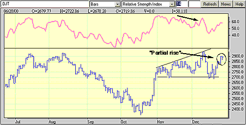
Some of these queries came up when the megaphone-like formation in the Dow Jones Transportation Average was noticed over the last two months. This compilation, with a flat, horizontal bottom and a progression of higher highs as well as a up-sloping trend line, is known as a right-angled broadening formation. Since the pattern is registering higher highs, it is referenced as an ascending broadening formation. However often “ascending” is a bit of a misnomer. Right-angled ascending broadening formations are bearish beasts.

Prior to taking a closer look at the pattern developing in the DJTA, more can be said about right-angled ascending broadening formations. Unlike other chart patterns, right-angled ascending broadening formations have an variable volume trend during the development of the formation, after all a volume surge on the breakout is common. While premature breakouts (upside or downside) tend to be isolated, pullbacks to the horizontal trend line are quite common. Also common are “partial rises” during which prices move toward the up-sloping trend line. These “partial rises” can be indications for a coming breakout, especially on the downside.

Broadening Formations

Fixed support at 2700 and higher highs in November and December establish this right-angled, ascending broadening formation. The declining relative strength also conveys a bearish retreat for the DJTA. Graphic provided by: MetaStock.

These characteristics are evident with the right-angled ascending broadening formation in the DJTA. The series of higher highs is present; the up-sloping trend line connects the highs of November with those of December. Also notice the steadfastness of the horizontal trend-line, which is hardly penetrated during the pattern’s development over the past two months. The “partial rise” phenomenon also seems to be effected, as the mid-December rally seems to have topped out at 2900.

Possibly one of the reasons why it is recommended that this formation is probably less beneficial has to do with waiting for the downside breakout. In the chart, a downside breakout would suggest a penetration of the horizontal line at 2700. The measure rule for right-angled, ascending broadening formations is sort of prudent, simply measure the distance from the highest high in the formation to the horizontal line at the bottom of the formation, then subtract that value from the horizontal line’s value. In this case, the formation’s high is at about 3000, while the horizontal line at 2700. This should give a formation size of 300 and cause a likely decline to as low as 2400.


Scottrade customers with a minimum account value of $25,000 are eligible to download our advanced online trading platform, ScottradeELITE®. Designed specifically for active traders, ScottradeELITE® delivers advanced tracking and account control. Plus, toggle among an unlimited number of linked and fully customizable trading layouts you create. It’s a robust portal designed to help you make informed investment decisions and react more quickly to market events.

While you’re exploring ScottradeELITE’s powerful research capacity, you can instantly move from one type of in-depth chart or graphing tool to another. Your preferred settings will automatically apply to every new symbol you enter.

Ready to execute an order? Trade directly from your current window wherever you are within the easy-to-use ScottradeELITE® online trading platform, knowing your decision is backed by breaking news, state-of-the-art software and advanced research and stock trading tools.


Leading Trading Tools & Research

Trading Tools to Fit Your Investment Strategy
Are you an active trader or just starting out? Get customized trading tools to fit your investing goals. Explore Trading Tools


Mobile Trading
Monitor your account, research and trade from any Internet-enabled mobile device. Learn about Scottrade Mobile


Screening Tools
Screen stocks, mutual funds and ETFs and find investments that fit your needs. Try our screeners and our interactive financial calculators.


Real-Time Account Updates
Your balances and portfolio values are updated in real-time to help you track your trading performance.


Scottrade SmartText®
Spend less time deciphering data and more time finding opportunities with your personal stock market interpreter.


Quality Stock News and Research
Research the market and get fast stock quotes. Stay up-to-the-minute with complimentary Dow Jones News. Start Your Research Now


Other key features and trading tools include:

  • Trade-Ideas™ – Instantly locate trading opportunities based on your preferences with this real-time stock screener.
  • Top Performers Scanner – Find the most actives, net gainers/losers and percent gainers/losers for 14 separate exchanges.
  • High/Low Filter – Catch breakouts and stay on top of the market with streaming, real-time highs and lows that are targeted to the segment of the market you’re watching.
  • Alerts – Monitor the market by setting price, account and news related alerts.

Trade anytime anywhere with your favorite desktop-based securities trading software, even if you don’t carry your laptop with you. Access all your system’s information remotely with a CloudDesktopOnline from Apps4Rent. Get a 15 day risk free trial!

The symmetrical broadening bottom is a bullish reversal pattern. The pattern is formed by two symmetrical horizontal lines that are divergent. So it is a inverted symmetrical triangle or an open triangle. The oscillations between the two bands of the triangle are therefore becoming more and more sizable. Each line must be touched at least twice for validation.

The symmetrical broadening bottomshows the growing nervousness of investors but also their indecisiveness. If the pattern is not identified quickly, the movement may seem totally random and thus trapping many investors.

The formation of this pattern should be preceded by an upward movement. This pattern is often due to cheap purchases that will form new highs. However, selling pressure remains strong and the indecisiveness is dominating.

The target price is given by plotting the height of the triangle at its start on the breakpoint. Another technique is to extend the maximum height of the triangle on the breakpoint

Here is a graphical representation of a symmetrical broadening bottom:

symmetrical broadening bottom

Broadening Bottom Example

Ascending triangle chart pattern example

The associated figure shows an example of a broadening bottom chart pattern on the daily scale. Price begins the broadening bottom at A and forms diverging peaks and valleys. At the end of the broadening bottom, C, a partial decline occurs which correctly predicts an upward breakout. This allowed astute traders early entry.

Notice that if you draw the top trendline to connect point B instead of C, the pattern would take on the appearance of a right-angled and descending broadening formation because the top trendline would be flat or nearly so. Also, price at E bounces to D and then makes a lower low at F. Point D looks like a partial rise which fails when the predicted breakout at F does not occur. This is one example of why trading broadening bottoms for profit is difficult, even if relying on a partial decline or partial rise.

Since 1999, Thinkorswim has supported traders through innovative trading platforms that have been recognized as some of the industry’s best for options trading. In our short history we have grown by leaps and bounds because we continue to focus on what we do best – delivering powerful, easy-to-use trading technology, supporting active traders over a wide range of products, and teaching the world a smarter way to seek risk management and spot potential opportunities.

In the beginning, our goal was simple, yet ambitious – to change the online brokerage industry and to shatter tradition for the benefit of the self-directed stock and option trader. Thanks to our advanced client-side technology and the range of offerings we delivered, our plan worked.

And now, as Thinkorswim® by TD Ameritrade®, we are combining our innovative approach to trading with the independent research, portfolio management tools, strong client service capabilities and stability that TD Ameritrade has been known for. The goal of our combination has been to redefine and set a new standard for the brokerage industry, to make a better experience for today’s traders, and – no surprises here – that’s what thinkorswim has always been about.

Whether hedging, speculating or seeking enhanced returns, we continue to challenge our clients to learn more, get smarter and make more informed decisions. Don’t be afraid to stick your toe in the water.

The integration of thinkorswim’s groundbreaking trading platform and TD Ameritrade’s network of resources offers investors a powerful trading experience. When people hear the name thinkorswim by TD Ameritrade, they think one thing – transformational. Whether it’s the way self-directed investors trade stocks, options, mutual funds, futures or Forex, we are constantly challenging what’s acceptable – and expected – when it comes to trading. Thanks to our effortless trading technology, research amenities, support resources and access to practical investor education, we are becoming more than just innovative – we’re becoming the standard.

FEATURES

    • Live, streaming CNBC plus. It’s instant replay for the financial markets – except better.


    • Forex (FX) currency trading is now available on thinkDesktop!


    • A state-of-the-art system for monitoring, analyzing and trading equities and option derivatives – efficient, feature-packed and powerful.


    • Java-based, browser-less application checks every time you log into it for any software updates and then updates itself.


    • thinkDesktop can be run using either “real” or “paper” (fake) money. In the paperMoney mode every user has two virtual accounts each funded with $100,000 of “play money”. Enjoy all of the same features except that the trades aren’t real and you can start over anytime you like.


    • Scan Tab to let you search for stocks based on fundamentals, personal and/or sector watch lists, top tens and implied volatility. Coming next month we’ll be adding chart recognition scans, option activity and historical implied volatility


    • Powerful analytics, streaming quotes, two charting packages, we could go on and on…


All your account records in one place: trade executions, all past submitted orders, current positions with execution and current settlement prices, year-to-date profit/loss for each underlying stock and index, deposits and withdrawals, commissions, along with the ability to create orders based on past orders and executions.


TD ameritrade offers a wide variety of platforms for their customers. They have four great tools for various needs. These are:

  • Web Platform
  • Trade Architect
  • ThinkorSwim
  • Mobile Trading

The web platform has built-in screeners and alerts, and allows trading of stocks, ETFs, Options, Bonds and CDs. The Trade Architect can be used to customize your news feed to find new investment opportunities.

ThinkOrSwimis a trading simulator based on the TD trading platform, although we always recommend using HowTheMarketWorks to get the most up-to-date trading ideas, research tools, and sharpen your skills (and win prizes) by participating in monthly contests with other new investors.

Their mobile platform also enables you to trade on the go. TDAmeritrade has been voted the top brokerage for many years for a good reason, and can be a great place for new investors to get started with buying and selling their first securities, or even setting up a retirement account.

HowTheMarketWorks users also have an exclusive offer to trade commission-free for 60 days, and get up to $600 if they open their account soon!

Click Here To Get Started:

The process of testing a trading strategy on prior time periods. Instead of applying a strategy for the time period forward, which could take years, a trader can do a simulation of his or her trading strategy on relevant past data in order to gauge the its effectiveness.

The eSignal award-winning products and services offer something for every level of trader and professional. With real-time, streaming, stock, futures, Forex and options quotes and analysis on the world’s markets delivered to PCs, laptops, Android, Java-enabled devices and the iPhone, as well as hosted server solutions.

Our flagship product, eSignal, offers accurate and reliable real-time, delayed and end-of-day data coupled with advanced trading analysis tools, such as real-time scanners to find the best trades, charting and customizable indicators to define strategies and identify entry and exit points, as well as integration with your choice of direct access brokerages for instant executions.

eSignal’s latest trading software release — 11.5 — features new product functionality and enhancements, including a unique collection of top charting and technical analysis tools that seamlessly integrate with 50+ brokers.

  • Alert Ticker to Know When to Trade
  • eSignal Futures Trader with Connections to 50+ FCMs
  • Enhanced Drawing Tools for Market Geometry
  • Volume Delta to See Which Side of the Market Has Control
  • 3 New Add-On Technical Analysis Studies That Use EFS
  • Several New Chart Types, including Point & Figure

FAST, RELIABLE, GLOBAL MARKET DATA

  • Real-time, streaming quotes optimized for high volume
  • Stocks, futures, Forex, options, ETF data
  • 100s of exchanges and indices worldwide

 ADVANCED, EASY-TO-USE CHARTS

  • 100s of technical analysis indicators included
  • Sophisticated drawing tools and alerts
  • eSignal Formula Script (EFS) to build and adjust strategies

  ALL-IN-ONE, EASY-TO-USE TRADING PLATFORM

  • Automated exit strategies
  • Classic price ladder and Chart Trading
  • Real-time market scanner to find profitable opportunities

 ADD-ON SERVICES FOR EVERY TRADER

  • Global market depth and market-moving news
  • Extended intraday and options data history
  • Premium technical analysis studies

VectorVest has already done the work for you. In fact, VectorVest is the onlysystem that analyzes, ranks and graphs over 21,500 stocks everyday for Value, Safety and Timing. VectorVest is the only system that combines fundamental and technical analysis to give you a complete picture of every stock and a clear Buy, Sell or Hold recommendation. And VectorVest is the only system you can trust to keep you on the right side of the market.

What is VectorVest all about?

When I designed this system I did not have time to look through thousands of stocks. I needed answers fast and that’s why I created VectorVest
Dr. Bart DiLiddo

In 1978, Dr. Bart DiLiddo, Ph.D. began to create mathematical models that clearly define EXACTLY what causes a stock’s price to rise or fall. No opinions. No guesswork.

He discovered that all the influencing factors could be summed up in mathematical value models, mathematical safety models and mathematical timing models. After testing and retesting, he discovered that the models worked.

Profits were reaped even during the worst recent stock market chaos. This stock market trend analysis system has been proven over and over again.

The result is MAXIMUM PROFIT with MINIMUM RISK. It’s the most powerful stock analysis software available anywhere at any price!

This amazing software is for any kind of individual investor. It’s easy to use. Just two or three clicks of your mouse and you’ve got a world of powerful, objective information at your fingertips.

You get clear BUY signals, but you also get clear SELL or HOLD signals. This is important. Most investment advisors will tell you to buy, but often too late. And they might tell you to sell. Again, often too late.

etrade trading platformTechnical Screener

Strategy Scanner features real-time strategy recognition and streaming alerts, now with predefined strategies by market outlook.  View the Strategy Scanner Demo.

New Visual Backtesting

Strategy Scanner makes it easy to see how your trade would have performed with visual view of best, worst, and average gain/loss.

Sector & Industry Tracker

Find the top performing sectors, industries, and companies in just 3 clicks.

Sophisticated Options Tools

Trade all options strategies with professional-grade tools and enhanced options analytics, including a new options screener and options strategy optimizer.

Streaming News & Watch Lists

Create customized watch lists to easily track the stocks and options you care about most.

Powerful Charting & Technical Studies

Spot trends and manage risk with a fully customizable charting package.

Live Streaming CNBC TV

See what’s moving the markets with fully integrated live CNBC TV right from your desktop, including international feeds and Video on Demand.

Options are an important instrument for many traders, and to understand options you need to understand options tables and learn how to read option tables!

Depending on the software or website you use, the actual information may vary, but all tables have these basic sets of information:

Calls Puts Strike Vol Expiry Last Chg Bid Ask Open Int Symbol

Calls: This will show whether the option being looked at it is a call (gives the option to buy at a future date)

Puts: This will show whether the option being looked at is a put (gives the option to sell at a future date)

Strike: The strike price is the price at which we can exercise the option. For example, a call option with a strike price of 50 will allow to buy the stock at $50 instead of the current price.

Vol: The Volume works the same as stocks. It is the amount of option contracts that have been traded (Note: options contracts are always for the 100 options! So when you buy 1 option contract you are actually buying 100 options to call or put the underlying stock!)

Expiry: This is the month, day, and year that the option expires. At option expiry you will either get the your profit if you are “in the money” or your options will be worthless if you are “out of the money”.

Last: The last traded price, just like with stocks.

Chg: The change in price from the open to the last price, just like with stocks.

Bid: The price you get when you buy an option.

Ask: The price you get when you sell an option.

Open Int: This indicates the open interest or number of outstanding options contracts.

Symbol: There are many different ways that option symbols are shown, but the symbol is based on the underlying stock, the strike price, and the expiration date. Here is one of the more used symbols:

GE150821C00018000

To understand what this symbol is telling us, we need to break it into parts:

GE150821C00018000

These are what each part means:

GE: This is the symbol of the underlying stock
150821: This is the expiration date: “15” as the year, “08” as the month, and “21” as the day. Now we know this option expires on August 21, 2015
C: This tells us whether this is a “Call” or “Put” option. C stands for Call, P for Put
00018000: The last part is the Strike Price. The rightmost 3 digest are the decimal values (all options go down to tenths of cents, so there are 3 decimal places shown), so we know that this option’s strike price is $18.

Put it all together, and we know this is the symbol for a GE Call stock that expires on August 21, 2015, with a strike price of $18. Similarly, MFST170123P00008275: Would be a Microsoft 2017 January 23rd expiry Put with a strike price of 8.275$.

A graphical interface is used to trade currencies, equities, future, or options. Also called a “trading turret”.   Software provided to you by the broker which displays not only the current market prices for stocks, but also the complete details of your account status. It is on the same software that you find the facility to open new stock positions with the click of a few buttons.

Stock Picking Software automates the task of identifying the best stocks and the best time to buy those stocks.  This software can sometimes be programed by the user and sometimes comes pre-programmed by the manufacturer to identify the right buying opportunities and the right timing.

Automatic / Automated Investment Management allows you to make buy and sell recommendations automatically using your investment algorithm or that of the company from whom you purchased the software.  This type of software can be used to backtest or forward test investing strategies using vertual investing accounts to minimize your risk.


Stock scanner and Stock Screener Software is absolutely essential to swing trading. You need to be able to find stocks with the exact setup that you are looking for. For day trading and swing trading, you have to be able to run scans to search for your ideal technical or financial attribributes!

What if you could emulate the actions of the most successful hedge fund managers for a fraction of what they cost? Two ETFs that debuted this summer are trying to do that by using public filings to replicate their portfolios. And a third, which launched early this month, promises to add another hedge fund dimension to ETF copycats by adopting what its sponsor calls the only true market-neutral strategy in the lot.

Researchers have been trying to emulate hedge fund strategies since the 1990s. But the first mutual fund to do so, Index IQ’s Alpha Hedge Strategy Fund (IQHIX), didn’t launch until June of 2008. It has since outperformed the S&P 500 TR, an ETF based on the index, which is in red so far this year and for the past 12 months and 3 years, whereas IQHIX is up 4.8 percent, 6.9 percent and 2.6 percent, respectively, for the same periods.

There soon followed two Index IQ ETFs, Hedge Multi-Strategy Tracker ETF (QAI) and Hedge Macro Tracker ETF (MCRO), based on “factor replication.” Factor replication uses statistical modeling of funds to analyze the managers’ investment patterns within six overall styles and recreate their risk-adjusted performance based on those factors for purposes of creating a fund of funds. The process originated with Index IQ’s chief strategist, Robert Whitelaw, who chairs the finance department at New York University’s Stern School of Business.

But these ETFs are trailing the hedge fund universe. As of early October, QAI and MCRO had respective 3-year annualized average returns of 2.9 percent and 3.2 percent, compared with 3.9 percent for the HFRI Fund Weighted Composite Index.

In contrast, two of the newest ETFs seek to replicate hedge funds’ strategies base on their actual positions. New York-based Global X Funds’ Top Guru Holdings Index ETF (GURU) and San Francisco-based AlphaClone’s Alternative Alpha ETF (ALFA) invest in indexes they create based on the holdings of hedge fund managers as reported in their 13F SEC filings. ALFA, which started trading on May 31, 2012, has a 3-month average annualized return of 9.23 percent, and GURU, which initiated trading on June 5, 2012, has a 3-month return of 9. 60 percent, compared with the HFRI index’s 3-month return of 2.6 percent for roughly the same period.

Certainly little insight can be gleaned from such short track records alone. As for the fund providers’ backgrounds, Global X Funds founder Bruno del Ama holds an MBA from the Wharton School of the University of Pennsylvania and was head of operations in the structured products business at Radian Asset Assurance, a New York-based reinsurer. Mazin Jadallah, founder and CEO of AlphaClone, also manages separate accounts and is an active investor.

The bigfest difference between the two position-based funds is that AlphaClone, unlike Guru, may take short positions to hedge against market moves a strategy known at least in some quarters as “market neutral.”

Index IQ’s QAI and MCRO ETFs are also designed to protect investments in a downside market, while providing upside potential when markets shift. “Which is what hedge funds were designed to do,” Index IQ CEO Adam Patti tells Institutional Investor . But Patti contends that AlphaClone is not not truly following a market neutral approach. “Dropping your equity exposure temporarily to zero does not make a market neutral strategy,” he insists. Unlike its older ETFs, IndexIQ’s newest offering, IQ Hedge Market Neutral Tracker ETF (QMN), which debuted on Oct. 4, does that, says Patti, by replicating the strategies of market neutral hedge funds. And Patti contends the strategy will provide “consistent returns in all market conditions with low volatility.”

Patti also joined other critics in citing the lack of context and time delay in relying on quarterly filings that can be at least three months out of date by the time they appear. “We looked at 13-F filings four years ago; they didn’t make much sense,” he says, since it’s impossible to determine from the filing the rationale behind a particular position, what other investments may exist in the portfolio since the filing was made, or even whether the fund still holds the position.

Jadallah responds that the firm’s “exhaustive research” shows that concerns over the timeliness and context of 13F filings is unfounded. “Hedge fund holding periods are a lot longer than most people think,” says Jadallah, adding, that “a lot of their out performance comes from their long positions, not their shorts.”