Learning how to trade ETFs (or Exchange Traded Funds) is quite easy. This page will get you started on your journey to become a master when it comes to ETFs. You can start trading ETFs almost instantly with virtual trading since they trade just like stocks. To help you get started we have pulled together this list of key concepts that will give you a great start on understanding ETF’s in depth. Take your time reading through this list and make sure to practice.
AmeriTrade’s award winning trading platform is the most intuitive Web-based trading platform. This platform offers powerful investment tools and independent research, everything you need to trade at your fingertips. With the Ameritrade Trade Architect, there are no subscription fees, no platform fees and no trade minimums.
Once you set up a TD Ameritrade account, you’ll gain access to all of TD Ameritrade’s inveesting tools, guidance, and resources. Clients enjoy low, straightforward pricing and knowledgeable support when you need it.
The Wall Street Journal, published by Dow Jones and Company is distributed daily newspaper discussing financial matters and the stock market . All round rounded students in business should subscribe to this publication. It is the the largest circulated newspaper in the U.S. with a circulation of 2.1 million copies, and 400,000 online paid subscriptions.
The WSJ has been in print since July 8, 1888 by Charles Dow, Edward Jones, and Charles Bergstresser. The Journal encompasses American economic and worldwide business topics, as well as daily financial news and issues of the day. The printed version has won the Pulitzer Prize thirty-three times which includes 2007 prizes for reports on backdated stock options with adverse effects of China’s booming economy.
Investor’s Business Daily (IBD) has been around since 1984 helping investors acquire superior results on the market. IBD’s asset investing strategies have been affirmed continuously to achieve the highest returns for the novice investor.
An independent study was taken of more than 50 investment strategies by the American Association of Individual Investors from the date of January 1998 to December 2010. AAII’s system, known as CAN SLIM®, acquired 2,487.3% as compared to the S&P 500 which built up to 29.6%.
In the last 25 years there have been a lot of investors that have had large and regular returns by accepting IBD’s CAN SLIM strategy for growth to protecting their money. This approach is based on historical fact.
The Federal Reserve made known a third round of quantitative easing Thursday afternoon. A net $40 billion a month in added purchases of mortgage-backed securities. Plus policymakers expressed an additional accommodation will continue “for a considerable time after the economic recovery strengthens.”
However the effect of a large, unrestricted QE3 is not very clear. The desired outcome is that added Federal action will lower interest rates, even thought they are currently at rock-bottom levels. Treasury yields certainly have moved a bit higher after the Feds announcement.
Stocks have come around with major averages up around 1% in mid-afternoon trading. Wall Street was quite pleased, but what about Main Street? Average Americans can expect to experience higher gasoline prices. Quantitative easing also forces upward commodity prices, by increasing demand for financial assets and by reducing the strength of the dollar.
Crude oil prices have been drifting upward and were up $1 to nearly $98 a barrel in mid-afternoon trade. That quickly filtered down to gasoline prices at the pump. Gas prices went back to $3.847 a gallon last week, the highest since April. They have gone up for 10 straight weeks in part on expectation that QE3 was arriving. Gas prices once again could pressure the $4 level which is already well over that amount in California. This is even without a major supply issue or anticipated disruptions around the world.
Food prices may go higher because of oil and gas prices, by encouraging more corn burning to produce ethanol, as IBD’s Jed Graham recently noted. Corn prices are close to record highs because of this summer’s historic drought.
The producer price index soared up 1.7% in August, the largest bump in three years. on higher food and energy costs. Wholesale level gasoline prices exploded 13.6% while food costs rose 0.9%, the most in nine months. With job growth and wage gains weakened, higher food and gas prices will effect consumers’ buying power on everything else. That will offset much of the modest QE3 benefits.
Developed by J. Welles Wilder, the Average True Range (ATR) is an indicator that measures volatility. As with most of his indicators, Wilder designed ATR with commodities and daily prices in mind. Commodities are frequently more volatile than stocks. They were are often subject to gaps and limit moves, which occur when a commodity opens up or down its maximum allowed move for the session. A volatility formula based only on the high-low range would fail to capture volatility from gap or limit moves. Wilder created Average True Range to capture this “missing” volatility. It is important to remember that ATR does not provide an indication of price direction, just volatility.
Wilder features ATR in his 1978 book, New Concepts in Technical Trading Systems. This book also includes the Parabolic SAR, RSI and the Directional Movement Concept (ADX). Despite being developed before the computer age, Wilder’s indicators have stood the test of time and remain extremely popular.
True Range
Wilder started with a concept called True Range (TR), which is defined as the greatest of the following:
Method 1: Current High less the current Low
Method 2: Current High less the previous Close (absolute value)
Method 3: Current Low less the previous Close (absolute value)
Absolute values are used to ensure positive numbers. After all, Wilder was interested in measuring the distance between two points, not the direction. If the current period’s high is above the prior period’s high and the low is below the prior period’s low, then the current period’s high-low range will be used as the True Range. This is an outside day that would use Method 1 to calculate the TR. This is pretty straight forward. Methods 2 and 3 are used when there is a gap or an inside day. A gap occurs when the previous close is greater than the current high (signaling a potential gap down or limit move) or the previous close is lower than the current low (signaling a potential gap up or limit move). The image below shows examples of when methods 2 and 3 are appropriate.
Example A: A small high/low range formed after a gap up. The TR equals the absolute value of the difference between the current high and the previous close.
Example B: A small high/low range formed after a gap down. The TR equals the absolute value of the difference between the current low and the previous close.
Example C: Even though the current close is within the previous high/low range, the current high/low range is quite small. In fact, it is smaller than the absolute value of the difference between the current high and the previous close, which is used to value the TR.
Calculation
Typically, the Average True Range (ATR) is based on 14 periods and can be calculated on an intraday, daily, weekly or monthly basis. For this example, the ATR will be based on daily data. Because there must be a beginning, the first TR value is simply the High minus the Low, and the first 14-day ATR is the average of the daily TR values for the last 14 days. After that, Wilder sought to smooth the data by incorporating the previous period’s ATR value.
Current ATR = [(Prior ATR x 13) + Current TR] / 14

  - Multiply the previous 14-day ATR by 13.
  - Add the most recent day's TR value.
  - Divide the total by 14

CLICK HERE to see a complete list of Technical Indicators / Technical Analysis
Upon making a decision to choose a stock, you are “Taking a Position.” There are two kinds of positions you can choose from. A Long or a Short Position.
Taking a long position means purchasing a stock formulated on the confidence you have in that the price will rise, consequently taking a long, or bullish position. The short position is a bit more complicated. When you short you sell the stocks and then buy them back when the price goes down, earning you a profit.
If you do not own any shares of XYZ stock however you tell your broker to sell short 100 shares of XYZ, you have carried out shorting a stock. In broker’s lingo, you have set up a short position in XYZ of 100 shares. It’s also explained as ‘you hold 100 shares of XYZ short.’
Because you rely on the price of that stock will going down, and so you can then buy it back at a much lower price than you sold it at. The short sale of stock is a gamble that the price of that stock will go down.
Here’s an example:
You determine that XYZ at a price of 110 is at or close to its peak. You think that XYZ will drop in price from this level So you decide to short the stock.
You call your broker and say you want to short 100 shares of XYZ at 110. From your broker you borrow 100 shares of XYZ at 110 and sell it to someone else.
This is the essence of the short sale is that you’re selling something which you borrowed. Again, you borrowed 100 shares of XYZ at 110 and sold it to another party.
In actuality you borrowed the 100 shares of XYZ from your stockbroker. They either have it in inventory or they borrowed it from another client or another brokerage firm. Otherwise, it is your broker that loans you the stock to sell to another party.
So what happens now?
We hope the price of XYZ goes down for you. For instance, say that XYZ declines to 85. At 85, you think that XYZ may not decline much further, if at all.
Now you’d like to take your profits to your portfolio. How do you do that?
You now purchase 100 shares of XYZ at 85 and reimburse your broker the 100 shares of XYZ. You took the stock temporarily at 110 and paid it back at 85. You’ve made 25 per share in profit or 2,500. You sold the borrowed stock for 11,000 and purchased it again for 8,500.
On the other hand, suppose the price of XYZ goes up to 125. You would have sold the stock for 11,000 and now want to retreat from the position. You’ll have to go into the market now and purchase 100 shares of XYZ for 12,500. You would then be returning the loaned stock at 12,500. In this scenario, you’ll have a loss of 1,250.
Some points of common sense
Perhaps a stock you shorted starts to appreciate to a level reaching your account equity. Or when it seems like you will be unable to repurchase the shares in the open market given your current account value; your broker may force the short position to be covered meaning he can call the loan, making you repurchase the stock at a loss in order to deliver the borrowed shares.
Keep in mind that the downside to short selling is theoretically unlimited since a stock might continue to go up. This is different from an average long investment where an equity holder’s downside risk is simply his principal. Shorting a stock is frequently a strong strategy for making big gains or hedging an investment portfolio. Remember the risks for individual investors are very real.
The Moving Average Convergence-Divergence (MACD) indicator is one of the easiest and most efficient momentum indicators you can get. It was developed by Gerald Appel in the late seventies. The MACD moves two trend following indicators and moving averages into a momentum oscillator by subtracting the longer moving average from the shorter moving average. The result is that the MACD gives the best of both worlds: trend following and momentum. The MACD is continually changing above and below the zero line while the moving averages come together, cross and diverge. Traders can search for signal line crossovers, centerline crossovers as well as divergences to generate signals. For that reason the MACD is unbounded, it is not necessarily useful for identifying overbought and oversold levels. Note: MACD is pronounced as either “MAC-DEE” or “M-A-C-D”.
Calculation
MACD Line:(12-day EMA - 26-day EMA)

Signal Line:9-day EMA of MACD Line

MACD Histogram:MACD Line - Signal Line
The MACD Line is the 12-day Expotential Moving Average(EMA) minus the 26-day EMA. Closing prices are used for these moving averages. A 9-day EMA of the MACD Line is plotted with an indicator to function as a signal line and identify turns. The MACD Histogram denotes the difference linking MACD and its 9-day EMA, the Signal line. The histogram stays positive when the MACD Line is above its Signal line and negative when the MACD Line is below its Signal line. The values of 12, 26 and 9 are the typical setting used with the MACD, but other values can be exchanged depending on your trading style and goals.
Interpretation
The MACD is about the convergence and divergence of the faster and slower moving averages. Convergence occurs when the averages move towards each other. Divergence occurs when the averages move away from each other. The shorter moving average is faster and more responsive. The longer moving average is slower and less reactive to price changes. The MACD Line moves above and below the zero line – also known as the centerline. The direction, of course, depends on the direction of the moving average cross. A positive MACD is when the shorter moving average crosses above the longer moving average. As the shorter moving average moves further above the longer moving average (diverges) this means the stock price upside momentum is increasing. When the short moving average drops below the long moving average, it demonstrates that the stock shows a downward momentum.
The yellow area shows the MACD Line in negative territory as the short line is below the long line. In this chart, the crossing occurred at the end of September (see the black arrow) and the MACD moved diverged further into negative territory as the short moving average moves further away from the long moving average. The orange area highlights the period of positive MACD values, which is when the short moving average moves above the long moving average. Notice that the MACD Line stayed below during this period (red dotted line). The red line means that the distance between the slow EMA and long EMA was less than 1 point, which is not a much of a difference.
Divergences
Divergence forms when the MACD line moves away from the price line of the stock. Bullish divergence are formed when a stock’s price records a lower low and the MACD hits a higher low. The lower low for the stock confirms the downtrend, but the higher low for the MACD line shows less downward momentum. Downside momentum still outpaces the upward momentum as long as the MACD remains negative. When the downward momentum slows, it can foreshadows a trend change or a upside rally. The next chart uses a Google (GOOG) chart with a bullish divergence for Oct-Nov 2008. Notice that there were clear lower troughs as both Google’s price line and its MACD line bounced in October and late November. Notice that the MACD line formed a higher low as Google’s price line formed a lower low in November. MACD is signalling a bullish divergence as the signal line crosses over in early December. Google’s price line confirmed the reversal with a breakout.
A bearish divergence forms when a stock price records a higher high and the MACD line forms a lower high as the faster MA crosses the slower MA. The higher high for the stock price is quite normal for uptrends but when the MACD shows a lower high, this illustrates less upside momentum. Even though upside momentum may have declined, upward momentum is still out performing downside momentum as long as MACD is positive. Declining MACD upward trends can foreshadow a trend reversal or forecast a large price decline. Below we see a chart for Gamestop (GME) with a large MACD bearish divergence from Aug to Oct. The stock chart demonstrates a higher high above 28, but the MACD line falls short of the previous high and shows a lower high. The following MACD crossover is bearish. On the GME price chart, notice how the support is broken and turned into resistance on the following bounce in Nov as we see with the red dotted line. This momentary price bump provided another chance to sell or sell short.
We should be careful interpreting a MACD divergences. Bearish divergences are quite common for strong uptrends as do bullish divergences during a strong downtrend. Price uptrends quite often begin with a strong advance which will produce strong upside momentum for MACD. Even though we can see that the uptrend continues, it continues at a slower pace than started the uptrend which causes the MACD to decline. Even when upside momentum is not as strong, upside momentum still outpacing the downside momentum as long as the MACD line is above zero. We can see the opposite occuring when a strong downtrend begins. The next chart shows SPY which is the S&P 500 ETF. This chart shows four bearish divergences from Aug to Nov 2009. Despite the slower upside momentum, SPY’s price line continued higher because the uptrend was strong. Notice how SPY’s price continues a series of higher highs as well as higher lows. Remember, as long as MACD is positive the upside momentum is stronger than downside momentum.
Conclusions
MACD is a special indicator as it brings together both momentum and trend in one technical indicator. This unique combination of trend and momentum can be used with daily, weekly and monthly charts. The standard moving average lines for MACD use the difference between the 12 and 26-period EMAs. Chartists that are looking for a more responsive indicator can use a shorter short-term moving average and a longer long-term moving average. A MACD(5,35,5) is far more responsive than the more standard MACD(12,26,9) and can be a better indicator for weekly charts. Chartists looking for a less sensitivity indicator can use lengthening the moving averages. A less responsive MACD will still oscillate above/below zero but the frequency of the crossovers centerline and signal line crossovers will decline. Finally, remember that MACD is calculated using the difference between two moving averages. This means that the MACD line is dependent on the price of the stock. For example, the MACD line for a $20 stock may move from -1.5 to 1.5 while the MACD line for a more expensive $100 stock can move from -10 to +10. You cannot compare the MACD charts for several stocks with far different prices. If you want to compare the momentum of various stocks you should probably use the Percentage Price Oscillator (PPO) rather than MACD.
Moving Averages are one of the most popular and important technical analysis tools. The ease of use and simple calculation make it a great tool to get information quickly. They also provide the basics for more advanced technical analysis tools like MACD and Bollinger Bands and can be useful for removing some of the “noise” from daily fluctuations in the market. In simple terms, the moving average is an average that compares the previous period over time. There are two types of moving averages: the Simple Moving Average (SMA) and the Exponential Moving Average (EMA) which puts more weight on the latest date. We will explore the differences more in depth later on.
Moving Average Technical Analysis
Moving Averages are lagging indicators and give an indication of the strength of a trend rather than predict movement in the asset or market. They are also useful for identifying support and resistance lines and can be used to look at a market reversal. As we will see below, the longer the period used for the SMA, the stronger the trend, hence a 200 day SMA provides a stronger indication of trend than a 10 day SMA.
Moving Averages give a lot of information at crossings between shorter and longer Moving Averages, the distance between the price and the moving average and provide support and resistance lines as well.
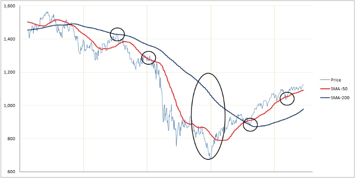
Below is a graph with a 50 day and 200 day SMA.
The first thing to point out is that the 50 day SMA follows the price much more closely than the 200 day SMA. Hence the longer the period of the SMA, the smoother and more static the line is. As an analogy the 10-day SMA is like a sports car that can turn quick and easily whereas the 200-day SMA is like a large truck that cannot change or turn quickly.
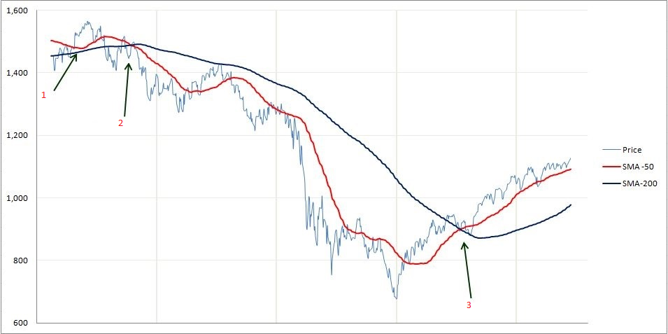
Take note of the points where price and SMA’s or EMA’s cross each other. If we start with the leftmost arrow (1), we can see that the price crosses the 50 day and 200 day multiple times. This is not a strong indication of trend, as the price can frequently give “false” warnings in day to day trading.
A much stronger indication is when a shorter period SMA crosses a longer period SMA. As we can see at the second arrow (2). The 50 day SMA crosses the 200 day SMA from the top (downward) which is a strong indication of a bear market.
On the other hand, the third arrow (3) has the 50 day SMA crossing the 200 day SMA from the bottom (upward) giving a strong indication of a bull market.
Another aspect we can see from moving averages is the support and resistance lines. Support lines are when the moving average is below the price and resistance lines are when the moving average is above the price. As we can see from the multiple small circles, the price rarely goes above or below the moving averages for long and even less frequently when it is a longer period. The other thing to notice is the large oval. The greater the distance between a moving average and the underlying price, the more we can expect a reversal of the current trend as we can see above.
!!! Note: These indicators can be useful to determine resistance, support, some reversals and trend strength. However, as you can see from the top left in the graph, this is not always the case. The 50 day SMA came very close to crossing the 200 day average but would not have indicated a very strong trend!
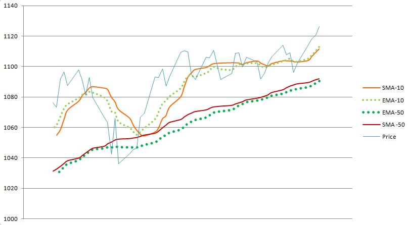
SMA vs EMA
As we saw earlier the EMA gives more weight to the current price which we will see in more detail in the calculation section.
You can see slight discrepancies above between the EMA and SMA. With a price that has more volatility however, you will see greater differences. We can also see that there the EMA tracks some big changes more closely, especially for the EMA that is 10 days as opposed to 50 days.
Moving Average Calculations
The Simple Moving Average calculation is far more straight forward than the Exponential Moving Average Calculation.
SMA calculation:
N Day SMA: Is the sum of N previous closing prices over N where N is the number of Days considered.
For example: 20 Day SMA is the sum of the closing prices of the 19 previous days(includes today’s closing) over 20.
If we have a 5 day SMA with prices as follows:
Jan 1st
12.5
Jan 2nd
13.7
Jan 3rd
14.5
Jan 4th
13.9
Jan 5th
16.8
Then the 5-Day SMA on the 5th of January is: (12.5+13.7+14.5+13.9+16.8)/5 = 14.28
!!! You always need the number of days data before you can calculate that day’s Average! So if you want the 200 day SMA for a particular day you need 200 days of data before that!
Mathematical Formula:
(Σ closing price from i-N to i) / N where i is the current day and N is the time period.
EMA calculation:
The EMA is a more complex calculation, though, as we have seen, just as easy to interpret.
EMA = (current Price * 2/(1+N)) + (Previous Day’s EMA * (1-2/(1+N))
The expression 2/(1+N) is called the weighting multiplier and will be higher for smaller periods of EMA. This means that more weight will be given to the last day’s price.
SMA VS EMA
Price
SMA-5
EMA-5
19
17
17
20
18
18
50
24.8
28.67
22
25.8
26.44
23
26.8
25.3
From the table above we can see from the red number in the table, the EMA is much higher than the SMA. This is because the EMA will more closely follow a the last price change.
Bollinger Bands®, developed by John Bollinger, are volatility bands put above and below a moving average. Volatility is founded on the standard deviation, which modifies as volatility expands and declines. The bands spontaneously widen when volatility expands and narrow when volatility declines. Bollinger Bands can be used on different securities with the standard settings. For signals Bollinger Bands can be used to label M-Tops and W-Bottoms or to decide the security of the trend. Signals determined from narrowing BandWidth are talked about in the chart article on BandWidth.
Note: Bollinger Bands® is a registered trademark of John Bollinger.
SharpCharts Calculation
  * Middle Band = 20-day simple moving average (SMA)
  * Upper Band = 20-day SMA + (20-day standard deviation of price x 2)
  * Lower Band = 20-day SMA - (20-day standard deviation of price x 2)
Bollinger Bands are made up of a middle band with two outer bands. The middle band is a simple moving average that is normally set at 20 periods. A simple moving average is utilized due to the standard deviation formula it also uses a simple moving average. The look-back period for the standard deviation is identical as for the simple moving average. The outer bands are normally set 2 standard deviations above and below the middle band.
Settings are adjustable to suit the characteristics of particular securities or trading styles. Bollinger suggests making small incremental alterations to the standard deviation multiplier. Adjusting the number of periods for the moving average will also affect the number of periods used to compute the standard deviation. For that reason, only small adjustments are necessary for the standard deviation multiplier. A growth in the moving average period would automatically increase the number of periods utilized to calculate the standard deviation and would also authorize an increase in the standard deviation multiplier. With a 20-day SMA and 20-day Standard Deviation, the standard deviation multiplier is set at 2. Bollinger recommends increasing the standard deviation multiplier to 2.1 for a 50-period SMA and decreasing the standard deviation multiplier to 1.9 for a 10-period SMA.
Signal: W-Bottoms
W-Bottoms area a portion of Arthur Merrill’s work that showed 16 patterns with a simple W shape. Bollinger also used differing W patterns with Bollinger Bands to recognize W-Bottoms. A W-Bottom appears in a downtrend and involves two reaction lows. Specifically, Bollinger searches for W-Bottoms where the second low is lower than the first, but holds above the lower band. There are four steps to validate a W-Bottom with Bollinger Bands. First, a reaction low forms; this low is usually, but not typically, below the lower band. Second, there is a bounce towards the middle band. Third, there is a new price low in the security. This low holds above the lower band. The capability to stay above the lower band on the test reveals less weakness on the last decline. Lastly, the pattern is validated with a strong move off the second low and a resistance break.
On Chart 2 it shows Nordstrom (JWN) with a W-Bottom in January-February 2010. a) The stock formed a low response in January (black arrow) and went below the lower band. b) There was a bounce back above the middle band. c) The stock went below its January low and stayed above the lower band. Even though the Feb-5 spike low broke the lower band, Bollinger Bands were calculated using closing prices so signals should be based on closing prices. d) The stock swept with expanding volume in late February and broke above the early February high. In Chart 3 you’ll see Sandisk with a smaller W-Bottom in July-August 2009.
Signal: M-Tops
M-Tops were also part of Arthur Merrill’s work that shows 16 patterns with a basic M shape. Bollinger utilizes these various M patterns with Bollinger Bands to classify M Bottoms. According to Bollinger, tops are normally more confusing and drawn out than bottoms. Double tops, head-and-shoulders patterns and diamonds typify evolving tops.
An M-Top, in its most common form, is much like a double top. But the reaction highs are not always equal. The first high can be higher or lower than the second high. Bollinger recommends searching for signs of non-confirmation when a security is making new highs. This is actually the opposite of the W-Bottom. A non-confirmation occurs with three steps. 1) A security forges a reaction high above the upper band. 2) There is a pullback towards the middle band. 3) Prices move above the prior high, however they fail to reach the upper band. This is a warning sign. The inability of the second reaction high to reach the upper band shows declining momentum, which can indicate a trend reversal. Final confirmation comes with a support break or bearish indicator signal.
Exxon Mobil (XOM) on Chart 4 shows an M-Top in April-May 2008. This stock went above the upper band in April. There was a pullback in May and then another push above 90. Although the stock went above the upper band on an intraday basis, it did not close above the upper band. The M-Top was affirmed with a support break two weeks later. Please note that MACD produced a bearish divergence and moved below its signal line for confirmation.
Pulte Homes (PHM) on Chart 5 shows an uptrend in July-August 2008. Price went above the upper band in early September to confirm the uptrend. After a pullback below the 20-day SMA (middle Bollinger Band), the stock motioned to a higher high above 17. In spite of this new high for the move, the price didn’t exceed the upper band. This flashed a warning sign. The stock broke support a week later and MACD moved below its signal line. Take note that this M-top is more complicated because there are lower reaction highs on both sides of the peak (blue arrow). This evolving top formed a small head-and-shoulders pattern.
Signal: Walking the Bands
Moves above or below the bands are not signals in itself. Moves that touch or exceed the bands are not signals, but rather tags as Bollinger would say. Plainly a move to the upper band indicates strength, while a sharp move to the lower band indicates weakness. Momentum oscillators work much the same way. Overbought is not necessarily bullish. It takes courage to reach overbought levels and overbought conditions can stretch in a strong uptrend. Likewise, prices can walk the band with many touches during a strong uptrend. Just think about it, the upper band is 2 standard deviations above the 20-period simple moving average. It takes a fairly strong price move to exceed this upper band. An upper band touch that occurs after a Bollinger Band confirmed W-Bottom would signal the start of an uptrend. Just like a powerful uptrend produces many upper band tags, it is also usual for prices to never reach the lower band during an uptrend. The 20-day SMA at times act as support. Actually, dips below the 20-day SMA at times give buying opportunities before the next tag of the upper band.
Air Products (APD) on Chart 6 shows a surge and close above the upper band in mid July. Notice that this is a big surge that broke above two resistance levels. A strong upward thrust is a sign of substance, not weakness. Trading turned flat in August and the 20-day SMA moved sideways. The Bollinger Bands narrowed, but APD did not close below the lower band. Prices and the 20-day SMA, turned up in September. Overall, APD closed above the upper band at least five times over a four month period. The indicator window showed the 10-period Commodity Channel Index (CCI). Any dips below -100 are considered oversold and moves back above -100 signal the beginning of an oversold bounce (green dotted line). The upper band tag and breakout started the uptrend. CCI then showed tradable pullbacks with dips below -100. This is an example of combining Bollinger Bands with a momentum oscillator for trading signals.
Monsanto (MON), on Chart 7 shows a walk down the lower band. The stock collapsed in January with a support break and closed below the lower band. From the middle of January until early May, Monsanto closed below the lower band around five times. Note that the stock didn’t close above the upper band once during this timeframe. The support break and initial close below the lower band signaled a downtrend. Essentially, the 10-period Commodity Channel Index (CCI) was used to show short-term overbought situations. A move above +100 is overbought. A move back below +100 signals a resumption of the downtrend (red arrows). This system pinpointed two good signals in early 2010.
Conclusions
Bollinger Bands mirror direction with the 20-period SMA and volatility with the upper/lower bands. Essentially, its possible to determine if prices are relatively high or low. The bands should contain 88-89% of price action, which makes a move outside the bands significant, according to Bollinger. Actually prices are relatively high when above the upper band and relatively low when below the lower band. Nevertheless, relatively high should not be considered as bearish or as a sell signal. Relatively low should not be considered bullish or as a buy signal. Prices are either high or low for a reason. As with other indicators Bollinger Bands are not supposed to be used as a stand alone tool. Chartists should utilize Bollinger Bands with a basic trend analysis and other indicators for confirmation.
Pivot Points use the previous period’s high, low and close which will define future support and resistance. Pivots Points are important levels chartists utilize to decide directional movement, resistance and support. Concerning this, Pivot Points are predictive of leading indicators. There are around five unique versions of Pivot Points. We will concentrate on Standard Pivot Points, Fibonacci Pivot Points and Demark Pivot Points.
Originally Pivot Points were used by floor traders to set key levels. Floor traders are the original day traders. They dealt in a quick moving environment with a short-term goal. At the start of the trading day floor traders would check out the previous day’s high, low and close to figure out a Pivot Point for the current trading day. With this Pivot Point as the foundation, extra calculations were used to fix support 1, support 2, resistance 1 and resistance 2. These fixed levels would be used to help their trading throughout the day.
Time Frames
Pivot Points for 1, 5, 10 and 15 minute charts use the previous day’s high, low and close. For example, Pivot Points for today’s intraday chart may be set entirely on yesterday’s high, low and close. Pivot Points do not change and remain in play throughout the day once they’ve been set.
Pivot Points for 30 and 60 minute charts utilize the previous week’s high, low and close. These estimates are based on calendar weeks. At the beginning of the week the Pivot Points for 30 and 60 minute charts stay fixed for the whole week. They will change once the week ends and then new Pivots be calculated.
Pivot Points for every day charts use the previous month’s information. Pivot Points for June 1st would be decided on the high, low and close for the previous month. They stay fixed the whole month of June. Brand new Pivot Points would be calculated on the first trading day of July. Again being based on the high, low and close for June.
Pivot Points for weekly and monthly charts will use the previous year’s data.
Standard Pivot Points
Standard Pivot Points begin with a base Pivot Point. This is an easy average of the high, low and close. The center Pivot Point is indicated as a solid line between the support and resistance pivots. Remember that the high, low and close are all from the previous period.
Pivot Point (P) = (High + Low + Close)/3

Support 1 (S1) = (P x 2) - High

Support 2 (S2) = P  -  (High  -  Low)

Resistance 1 (R1) = (P x 2) - Low

Resistance 2 (R2) = P + (High  -  Low)
The following chart shows the Nasdaq 100 ETF (QQQ) with Standard Pivot points on a 15 minute chart. At the beginning of trading on June 9th, the Pivot Points are in the center, the resistance levels are above and the support levels are below. These levels will remain consistent throughout the day.
Fibonacci Pivot Points
Fibonacci Pivot Points begin just like Standard Pivot Points. From the base Pivot Point, Fibonacci multiples of the high-low differential are added to form resistance levels and subtracted to form base levels.
Pivot Point (P) = (High + Low + Close)/3

Support 1 (S1) = P - {.382 * (High  -  Low)}

Support 2 (S2) = P - {.618 * (High  -  Low)}

Support 3 (S3) = P - {1 * (High  -  Low)}

Resistance 1 (R1) = P + {.382 * (High  -  Low)}

Resistance 2 (R2) = P + {.618 * (High  -  Low)}

Resistance 3 (R3) = P + {1 * (High  -  Low)}
Note the chart below. It shows the Dow Industrials SPDR (DIA) with Fibonacci Pivot Points on a 15 minute chart. R1 and S1 are structured on 38.2%. R2 and S2 are structured on 61.8%. R3 and S3 are based on 100%.
Demark Pivot Points
Demark Pivot Points begin with a different base and utilize different formulas for support and resistance. These Pivot Points are dependent on the connection between the close and the open.
If Close < Open, then X = High + (2 x Low) + Close

If Close > Open, then X = (2 x High) + Low + Close

If Close = Open, then X = High + Low + (2 x Close)

Pivot Point (P) = X/4

Support 1 (S1) = X/2 - High

Resistance 1 (R1) = X/2 - Low
The chart below demonstrates the Russell 2000 ETF (IWM) with Demark Pivot Points on a 15 minute chart. Take note that there is but one resistance (R1) and one support (S1). Demark Pivot Points will not have multiple support or resistance levels.
Setting the Tone
The Pivot Point determines the normal tone for price action indicated by the middle line of the group that is marked (P). An indication above the Pivot Point is positive and displays strength. But the Pivot Point is based on the prior period’s information. It is put forth in the current period as the first substantial level. A move above the Pivot Point conveys strength with a target to the first resistance. A break above first resistance indicates even more strength with a target to the second resistance level.
The opposite is true on the downside. A move below the Pivot Point implies weakness with a target to the first support level. A break below the first support level indicates even more weakness with a target to the second support level.
Support and Resistance
Support and resistance levels found on Pivot Points could be applied just like traditional support and resistance levels. The main thing to watch closely is price action when these levels come into play. Should prices fall to support and then firm, traders can look for a successful test and spring off support. It helps to check out a bullish chart pattern or indicator signal to prove an upturn from support. Likewise, should prices increase to resistance and stall, traders can look for a failure at resistance and decline. Chartists should, once again, look for a bearish chart pattern or indicator signal to affirm a downturn from resistance.
A second support and resistance level may also be utilized to label potentially overbought and oversold situations. A move above the second resistance level would indicate strength, however it would also indicate an overbought situation that may give way to a pullback. Likewise, a move below the second support would indicate weakness, but could also suggest a short-term oversold condition that could give way to a bounce.
Conclusions
Pivot Points offer chartists an approach to decide price direction and then set support and resistance levels. It normally begins with a cross of the Pivot Point. Occasionally the market starts above or below the Pivot Point. Support and resistance come into play after the crossover. While initially designed for floor traders, the concepts behind Pivot Points can be applied across various time-frames. With all indicators, it is valuable to validate Pivot Point signals with other aspects of technical analysis. A bearish candlestick reversal pattern could confirm a reversal at second resistance. Oversold RSI could confirm oversold conditions at second support. An upturn in MACD could be utilized to confirm a favorable support test. One final note, occasionally the second or third support/resistance levels are not visible on the chart. This is mainly because their levels exceed the price scale on the right. In other words, they are off the chart.
Pivots and SharpCharts
Pivot Points can be seen as an “overlay” on the SharpCharts Workbench. Standard Pivot Points are set as the default setting and the parameters box is empty. Chartists can apply Fibonacci Pivot Points by placing an “F” in the parameters box and Demark Pivot Points by putting a “D” in the box. It is also possible to show all three at the same time.
 AmeriTrade’s award winning trading platform is the most intuitive Web-based trading platform. This platform offers powerful investment tools and independent research, everything you need to trade at your fingertips. With the Ameritrade Trade Architect, there are no subscription fees, no platform fees and no trade minimums.
 The Wall Street Journal, published by Dow Jones and Company is distributed daily newspaper discussing financial matters and the stock market . All round rounded students in business should subscribe to this publication. It is the the largest circulated newspaper in the U.S. with a circulation of 2.1 million copies, and 400,000 online paid subscriptions.