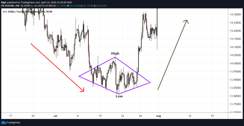
The pennant resembles the symmetrical triangle, but it’s characteristics are not the same. The pennants is shaped like a wedge of consolidation. Its normally appears after a sudden upward or downward movement. The life is short according to the time frame used.
The pennant’s pattern is a continuation pattern. The exit side of this pattern depends on the preceded movement. The formation may intervene in a bullish or bearish trend. This break will occur halfway of the movement.
The target calculation is compared to the prior trend. You should calculate the height of the entire movement, up or down before the formation of the pennant and then extend the high on the last low/high point of the pattern.
A graphical representation of a pennant follows:
Several statistics about the pennant are:
– In 75% of cases, the exit is made in the side of the previous trend.
– In 90% of cases, this will be a continuation pattern.
– In 55% of cases, the target of the pattern has been reached.
– In 16% of cases, a pullback occurs.
– 84% of cases, a pennant occurs on the lower third annual range when the trend is bearish and the highest third when the trend is bullish.
The more the movement prior to the formation of the pattern is powerful, the more the movement following the exit will be strong.
It is with a narrowed base is much more powerful than a pennant with a wide base.
It is more powerful if there are no false breakouts.
Pullbacks are harmful for the performance of the pennant pattern.
Eagle Daily Investor’s mission is to serve investors and policymakers by providing valuable information about the markets and the economy.
Our Role in Helping You:
We offer advice from top investment experts, along with insightful reports and analysis from our market-tracking editorial staffers.
Introducing our Investment Experts:
Our investment advisers feature Dr. Mark Skousen, a free-market economist who has been guiding investors for more than 30 years; Doug Fabian, a seasoned investment adviser who heads a wealth management company; Nicholas Vardy, an American with degrees from Stanford and Harvard universities who is a London-based money manager; and Chris Versace, a former equity research analyst who now focuses on tracking trends to help investors profit from the next growth opportunities. To learn more about them click on the Investment Experts tab and to learn more about their services, click on the Premium Content tab.
Mark Skousen, Ph.D., is a professional economist, investment expert and university professor who has authored more than 25 books. He earned his Ph.D. in monetary economics at George Washington University in 1977 and currently holds the Benjamin Franklin Chair of Management at Grantham University. He has taught economics and finance at Columbia Business School, Columbia University, Barnard College, Mercy College and Rollins College. In honor of his work in economics, finance and management, Grantham University renamed its business school, “The Mark Skousen School of Business.” Since 1980, Skousen has been editor in chief of Forecasts & Strategies, a popular and award-winning investment newsletter. He also is editor of three trading services, Skousen Hedge Fund Trader;Skousen High-Income Alert and Hot Commodities Alert. In 1995, he served as editor of the investment series, “Secrets of the Great Investors,” with Louis Rukeyser as narrator.
Skousen Investor CAFÉ is a weekly electronic newsletter written by Dr. Mark Skousen. Mark offers commentary on the markets, the economy, politics and other topics of interest and what they mean to individual investors.
Forecasts & Strategies uses a high-gain, low-risk way to reach your investment goals, with over a 30-year track record of success!
Dr. Mark Skousen gives you a perspective on the economy and markets you won’t find anywhere else. This insight leads to many unique ideas about how to safely grow your portfolio handsomely, even during down markets.
Create your very own custom-made, private hedge fund. You will generate superior short-term profits by going long or short, and buying calls and puts with this short-term trading service. The Hedge Fund Trader portfolio typically features between 4-8 investments at a time, holding each position for an average of 57 days.
Dr. Skousen employs opportunistic trading to uncover the most profitable commodities investments — regardless of overall market movement. The Hot Commodities portfolio typically recommends between 4-8 investments at a time, holding each position for a period of 3–8 weeks.
Every recommendation will pay superior income and have great capital-gains potential. You’ll be in the know about the best-returning — and highest-yielding — investments the world has to offer. The High Income Alert portfolio also features between 4-8 investments at a time, holding each position for an average of a little more than 2 months.
The Winner’s Circle is a limited-membership coalition of highly motivated investors seeking the highest level of investment success. As a member you get every shred of information Mark Skousen has to offer… including subscriptions to Hedge Fund Trader, Hot Commodities Alert and High-Income Alert. Plus, you’ll receive his investment newsletter, Forecasts & Strategies. You’ll be entitled to an array of up-to-the-minute information, in-depth analysis and expert guidance available only to you and your fellow members. Join the elite ranks of America’s smartest, most successful investors.
Doug Fabian is the editor of Successful Investing and High Monthly Income and hosts the syndicated radio show, “Doug Fabian’s Wealth Strategies.”
Taking over the reins from his dad, Dick Fabian, back in 1992, Doug has continued to uphold the reputation of the newsletter as the #1 risk-adjusted market timer as ranked by Hulbert’s Investment Digest.
Learn how to build long-lasting wealth with Doug Fabian’s free weekly email newsletter
Making Money Alert by Doug Fabian is a free newsletter sent via email every Wednesday.
Doug is the editor of two paid newsletters that tens of thousands of people have been profiting from for years — Successful Investing, High Monthly Income and his weekly trading service ETF Trader. He also has a strong following for his radio show, Doug Fabian’s Wealth Strategies, syndicated in several cities.
In Making Money Alert, Doug shares with you his no-nonsense insights and outlook on the world markets — and what they mean to individual investors, including where to find the best profit opportunities using ETFs.
In addition to Doug’s market commentary, Making Money Alert is full of useful advice on how to use ETFs, your 401(k) plan, the real estate market, the Fed’s policy, life insurance, taxes, retirement planning and many more topics involving your life and your finances.
If your goal is capital growth plus a steady income stream, here’s why High Monthly Income is for you…
Our goal at High Monthly Income is simple: to help you generate enough income to meet your needs and wants for the rest of your life while protecting your hard-earned assets.
Our motto is equally simple: Safety first.
It simply doesn’t make sense to risk your assets — or peace of mind — in pursuit of high-growth or high-yield investments. Capital preservation isalways “Job One.”
Unfortunately, many of today’s income investors are risking their capital and simply don’t realize it.
That’s because many of the income investments they bought only looked “safe and steady” when the markets were strong, the economy was growing, real-estate prices were rising, and inflation was negligible.
Now, all that has changed — but far too many income portfolios have not been adjusted accordingly.
So if you’re the kind of open-minded income investor who knows how important it is to periodically reassess your holdings in the cold, hard light of contemporary market realities and if you want to increase your income stream, then I’d like to offer you the very best advice today — right here, right now with High Monthly Income.
Steady, market-beating double-digit annual gains for 30+ years!
Successful Investing was started in 1977 by Doug Fabian’s father, Dick Fabian. It is designed for investors who are in the growth stage of investing. We’ve beaten the market consistently and kept our subscribers’ assets from harm in bear markets by following The Fabian Plan. Instead of using guesswork, predictions, forecasts, or emotions, we base our investment decisions solely on the established trend of the market.
The Fabian Plan works on a simple common-sense strategy that has guided our subscribers safely through just about every nasty shock the market can throw at us — the stunning Crash of 1987, the spectacular Tech/Internet Bubble of the 1990s and, of course, the scary, portfolio-annihilating Sub-Prime Collapse of 2008. We use a 39-week moving average in our trend-identifying system which has produced an average of double-digit annualized gains in the past 30+ years.
Originally, we used mutual funds to produce these profits but weare officially OUT of the mutual fund market. You can quickly find out if you own a “lemon” fund by searching the Fabian Lemon List database.
For several years, Doug has been strongly urging subscribers to shift away from mutual funds and move into the best money making tool available today – Exchange Traded Funds (ETFs). Doug was one of the pioneers to advocate and profit from ETFs and has become one of the leading ETF experts in the financial world.
Successful Investing is a proactive investment advisory service, using ETFs for both domestic and international equity allocations. The Fabian Plan guides our buy and sell decisions, and when we do either, you’ll get an email recommending specifically what to buy and how much of your portfolio to allocate.
All you need are 10 minutes a week to follow Successful Investing and you can use this advisory service for 100% of your portfolio.
Do you know what investments to buy, when to buy them and when to sell?
Take the guesswork out of your investment decisions. Join us today and start profiting with ETFs right away!
In 2008 my ETF strategy gave investors 11.5% returns… while the S&P lost 39%. Discover the right way to use ETFs here…
Doug Fabian started moving investors into ETFs long before most others recognized their strength and value. Doug is known as one of the safest, most conservative investment advisors in the business. But being safe doesn’t mean being left out of the big profits. Just the opposite – you have to play it safe when you’re after big profits.
Safety is key when the stakes are high: It’s all about knowing what you’re doing, minimizing risks, and never straying from a system that works.
And that’s just what ETF Trader is designed to do – capture rapid-fire profits by combining the power of ETFs with our top-ranked timing system,The Fabian Plan, the same one we’ve been using for more than three decades in Successful Investing for safe, long-term market-beating returns.
We “supercharged” the system by compressing it to a short-term time frame to catch and ride the market’s strongest trends. We make just a few targeted buys each month and hold them for as little as a few days up to 60 days. Many Wall Street firms have entire teams of analysts that are paid to come up with just the kind of recommendations that you get with ETF Trader.
Once you join ETF Trader you’ll never need to worry about what stock to buy, when to buy it, when to sell, or how to keep what you make.
Every detail has been thought out to make trading ETFs easy – and profitable. We do all the work for you. We track every single ETF in the world and we use our proprietary indicators to help establish a direction and our money-making recommendations.
Nicholas Vardy has proven his knack for making money in markets around the world. He writes Bull Market Alert, a trading service that focuses on making short-term profits in the world’s hottest markets;Dividend Pro, a dividend-driven trading service; as well as Alpha Investor Letter, a monthly newsletter focused on longer-term investments. He also is chief investment officer of Global Guru Capital LLC, where he manages separate accounts for high net worth individuals. more»
Chris Versace is a financial columnist and equity analyst with more than 18 years of experience in the investment industry. He is the editor of a weekly, e-letter called PowerTrend Brief, a monthly investment newsletter called PowerTrend Profitsand the trading serviceETF PowerTrader. All three focus on his use of eight proprietary PowerTrends that help him to discern the sectors that provide the best investment opportunities and the stocks that he recommends for purchase. In addition, he has been ranked an All Star Analyst by Zacks Investment Research and his efforts in analyzing industries, companies and equity securities have been recognized by both Institutional Investor and Thomson Reuters’StarMine Monitor.
The symmetrical broadening top is called a bullish continuation pattern. This pattern is formed by two symmetrical horizontal lines that are divergent. It looks like an inverted symmetrical triangle or an open triangle. The oscillations in the middle of the two bands of the triangle are consequently becoming more and more sizable. Each line has to touch at least twice for validation.
The symmetrical broadening top will show how the growing nervousness of investors will affect their indecisiveness. If this pattern is not identified right away, this movement may seem totally irregular and then trap many investors.
This formation pattern should be preceded by an upward movement. The pattern is frequently due to profit taking that will lead to the formation of new lows. But, the buying pressure will remain strong and the indecisiveness will dominate.
The target price will be given by plotting the height of the triangle at its beginning on the break point. A different technique is to extend the maximum height of the triangle on the break point.
Here is a graphical representation of a symmetrical broadening top and a symmetrical broadening bottom:
Here are some statistics on the symmetrical broadening top:
– In 53% of cases, there is an upward exit.
– In 75% of cases, the target of this pattern is obtained by acquiring the maximum height of the triangle. With this downward exit, the percentage fell to 64%.
– More than 72% of cases, a downward breakout occurs when the price is into the highest third of its annual range. No bullish breakouts are identified into the lowest third of the annual range.
Be careful of indecisiveness patterns. Bullish breakouts will have more potential.
From the 5th rotation (i.e., the fifth points of contact on either resistance or support), there will be an 80% chance that the exit will occur at the next contact point with the support or resistance of this symmetrical triangle. From the sixth rotation, the percentage rises to 96%.
The descending flag shows as a continuation pattern. The flag is built by two straight downward parallel lines which is shaped like a rectangle. It is oriented in the direction of that trend which it consolidates. Contrary to a bearish channel, this pattern is quite short term and shows the fact that buyers will need a break.
The creation of this pattern will occur in an upward trend. Often, this break will occur halfway through the movement.
The object calculation will be compared to the previous trend. A calculation of the height of the overall upward trend before the formation of the descending flag and then extends the low on the last lowest point of the pattern.
A graphical representation of the pattern is as follows:
Look at some statistics about the descending flag:
Descending Flag statistics
– In 87% of cases, there is an upward exit.
– In 90% of cases, it shows a continuation pattern.
– In 62% of cases, the target of the pattern will be reached .
– 76% of cases, it occurs when the price is at the highest third of its annual range.
– In 10% of cases, a pullback occurs on the support.
The more the previous movement precedes the formation of the descending flag it is powerful, the more the bullish breakout will be strong.
It’s performance is not as important when it is oriented in the direction of the trend.
A descending flag with narrowed lines is performs more than a flag with outspread lines and is more powerful if there is no false breakout.
An ascending flag is a continuation pattern. The ascending flag is formed by two straight upward parallel lines which are shaped like a rectangle. It is adjusted in the direction of the trend that it consolidates. Contrary to a bullish channel, this pattern is quite short term and marks the fact the seller will need a break.
The formation of an ascending flag will occur in a downward trend. Often, this break will occur halfway through the movement.
The target calculation will be compared to the previous trend. A calculation of the height of the overall downward trend is before the formation of the ascending flag and then extends higher on the last highest point of the pattern.
A graphical representation of an ascending flag follows:
Here are some statistics about the ascending flag pattern:
– In 87% of cases, there will be a downward exit.
– In 90% of cases, the ascending flag is a continuous pattern.
– In 62% of cases, the target of the pattern is reached .
– In 76% of cases, the ascending flag occurs when the price is at the lowest third of its annual range.
– In 10% of cases, a pullback occurs on the support.
The more the previous movement precedes the formation of the flag holds powerful, the more the bearish breakout will continue to be strong.
The performance of an ascending flag is much less important when it is oriented in the direction of the trend.
A flag with narrowed lines is more performing than a flag with outspread lines.
A flag is more powerful if there is no false breakouts.
Quantshare is a desktop application that allows trader to monitor and analyze the market. You can display charts, add indicators, create watchlists, create trading strategies, backtest these strategies, create portfolios based on these strategies… QuantShare is suitable for all levels of traders and it works with U.S. and International markets. It is not only a stock trading software. It can be used by Forex, Futures, Options and ETFs traders.
With QuantShare trading software you have access to trading items shared by our members. This includes data downloaders, watchlists, trading systems, custom drawing tools… (+600 items). You have access to professional tools that will help you become a successful trader. We will provide you with personalized support
BENEFITS
Advanced charting with a bunch of features, full array of line drawing tools, +150 technical indicators…
QuantShare is a trading software with unlimited possibilities in designing and backtesting trading systems. The True Portfolio Backtester is one of the more advanced and fastest in the market
Create advanced watch-lists that auto-update when the trading software detects new quotes
While most trading software programs offer a database that can store quotes data, QuantShare allows you to
create any number of historical and intraday databases. You can store any data in these databases (Call-Put
ratios, News, Dividend & Split data, Short Selling data, Fundamental data, Insiders data…) , and use this data
in charting, analysis, backtesting…
You can download scripts, trading indicators, trading systems… from the sharing server
Artificial intelligence optimization of trading systems, list of rules, ranking systems and neural network prediction items
Use .Net scripts to automate everything and implement more advanced tools.
Download scripts other traders have share
Increase your trading knowledge with the help of our community of traders, become an expert.
Build trading systems using rules, ranking systems, composites, neural network models, money management techniques, and optimize the whole thing using GA or PBIL algorithms
A bullish channel is called a continuation trend pattern. The bullish channel is assembled by two parallel lines that frame the upward price trend. A line is validated when there has been at least two points of contact with the price. The more contact points it has, the stronger the trend line is and the more their breakout will give a strong sell signal.
The bullish channel is one of the most used chart patterns. You can find it on every time frame. There is no theoretical target in this pattern. The movement can continue as far as the lower band is supported.
Here is a graphical representation of a bullish channel:
It is not recommended to take a short position at the contact with the upper band. Actually the trend may continue along the upper band. Besides, the movement towards the lower band are correction movements into an upward trend and are therefore less powerful.
Try to avoid false breakouts by drawing your trend lines based on high and low points of candlesticks and not their body.
The breakout often occurs at the 4th point of contact.
The more the lower band acts as support, the more the breakout will be violent.
A bearish channel is a continuation trend pattern. The bearish channel is arranged by two parallel lines that frame the downward price trend. To certify a line, there has to be at least two points of contact with the price. The more contact points it has, the more the trend line is stronger and their breakout will give a stronger buy signal.
The bearish channel one of the most used chart patterns. You can find it on every time frame. There is no theoretical target in this pattern. The movement can continue as far as the upper band is resistance.
Here is a graphical representation of a bearish channel:
It isn’t a good idea to take a long position at the contact with the lower band. Actually the trend might continue along the lower band. Also the movements towards the upper band are correction movements into a downward trend and as a result are less powerful.
To avoid false breakouts, draw your trend lines based on high and low points of candlesticks and not their body. The breakout will often occur at the 4th point of contact.
The more the upper band acted as resistance, the more the breakout will be violent.
The triple top is a bearish pattern with an MN shape. Three bottoms will come in succession, reflecting an important resistance. This marks a reversal will.
Below the triple top shows the area of resistance that will lead to a correction of the price three times. The neckline pattern will be formed by the lowest of these two bearish peaks. An initial correction will then occur and, then the price will go back on resistance. The magnitude of these three tops are normally the identical (as in the case below), but it may happen that the first top may be lower than the next two tops. This composition strengthens the validity of the pattern since it reflects a breathlessness of buyers. If the second top is higher than the two others, it could be a head and shoulders pattern.
Another correction will take place, theoretically on the same level as the first correction. Provided that the neckline is broken at this point, then it can be a double top. In many instances we know afterward what type of pattern we will face. A return on the resistance must be done. If the third top were higher than the first two, then that would reinforce the chances of reversals (breathlessness of buyers). The third correction that will lead to the breakout of the neckline and will validate the bearish reversal.
Once this neckline is broken, it could happen that the price will take resistance on it (that line becomes a resistance, called a pullback), then the price will take up its bearish movement. A target price will be determined by the gap between the resistance and the neckline.
Another example of a triple top with a breathlessness of buyers (top are less and less high) is provided.
Following are are several statistics about the triple top:
– In 85% of cases, there is a downward exit.
– In 50% of cases, the target of the pattern is reached once the neckline is broken.
– In 84% of cases, a pullback will occur.
– In 85% of cases, there is a pursuit of the movement once the neckline is broken.
In case of pullback, the downward movement may not be as important once the target of the pattern is reached.
If the resistance is overly tested prior to a correction (flat top), then the decrease following the breaking of the neckline will be more important.
The more the three tops are close, the more of the percentage of success of the pattern is high.
The more the movements between the neckline and resistance are straight, the more the pattern is efficient.
The more the bullish movement proceeds the formation of the triple top is big, the more the downward movement at the breakout of the neckline will be strong.
The pattern is more efficient if the third top is not as high as the other two.
OmniTrader includes tools to analyze the market right out of the box. Preconfigured trading strategies and stock scans bring the types of trades that you are looking for right to your desktop. Just tell OmniTrader what kind of trading opportunities you want, and it will search the market for stocks such as:
OmniTrader includes tools to analyze the market right out of the box. Preconfigured trading strategies and stock scans bring the types of trades that you are looking for right to your desktop. Just tell OmniTrader what kind of trading opportunities you want, and it will search the market for stocks such as:
Use chart pattern recognition, apply line studies, and see the market better with advanced chart types. OmniTrader’s advanced pattern recognition technology is constantly monitoring your charts to alert you to support/resistance bounces, trendline breaks, and other great trading setups.
Our Non-Time Based (NTB) Charts such as Range Bars, Renko Charts and Tick Charts eliminate noise from the market so that you can concentrate on capturing the big moves.
TRADING
OmniTrader allows you to create an unlimited number of paper trading accounts so you can practice trading with the software with no risk. Our paper accounts will mimic actual trading by including commission charges for each security type, tax implications and margin.
OmniTrader delivers advanced trading simulators to let you practice trading any market – intraday or after hours.
Paper Trading
OmniTrader allows you to create an unlimited number of paper trading accounts so you can practice trading with the software with no risk. Our paper accounts will mimic actual trading by including commission charges for each security type, tax implications and margin.
You can view, edit and create paper trading accounts in our portfolio feature. Check on your open positions, see your position history, and add to your account with just a few clicks. OmniTrader’s paper trading capability will prepare you to take your trading to the real market.
Trading Simulation
While paper trading allows you to practice trading in the current market, many traders want more practice by trading on historical data. This is where OmniTrader shines. OmniTrader delivers advanced trading simulators to let you practice trading any market – intraday or after hours. Easily step through years of data as OmniTrader analyzes the market exactly as it would have on that day. There is no forward look by any of the analysis tools in the software, so you are honing your skills just like you had been trading the markets for years.
Broker Tools
Ready to take your trading to the real market? OmniTrader offers you the ability to trade directly from your charts with any of our supported brokers. Simply click on the Trade icon, and the quick trade interface is presented – preloaded with the symbol that you are currently charting.
Once you’ve entered a trade, you can manage your position in the charts as well. Place a loss stop at an exact chart level, or determine where on your chart you are going add to your position. OmniTrader even includes “virtual” orders which allow your trade to be managed on your computer – and hiding your orders from the rest of the market! OmniTrader’s integrated brokerage tools give you a unique trading advantage.
OmniTrader’s web site: http://www.OmniTrader.com OmniTrader’s Phone Number: 800-880-0338
Triple bottom is a bullish pattern with a WV shape. Three bottoms will succeed, reflecting an important support. This will mark a reversal. See the triple bottom shown below, the area of support allows the prices to bounce back three times. The neckline of this pattern is formed by the highest peak of the two bullish peaks. An initial bounce will then occur and the price will go back on the support. The bulk of the three bottoms is usually the same (as indicated below), however it can happen that the first bottom may be lower than the next two. This configuration strengthens the validity of this pattern since it reflects a tension of sellers.
If the second dip is lower than the other two, it can be a reverse head and shoulders pattern. A second rebound will take place, probably on the same level as the initial bounce. However, if the neckline is broken at this point, it can be a double bottom. In some cases, afterward we know what type of pattern we were facing. A return on the support must be accomplished. The third bottom may be lower than the first two thus reinforcing the chances of reversals (tension of sellers). This will be the third rebound which leads to the break out of the neckline and reinforce the bullish reversal.
When the neckline becomes broken, it might appear that the price takes support on it (the line will become a support, called a pullback); then the price will take up its bullish movement. The target price is decided by the gap between the support and the neckline.
Another example of a triple bottom with a tension of sellers (bottoms are less and less low) is indicated here.
Here are some statistics about the triple bottom:
– In 66% of cases, there is an upward exit.
– In 73% of cases, the target of the pattern will be reached once the neckline is broken.
– In 70% of cases, a pullback will occur.
– In 96% of cases, there is a pursuit of the movement once the neckline is broken.
In case of pullback, the upward movement is not as important once the target of the pattern is reached.
If the support is endlessly tested prior to a rebound (flat bottom), then the increase following the breaking of the neckline will be more important.
The more the three bottoms are close, more of the percentage of success of the pattern will be high.
The more movements between the neckline and support are straight, the more the pattern is efficient.
The more the bearish movement that precedes the formation of the triple bottom is big, the more the upward movement at the breakout of the neckline will be strong.
The pattern will be more efficient if the third bottom is not deeper than the two others.
Timely Stock Market Advice for Smart Trading Decisions
Stock Picking Software
Since the earliest days of the personal computer, investors have been relying on stock picking software to supplement their own market acumen. Traditionally, such financial analysis software has leveraged access to up-to-the-minute technical stock data, supplemented by company announcements, to provide insight into company activity and market performance. Investors have used this analysis to better guide investments, maintaining their edge and boosting returns.
However, savvy investors have long understood that the stock market isn’t just about numbers. Unstructured talk around the office water cooler – gossip, rumor, opinion, gut feelings – this sentiment shapes the market at least as much as a stock’s P/E, EPS, or Market Cap, perhaps even more. Now, finally, stock picking software is catching up – reflecting sentiment as well as technical stock data.
Too Much Sentiment, Not Enough Clarity
Fortunately and unfortunately, there is no shortage of sentiment and stock market advice expressed in the Internet age. Forums, blogs, documents, Tweets, mainstream and niche media – today’s investor faces a flood of facts, insights, and opinions – some valid and valuable, many not. So much information is available, that even sophisticated investors and stock picking software quickly bog down, processing and using only a fraction of potential sources.
In such a data-soaked environment, the challenge for today’s financial analysis software is how to harness the power of sentiment, without sinking into the quicksand of information overload.
Mining Clarity from Sentiment
The next generation of stock picking software, like The Stock Sonar, turns qualitative sentiment into structured, quantified, actionable data that investors can use.
These advanced financial analysis software systems use cutting-edge text-mining and semantic matching techniques to perform real-time analysis and assessment of quantities of data that far exceed human capabilities. Unstructured data from multiple sources is analyzed, intelligently weighted, and then scored on a scale of positive or negative values. Full source transparency allows easy drill down to allow investors to review source material in original format.
These financial analysis software tools also offer interactive charting, enabling investors to better understand the full share price impact of a given event by correlating positive and negative sentiment with actual technical stock data – providing a comprehensive snapshot.
By automatically, objectively, and accurately measuring sentiment in real-time, stock picking software like The Stock Sonar extends the reach of investors. These systems enable investors to tap into insights from analysts, media, social media, and company announcements, gaining clearer real-time understanding of the potential effect of sentiment on stock values.
A Holistic Perspective
When selecting stock picking software, a holistic approach is preferable. Traditional financial analysis software provides valuable insight based on readily-available technical stock data. Supplementing this, stock trading software like The Stock Sonar – which is based on sentiment analysis and uses advanced text-mining and information extraction technologies – provides a broader perspective, and delivers actionable data based on the market’s true driving force: people.
High quality global journalism requires investment. The Financial Times is one of the leading business news and information organizations. It is recognized worldwide for its integrity, authority, and accuracy of information. The FT family of companies consists of many newspapers.
The FT has a collection of paid print and digital circulation of over 600,000, with over 600 journalists worldwide. The FT newspaper is circulated daily to approximately 293, 326 and FT.com shows over 5 million registered users, which includes 312,000 paying FT digital subscribers.
Financial Publishing supplies print and online substance for every consumer and professional financial audience. There is specialist information for retail, personal and institutional finance industries.
Reverse head and shoulders is a trend reversal pattern. It will mark a desire to make a bullish reversal. The theory is the same as a triple bottom other than the second bottom will be lower than the others, which are technically at the same height. The reverse head and shoulders pattern will be formed by three bottoms that will succeed.
The first and third bottoms are around the same height. It’s said that they formed the shoulders. The second top is lower than the other thus representing the lowest point. This is the head. There are few rules for many investors say that the height of the head should be 1.5 or 2 times lower than the shoulders. Investors also agreed that spacing between each bottom has to be the same. This is a major point to identifying patterns.
The highest attained between the shoulders and the head shape the neckline (in red below) that acts as a resistance. The neckline can be ascending (38% of cases), descending (40% of cases) or horizontal (22% of cases). This is the breakout of the resistance that validates the reversal patterns. The target price is equal in distance between the neckline and the bottom of the head that we symmetrically carry over to the neckline. This pattern is well known to investors and that is what makes it successful.
The reverse head and shoulders pattern offers a good performance on a bearish trend.
Some statistics about the reverse head and shoulders follows:
– In 98% of cases, there is an upward exit.
– In 97% of cases, there is a pursuit of the bearish movement at the breakout of the neckline.
– In 74% of cases, the target of the pattern is reached once the neckline is broken.
– In 52% of cases, a pullback occurs on the neckline.
The trend before the formation of the reverse head and shoulders is long, then the upward movement at the breakout of the neckline shall be strong.
The movement prior to the formation of the reverse head and shoulders is brutal, the upward movement at the breakout of the neckline will be very important.
Patterns with an descending neckline will give a better performance.
If the left shoulder is over the right shoulder, the pattern gives better performance.
Pullbacks on the neckline may be harmful to the performance of the pattern.
The symmetrical broadening bottom is called a bullish (if reversed, then bearish) reversal pattern. This pattern is formulated by two symmetrical horizontal lines that are divergent. It is an inverted symmetrical triangle or looks like an open triangle. The oscillations between the two bands of the triangle are consequently becoming more sizable. Each line has to be touched at least twice for a validation.
The symmetrical broadening bottom indicates the increased nervousness of investors but also with their indecisiveness. If this pattern is not identified immediately, this movement might seem quite random and hence trapping investors.
This formation of the pattern must be indicated by an upward movement. The pattern is frequently attributed to cheap purchases that will form new highs. However, pressure to sell remains strong and the indecisiveness is dominate.
A target price will be given by plotting the height of the triangle from its beginning on the break point. A similar technique is to extend the maximum height of the triangle on the break point.
A graphical representation of a symmetrical broadening bottom follows:
Statistics about the symmetrical broadening bottom are as follows:
– In 58% of cases, there will be an upward exit.
– In 60% of cases, the target of the pattern will be reached by taking the maximum height of the triangle. Then with a downward exit, the percentage will go up to 70%.
– More than 78% of cases, downward breakout occurs when the price is into the lowest third of its annual range.
Pay attention to the indecisiveness patterns.
Bearish potential will be greater than the bullish potential in case of breakout, which is rare in technical analysis.
Notice that from the fifth rotation (i.e., the fifth points of contact on either resistance or support), there will be 80% chance that the exit will occur at the next contact point and the support or resistance of the symmetrical triangle. Then from the sixth rotation, this percentage will rise to 90%.
The double top is a bearish pattern shaped like an M. Two tops must succeed, imaging an important resistance. This marks a reversal. The pattern may also be in WV shape. We can consider a triple top as well.
The initial correction will decide how the neckline is evidenced by the lowest between the two tops. Consequently, the price will return to the resistance. The degree of the two or three tops will normally be the same (as our example below shows), however it may happen that the first top will be higher than the first one. This configuration will reinforce the validity of the figure since it will reflect a breathlessness of the buying movement. A third rebound could happen, but in all cases, it is the breaking of the neckline that should validate the bearish reversal.
Once the neckline is broken, it could happen that the price will get back to it (this line becomes the resistance), then will decrease again. The potential of this decrease is determined by the difference among the beginning resistance and of the neckline.
Following are several statistics about the double top:
– In 75% of cases, there will be a bearish reversal.
– In 71% of cases, the target of the pattern is reached once the neckline is broken.
– In 61% of cases, a pullback will occur.
– In 83% of cases, there is a pursuit of that movement once the neckline is broken.
In case of pullback, the upward movement will be less important once the target of the pattern is reached.
When more the two bottoms are closed, the more the percentage of success of the pattern is important.
The more the bullish movement that precedes the formation of the double top is important, the more the downward movement at the breakout of the neckline will be powerful.
The double bottom is a bullish pattern indicated by a W shape. The two bottoms will succeed, mirroring an important support (in green). This will mark a reversal will. The pattern may also be in a WV shape. We’ll discuss a triple bottom.
Showing the double bottom below, the area of support will let the price rebound twice. The first will determine the neck line (in red), illustrated by the highest between the two bottoms. Furthermore, the price should get back to the support. The magnitude of the two bottoms is often the same (as indicated below), however it could happen that the first bottom is lower than the first. This configuration strengthens the validity of the figure since it reflects a breathlessness of the selling movement. Another rebound will then occur, but the breaking of the neck line that will validate this bullish reversal.
Once the neck line breaks, it might happen that the price will get back to it (this line then becomes support), then increases once again. The possibility of increase is decided upon by the difference between the beginning support and the neck line (noted by the black arrows).
Here are some statistical facts about the double bottom:
– In 70% of cases, there is a bullish reversal.
– In 67% of cases, the target of the pattern is reached once the neckline is broken.
– In 59% of cases, a pull back occurs.
– In 97% of cases, there is a pursuit of the movement once the neckline is broken.
They are several types of double bottom that are differentiated according two criteria.
The shape of the bottom can be a V-shape (known as Adam bottom) or a U-shape (called an Eve Bottom).
The second bottom might be higher, at maybe the same or lower than the first bottom.
In case of pull back, the upward movement will not be as important once the target of the pattern reached.
More the two bottoms are close, more the percentage of success of the pattern is vital.
The bearish movement that precedes the formation of the double bottom is important, more the upward movement at the breakout of the neckline will be powerful.
Diamond tops are a reversal pattern. This pattern is formed by two juxtaposed symmetrical triangles. It’s shape is like a diamond.
Diamond tops have to be preceded by an upward trend. This pattern shows the shortness of buyers and as a result investor’s indecisiveness. However, this pattern will reflect a growing volatility which will eventually be reduced towards the end of the diamond.
Oscillations are of multiplied amplitude and then decreasing which suggests a trend reversal. Actually buyers will gradually abdicate.
The target of the pattern is calculated by plotting the maximum height of the diamond at the exit point. The downward movement is normally as fast as the upward trend that preceded it.
A graphic representation of a diamond tops is as follows:
Following are some statistics about diamond tops:
– In 80% of cases, there is a downward exit.
– In 95% of cases, the target of the pattern is reached.
– In 59% of cases, a pull back will occur.
There are three times more diamonds tops than diamonds bottoms.
It is occasionally possible to see an inverted head and shoulders within the diamond bottoms.
This pattern is quite hard to see. At the beginning of the formation of a diamond, the pattern appears to be like a widening of a symmetrical triangle. But, the symmetrical triangle is a continuation pattern and the diamond is a reversal pattern.
A reversal pattern is called a diamond bottoms. This pattern is formulated by two juxtaposed symmetrical triangles. It is shaped like a diamond.
Diamond bottoms must be preceded by a downward trend. This pattern targets the shortness of sellers and consequently investor’s indecisiveness. Similarly, this pattern shows a growing volatility which is gradually reduced towards the end of the diamond.
Oscillations are increasing amplitude and then decreasing thus suggesting a trend reversal. Actually sellers gradually abdicate.
The target of the pattern is figured by plotting the maximum height of the diamond at the exit point. The upward movement is normally faster as the downward trend that precedes it.
Here is a graphic representation of a diamond bottoms:
Diamond Bottom courtesy of AskTraders
Statistics about the diamond bottoms are as follows:
– In 82% of cases, there is an upward exit.
– In 60% of cases, the target of the pattern is reached.
– In 43% of cases, a pull back occurs.
There are three times more diamonds tops than diamonds bottoms.
It occasionally is possible to see an inverted head and shoulders within the diamond bottoms.
This pattern is difficult to see. At the beginning of the diamond formation, the pattern appears like a widening of a symmetrical triangle. But, the symmetrical triangle is a continuation pattern and the diamond is a reversal pattern.
A falling wedge is a bullish reversal pattern made by two converging downward slants. To prove a falling wedge, there has to be oscillation between the two lines. Each of the lines must be touched at least twice for validation.
The pattern labels the shortness of sellers. A characteristic is by a progressive reduction of the amplitude of the waves. The highest will reach during the first correction on the support of the wedge and will form the resistance. Another wave of decrease will then happen, but with lower amplitude, thus displaying the weakness of sellers. A second wave is formulated thereafter but prices will decrease lower and lower at the contact with the resistance. Volumes will then be at their lowest and eventually decrease as the waves. The movement will have almost no selling power which displays the willingness of a bullish reversal.
The target price is presented by the highest point that results in the formation of the wedge.
Here is a graphical representation of a falling wedge:
Check out some statistics about the falling wedge:
– In 92% of cases, there will be a downward exit.
– In 63% of cases, the target of the pattern will be reached once the resistance is broken.
– In 47% of cases, a pullback will occur on the resistance.
– In 27% of cases, false breakout occurs.
The spacing between each contact point on lines is necessary, it is important otherwise it could be a pennant.
More of the trend lines are sloped, the more the upward movement will be violent.
The downward retracement is normally two times faster than the formation of the wedge.
Pullbacks are detrimental to the performance of the pattern.
The breakpoint is normally located around 65% of the length of the falling wedge.
Falling wedges which are bigger give better performance than narrow wedges.


 Stock Picking Software