Our March Trading Contest is now finished, we had tens of thousands of trades placed to fight for the top spots! See the winners below! If you want a shot at a cash prize yourself, join our next contest!
Click Here To Join The Next Contest!
Stock Trading Contest Results
MichaelGebhart+53.77%
wpeldiak+50.55%
Janene+31.00%
bobbyson+24.51%
htngoog+23.58%
HTMW Team Members
vickypaolag +1.17%
gbrown +1.04%
Rossman +0.38%
ksmith +0.01%
See The Trading Strategies From This Contest!
Janene’s March Trading Strategy-Contest: March Trading Contest Final Portfolio Value: $131,022.78 Trading Strategy For This Contest I’ve watched the market as it fluctuates, learning to buy and short gold as it adjusts. I tend to go with my gut instinct when buying stocks. Sometimes it works, sometimes, not so much. The best thing you can do, to help you Read More...
Vicky’s March Trading Strategy-Contest: March Trading Strategy Final Portfolio Value: $101,169.24 Trading Strategy For This Contest Trading Strategy: Investing for the first time in the stock market is very overwhelming; even if it is done with virtual money. I’ll start saying that implementing a strategy takes a lot of practice and patience. You must begin understanding some of Read More...
About The Challenge
We held trading contest from March 8 through March 31, 2016, with over 4,000 traders joining in! We gave prizes to the top 5 finishers. This was the third prized contest of 2016!
Prizes
Top 5 Finishers Each Win $100
Rules
There will be a full audit at the end of the investing contest on all winners to verify any corrections due to stock splits, dividends, or any other corporate action our team may have missed. Only legitimate portfolio returns will be counted in the ranking.
Each person is allowed only 1 entry. Users with multiple portfolios in the contest will be disqualified.
The usernames of the winners will be made public, but not their actual first name, last name, nor email address.
No member of the HowTheMarketWorks Team is eligible for any prizes
Other Prized Contest Results
Fall 2017 Challenge-Win prizes in our stock market contests! Find all of the information for any stock contests with prizes we are currently running here! You can also find information on past contests and their winners. Register Here To HTMW Fall Challenge Who can join? Anyone can join! Joining our stock market contests is completely free, so Sign Up Read More...
Back To School Challenge-Our Back To School Challenge is now finished, we had tens of thousands of trades placed to fight for the top spots! See the winners below! If you want a shot at a cash prize yourself, join our next contest! Click Here To Join The Next Contest! Stock Trading Contest Result Fractals7 Namburiv Catspaws Igorski123 Read More...
April Trading Contest-Our April Trading Contest is now finished, we had tens of thousands of trades placed to fight for the top spots! See the winners below! If you want a shot at a cash prize yourself, join our next contest! Click Here To Join The Next Contest! Stock Trading Contest Result TJack43 EddieB18 Housemanager brucehaan wolforda17 About Read More...
March Trading Contest-Our March Trading Contest is now finished, we had tens of thousands of trades placed to fight for the top spots! See the winners below! If you want a shot at a cash prize yourself, join our next contest! Click Here To Join The Next Contest! Stock Trading Contest Results MichaelGebhart +53.77% wpeldiak +50.55% Janene +31.00% Read More...
February Trading Contest-Our February Trading Contest is now finished, we had tens of thousands of trades placed to fight for the top spots! See the winners below! If you want a shot at a cash prize yourself, join our next contest! Click Here To Join The Next Contest! Stock Trading Contest Results almater1 +44.59% Housemanager +43.9% Michael +35.1%% Read More...
January Stock Trading Contest-Our January stock trading contest is now finished, we had tens of thousands of trades placed to fight for the top spots! See the winners below! If you want a shot at a cash prize yourself, join our next contest! Click Here To Join The Next Contest! Stock Trading Contest Results smithjj5 +30.19% blowke +28.64% qtran12203 Read More...
December Stock Trading Contest-Our December stock trading contest is now finished, we had tens of thousands of trades placed to fight for the top spots! See the winners below! If you want a shot at a cash prize yourself, join our next contest! Click Here To Join The Next Contest! Stock Trading Contest Results smithjjj5 – +36.28% Return mchung37 Read More...
November Investing Contest Results-Our November investing contests are now finished, we had tens of thousands of trades placed to fight for the top spots! See the winners below! If you want a shot at a cash prize yourself, join our next contest! Click Here To Join The Next Contest! First Weekly Contest blowke +15.56% Second Weekly Contest brendanriley +15.41% Read More...
October Stock Contest Results!-The October stock contests are finished, with over a thousand participants from all over the world! We had hundreds of thousands of trades placed, and already gave away almost $1000! See who won below! First Weekly Contest The Top 5 performers by portfolio value were: hoabidebay +16.94% kingsalman+14.36% brucehaan +14.08% daniellopez +10.16% Housemanager +9.83% The Read More...
September Monthly Million Challenge!-The September Monthly Million Challenge is the first in our Monthly Million series, with over a thousand participants from all over the world! The rankings were fierce, with the HowTheMarketWorks team scattered throughout, but you’ll be surprised who won! The Top 5 performers by portfolio value were: AngelRivera +30.81% Janene+23.14% wkaraman14 +18.15% puttno2 +12.63% smithjjj5 Read More...
HowTheMarketWorks is growing at a faster rate than ever – all thanks to teachers looking for the absolute best resources to include in their class materials. We want to make sure instructors who go the extra mile for their students get the recognition they deserve, so let us put you in the spotlight! Share your class material with us.
What are we looking for?
We are looking for teacher-created materials to feature on HowTheMarketWorks. This includes lesson plans, educational articles, class projects, homework assignments, and even videos that you’ve created that help teach personal finance, business, mathematics, social studies, or history to students between 3rd and 12th grade. You can find specific details on what we’re looking for below.
We aren’t asking for free either! If we feature your class material, you’ll get an Amazon gift card (amount depending on the resource).
How do I submit my class material?
Once you have a resource ready to submit, just send it to us by email at support@howthemarketworks.com with the subject line “Featured Materials”. Our editorial team will review your materials, let you know if we think any changes need to be made, and approve it to be featured on our site as soon as it is ready.
Who can submit class material?
For lesson plans and activities, we are currently only accepting resources from current or retired teachers. However, anyone can submit any other type of resources and get the same rewards, even students!
Details On Each Resource Type
We’ll pay you a different amount depending on class material, and we might not accept everything you send in (especially if it covers something we’ve already covered in detail, or have from a previous Teacher of the Week).
Lesson Plans
Lesson Plans are resources used to teach a concept to students – this usually includes an overview of the concept being taught, one or more activities, and a method of assessment (quiz, test, or method of grading the activities), including any relevant answer keys. You can check out our current archive of lesson plans here for inspiration.
The activities used in the lesson plan are counted separately from the lesson plan itself for our rewards – feel free to include activities from other sources, but if you have your own original activities, you can submit them separately for additional rewards.
Reward if we feature yours: $50 per lesson plan
Tips to get us to accept it: We always like to see an activity that makes use of HowTheMarketWorks in some way with the lesson. This isn’t a requirement, but if two teachers submit very similar lesson plans on the same topic, one which includes an activity with HTMW and one that doesn’t, we will probably go with the first. We are also less likely to take more lesson plans covering the same topics that have already been featured from teacher submissions (but we don’t mind having more if yours covers different ground!). We also like to see how this lesson plan works into your state’s Common Core. You must be a current or former teacher for us to accept your lesson plan.
Activities
“Activities” are things students do either in the classroom or as homework to help learn about a topic. Activities are usually part of, or added to, existing lesson plans to take advantage of project based learning. This can include work sheets, class games, research projects, or anything that requires specific engagement from the students.
Reward if we feature yours: $20 per activity
Tips to get us to accept it: We like to see activities that can feature HowTheMarketWorks in some way, but since Activities have such variety, not including HTMW will certainly not count against you. However, we greatly prefer activities that work with lesson plans we have (or that you submit with the activity!) to make it easier for teachers to integrate them with their class material. You must be a current or former teacher for us to accept your activity.
Articles
“Articles” are educational content that we feature in the education center (for example, our “What is a Stock” article). These articles teach about important topics in investing, personal finance, and business. Articles can be formatted as a “glossary” entry – explaining an important investing term in detail, an “Event”, which explains an important economic event with some editorial perspective, or a “Guide”, which can explain things like how to pick your first stock, how to build a strategy, or how the news impacts investments. Articles should also include a 3-5 question quiz for review.
Articles can be on a very wide range of topics, so it is a good idea to “pitch” your article to us before writing it to make sure its on a topic we are interested in. Just send us the general topic and an outline of what you would cover, and we’ll let you know if we would be interested before you write the full content.
Reward if we feature yours: $50 per article
Tips to get us to accept it: We are always looking for articles covering a wide range of subjects, so just send us your “pitch” and we’ll let you know if it is something we would be interested in. There are many articles on this site that might be only a couple paragraphs long, we are always looking to replace them with articles with more “meat”. You do not need to be a teacher to submit an article – even students are welcome!
Videos
“Videos” are like articles, but in the form of moving pictures! We are looking for all the same things in a video as we would an article – “Glossary”, “Event”, and “Guide” -style videos are preferred. You can still send us a pitch before making the video to check if it is something we would be interested in.
Reward if we feature yours: $75 per video
Tips to get us to accept it: The same rules for articles also apply for videos, but since we have so few videos you have even more options! Just pick your topic and send us a pitch, we’ll let you know if we’re interested. You do not need to be a teacher to submit a video – even students are welcome!
Infographics
“Infographics” are pictures with a lot of information that can be used to help visualize a concept. You can see an infographic about how much research is done per year here. Infographics can vary widely in complexity and size – some might be better suited to be part of another article, while some are more than complex enough to stand on their own (this infographic about money requires a massive amount of research with over 150 sources, far more than any article we’ve published as of yet!)
Reward if we feature yours: Varies by infographic complexity – starts at $10 per graphic
Tips to get us to accept it: Infographics must be both informative and pretty to look at. They can be drawn or made using an image editor, but for us to accept them they must have some “polish”.
What’s in it for me?
We want to make sure teachers who go the extra mile get rewarded for it! If we choose your class material to add to our Teacher Resources, we’ll send you an Amazon gift card. You can submit as many resources as you want, and we’ll reward you for every resource we use. You can find the full details of how much you can get, and how we’ll use it before.
All submissions are governed by the rules in our Terms and Conditions. In plain English, here’s what it means:
Once you submit content to us, we can use it forever without further permission or fees. We can also re-post it, edit, redistribute, or otherwise re-use the content at a later date at our choosing.
You can’t later decide to rescind access – once we accept it, you can’t take it back.
We will not accept submissions which contain previously – published material, or material owned by someone else. This can be tricky for lesson plans – you can include activities in your lesson plans from other sources, but in this case we would reward you for the lesson plan itself and not the 3rd party activity (this is why we reward “activities” and “lesson plans” separately). If you have it already posted on your personal blog or website, that is no problem, but if this is already featured on a “class materials” website or exchange, we will proceed on a case-by-case basis (we need to verify you actually have the right to distribute it to us, and for us to distribute it afterwards).
We are under no obligation to accept content that you submit. If we use it, you’ll get the rewards, but if we don’t use it none of the other terms apply.
I made 4 trades at the start of the month all based on gold being undervalued. I suspected a medium term rally and I therefor bought leveraged gold stocks/etf. The only reason I made 4 trades was because I was forced to only have so much % of a stock allocated to my portfolio. The specific bets I made were silver standard/yamana. As well as leveraged ETF NUGT, I short sold DUST.
Final Open Positions and Portfolio Allocation
Performance Over The Total Contest
Click Here To Join The Next Contest!
See More Trading Strategies From This Contest
Michael’s February Trading Contest Strategy-Contest: February Trading Contest Final Portfolio Value: $135,104.98 (+35.1%) Trading Strategy For This Contest I made 4 trades at the start of the month all based on gold being undervalued. I suspected a medium term rally and I therefor bought leveraged gold stocks/etf. The only reason I made 4 trades was because I was forced Read More...
Housemanager’s February Contest Strategy-Contest: February Trading Contest Final Portfolio Value: $143,899.64 (+43.9%) Trading Strategy For This Contest Study sectors precious metals and energy- they have greatest potential for change because of most “auction” mentality” in stock and options activity. Research understanding small cap stocks. Read up on them and knowledge of these individuals is key. Final Open Positions Read More...
Study sectors precious metals and energy- they have greatest potential for change because of most “auction” mentality” in stock and options activity. Research understanding small cap stocks. Read up on them and knowledge of these individuals is key.
Final Open Positions and Portfolio Allocation
Performance Over The Total Contest
Click Here To Join The Next Contest!
See More Trading Strategies From This Contest
Michael’s February Trading Contest Strategy-Contest: February Trading Contest Final Portfolio Value: $135,104.98 (+35.1%) Trading Strategy For This Contest I made 4 trades at the start of the month all based on gold being undervalued. I suspected a medium term rally and I therefor bought leveraged gold stocks/etf. The only reason I made 4 trades was because I was forced Read More...
Housemanager’s February Contest Strategy-Contest: February Trading Contest Final Portfolio Value: $143,899.64 (+43.9%) Trading Strategy For This Contest Study sectors precious metals and energy- they have greatest potential for change because of most “auction” mentality” in stock and options activity. Research understanding small cap stocks. Read up on them and knowledge of these individuals is key. Final Open Positions Read More...
Our February Trading Contest is now finished, we had tens of thousands of trades placed to fight for the top spots! See the winners below! If you want a shot at a cash prize yourself, join our next contest!
Click Here To Join The Next Contest!
Stock Trading Contest Results
almater1+44.59%
Housemanager+43.9%
Michael+35.1%%
danialmayer+25.59%
bobsaget99+24.88%
HTMW Team Members
ksmith -16.29%
See The Trading Strategies From This Contest!
Michael’s February Trading Contest Strategy-Contest: February Trading Contest Final Portfolio Value: $135,104.98 (+35.1%) Trading Strategy For This Contest I made 4 trades at the start of the month all based on gold being undervalued. I suspected a medium term rally and I therefor bought leveraged gold stocks/etf. The only reason I made 4 trades was because I was forced Read More...
Housemanager’s February Contest Strategy-Contest: February Trading Contest Final Portfolio Value: $143,899.64 (+43.9%) Trading Strategy For This Contest Study sectors precious metals and energy- they have greatest potential for change because of most “auction” mentality” in stock and options activity. Research understanding small cap stocks. Read up on them and knowledge of these individuals is key. Final Open Positions Read More...
About The Challenge
We held trading contest from February 1 through February 26, 2016, with over 3,000 traders joining in! We gave prizes to the top 5 finishers. This was the second prized contest of 2016!
Prizes
Top 5 Finishers Each Win $100
Rules
There will be a full audit at the end of the investing contest on all winners to verify any corrections due to stock splits, dividends, or any other corporate action our team may have missed. Only legitimate portfolio returns will be counted in the ranking.
Each person is allowed only 1 entry. Users with multiple portfolios in the contest will be disqualified.
The usernames of the winners will be made public, but not their actual first name, last name, nor email address.
No member of the HowTheMarketWorks Team is eligable for any prizes
Other Prized Contest Results
Fall 2017 Challenge-Win prizes in our stock market contests! Find all of the information for any stock contests with prizes we are currently running here! You can also find information on past contests and their winners. Register Here To HTMW Fall Challenge Who can join? Anyone can join! Joining our stock market contests is completely free, so Sign Up Read More...
Back To School Challenge-Our Back To School Challenge is now finished, we had tens of thousands of trades placed to fight for the top spots! See the winners below! If you want a shot at a cash prize yourself, join our next contest! Click Here To Join The Next Contest! Stock Trading Contest Result Fractals7 Namburiv Catspaws Igorski123 Read More...
April Trading Contest-Our April Trading Contest is now finished, we had tens of thousands of trades placed to fight for the top spots! See the winners below! If you want a shot at a cash prize yourself, join our next contest! Click Here To Join The Next Contest! Stock Trading Contest Result TJack43 EddieB18 Housemanager brucehaan wolforda17 About Read More...
March Trading Contest-Our March Trading Contest is now finished, we had tens of thousands of trades placed to fight for the top spots! See the winners below! If you want a shot at a cash prize yourself, join our next contest! Click Here To Join The Next Contest! Stock Trading Contest Results MichaelGebhart +53.77% wpeldiak +50.55% Janene +31.00% Read More...
February Trading Contest-Our February Trading Contest is now finished, we had tens of thousands of trades placed to fight for the top spots! See the winners below! If you want a shot at a cash prize yourself, join our next contest! Click Here To Join The Next Contest! Stock Trading Contest Results almater1 +44.59% Housemanager +43.9% Michael +35.1%% Read More...
January Stock Trading Contest-Our January stock trading contest is now finished, we had tens of thousands of trades placed to fight for the top spots! See the winners below! If you want a shot at a cash prize yourself, join our next contest! Click Here To Join The Next Contest! Stock Trading Contest Results smithjj5 +30.19% blowke +28.64% qtran12203 Read More...
December Stock Trading Contest-Our December stock trading contest is now finished, we had tens of thousands of trades placed to fight for the top spots! See the winners below! If you want a shot at a cash prize yourself, join our next contest! Click Here To Join The Next Contest! Stock Trading Contest Results smithjjj5 – +36.28% Return mchung37 Read More...
November Investing Contest Results-Our November investing contests are now finished, we had tens of thousands of trades placed to fight for the top spots! See the winners below! If you want a shot at a cash prize yourself, join our next contest! Click Here To Join The Next Contest! First Weekly Contest blowke +15.56% Second Weekly Contest brendanriley +15.41% Read More...
October Stock Contest Results!-The October stock contests are finished, with over a thousand participants from all over the world! We had hundreds of thousands of trades placed, and already gave away almost $1000! See who won below! First Weekly Contest The Top 5 performers by portfolio value were: hoabidebay +16.94% kingsalman+14.36% brucehaan +14.08% daniellopez +10.16% Housemanager +9.83% The Read More...
September Monthly Million Challenge!-The September Monthly Million Challenge is the first in our Monthly Million series, with over a thousand participants from all over the world! The rankings were fierce, with the HowTheMarketWorks team scattered throughout, but you’ll be surprised who won! The Top 5 performers by portfolio value were: AngelRivera +30.81% Janene+23.14% wkaraman14 +18.15% puttno2 +12.63% smithjjj5 Read More...
Transform your current computer room into a Wall Street Trading Room!
Experiential Learning at its Best
Your high school probably has a “physics lab” or a “chemistry lab”, so why doesn’t it have a Finance Lab?
Engage your personal finance, business, accounting, economics, computer and math students with real-world applications in an exciting Wall Street-style classroom. Stock-Trak’s Financial Literacy Lab is an integrated combination of display hardware and educational software that will have your students lining up in the hallway to enter your school’s Financial Literacy Lab.
Money Talks. Students Listen, Then They LEARN!
Every student wants to know how to make money! The streaming tickers and the colorful LCD screens will pique their curiosity and lure them in to your new Financial Literacy Lab. And when your students sit down in your Financial Literacy Lab and access your custom-built website they will have full access to a wide range of educational tools and content aligned to your state standards:
our Investing101.net (an “Introduction to the Stock Market” online course)
a virtual $100,000 to invest in the stock market on a customized website branded with your high school’s logos and colors
project-based learning curriculum for personal finance, economics, math, social studies, business and CTE
Call Mark at 770-337-7720 OR email mark(at)StockTrak.com for more info.
While learning about the stock market and managing a virtual portfolio of stocks, mutual funds and bonds, they will be led though the site’s built-in curriculum of articles, activities, videos, and quizzes that align to your state standards in personal finance, economics, math, social studies, and/or business. And to add icing to this cake, the top performing student each semester at your school will receive a $500 scholarship to the U.S. university of their choice upon graduation.
Transform your current computer room into the most exciting classroom at school by adding these 4 integrated components:
1.WALL-TO-WALL STREAMING, COLOR STOCK QUOTES AND NEWS TICKERS. These scrolling tickers across the top of your walls will catch the attention of every student (and parent) that walks by your classroom.
2. INTERACTIVE LCDs. These LCD screens contain a built-in Stock-Trak Controller that allows them to connect to your school’s internet and then they can be configured to display live charts, financial news, class rankings, student portfolios, CNBC, Bloomberg TV, etc. They can even be configured to alternate between financial data and school announcements
3. CUSTOMIZED, PROJECT-BASED LEARNING WEBSITE (includes a Virtual Stock Market Trading Application). At the core of the Financial Literacy Lab is a customized website that is branded with your school’s name, colors, logos and images. This site features self-paced activities to guide students through embedded curriculum that is aligned to standards. Features of this site include:
a. Stock market simulation site that allows students to manage a virtual portfolio of stocks, bonds, and mutual funds.
b. Stock quotes, charts, and news.
c. Complete 5 year financial statements including balance sheets, income statements, cash flow statements, SEC filings, Wall Street analyst ratings, company profiles, earnings and economic calendars, NYSE/NASDAQ most actives, gainers and losers, and more
d. Interactive financial calculators including: compound interest, advanced investment return calculators that factor in taxes and inflation, personal budgeting, credit card interest and payoffs, car loan interest, mortgage rates and terms, housing rent vs buy, automotive buy vs lease and more.
e. Robust Education Center with articles and lessons aligned to state standards for personal finance, math, social studies, economics, business and computers.
f. Articles include “pop quizzes” at the end to assess students’ grasps of concepts
g. “Report Card” feature that allows teachers to monitor student activities on the site including stock market portfolio and pop quiz performance
4. COMPLETE ACCESS TO OUR INVESTING101.NET. This online course is designed like an introductory college Investments course. It is available to the general public at $99 per user but is included in the Financial Literacy Lab bundle. This site includes 10 chapters that help students understand what the stock market is, how to research stocks, and how to build a diversified portfolio.
TO LEARN MORE AND GET PRICING INFORMATION:
The scrolling tickers come in 8 foot sections and the LCDs are available in 40 inch and 48 inch models. Each of these comes with a built-in Stock-Trak Controller that connects to your school’s internet either via cable or wi-fi. The customized website takes about 8 weeks to develop and load with the appropriate learning modules depending on your state and the subjects you want included. While the technology and software is not free, if you don’t currently have a budget we can direct you to some organizations that may fund these projects for your school. Schools may be able to use Perkins and CTE grants to cover the cost of adding a Financial Literacy Lab to their school!
Call Mark at 770-337-7720 OR email mark(at)StockTrak.com for more info.
I’ll be general with my strategy so what I have done is I kept a max 5 stocks so it is easy to manage and chose which stock to buy wisely. (BUY WHAT YOU KNOW) that’s pretty much it 🙂
JamesAquino’s Trading Strategy-Contest: December Trading Contest Final Portfolio Value: $117,803.89 (+17.80%) Trading Strategy For This Contest I’ll be general with my strategy so what I have done is I kept a max 5 stocks so it is easy to manage and chose which stock to buy wisely. (BUY WHAT YOU KNOW) that’s pretty much it 🙂 Final Read More...
Our January stock trading contest is now finished, we had tens of thousands of trades placed to fight for the top spots! See the winners below! If you want a shot at a cash prize yourself, join our next contest!
Click Here To Join The Next Contest!
Stock Trading Contest Results
smithjj5+30.19%
blowke+28.64%
qtran12203+25.20%
MrHenderson125+22.94%
mchung3766+21.75%
HTMW Team Members
ksmith +9.07%
About The Challenge
We held trading contest from January 11 through January 29, 2016, with over 3,000 traders joining in! We gave prizes to the top 5 finishers. This was the first prized contest of 2016!
Prizes
Top 5 Finishers Each Win $100
Rules
There will be a full audit at the end of the investing contest on all winners to verify any corrections due to stock splits, dividends, or any other corporate action our team may have missed. Only legitimate portfolio returns will be counted in the ranking.
Each person is allowed only 1 entry. Users with multiple portfolios in the contest will be disqualified.
The usernames of the winners will be made public, but not their actual first name, last name, nor email address.
No member of the HowTheMarketWorks Team is eligable for any prizes
Other Prized Contest Results
Fall 2017 Challenge-Win prizes in our stock market contests! Find all of the information for any stock contests with prizes we are currently running here! You can also find information on past contests and their winners. Register Here To HTMW Fall Challenge Who can join? Anyone can join! Joining our stock market contests is completely free, so Sign Up Read More...
Back To School Challenge-Our Back To School Challenge is now finished, we had tens of thousands of trades placed to fight for the top spots! See the winners below! If you want a shot at a cash prize yourself, join our next contest! Click Here To Join The Next Contest! Stock Trading Contest Result Fractals7 Namburiv Catspaws Igorski123 Read More...
April Trading Contest-Our April Trading Contest is now finished, we had tens of thousands of trades placed to fight for the top spots! See the winners below! If you want a shot at a cash prize yourself, join our next contest! Click Here To Join The Next Contest! Stock Trading Contest Result TJack43 EddieB18 Housemanager brucehaan wolforda17 About Read More...
March Trading Contest-Our March Trading Contest is now finished, we had tens of thousands of trades placed to fight for the top spots! See the winners below! If you want a shot at a cash prize yourself, join our next contest! Click Here To Join The Next Contest! Stock Trading Contest Results MichaelGebhart +53.77% wpeldiak +50.55% Janene +31.00% Read More...
February Trading Contest-Our February Trading Contest is now finished, we had tens of thousands of trades placed to fight for the top spots! See the winners below! If you want a shot at a cash prize yourself, join our next contest! Click Here To Join The Next Contest! Stock Trading Contest Results almater1 +44.59% Housemanager +43.9% Michael +35.1%% Read More...
January Stock Trading Contest-Our January stock trading contest is now finished, we had tens of thousands of trades placed to fight for the top spots! See the winners below! If you want a shot at a cash prize yourself, join our next contest! Click Here To Join The Next Contest! Stock Trading Contest Results smithjj5 +30.19% blowke +28.64% qtran12203 Read More...
December Stock Trading Contest-Our December stock trading contest is now finished, we had tens of thousands of trades placed to fight for the top spots! See the winners below! If you want a shot at a cash prize yourself, join our next contest! Click Here To Join The Next Contest! Stock Trading Contest Results smithjjj5 – +36.28% Return mchung37 Read More...
November Investing Contest Results-Our November investing contests are now finished, we had tens of thousands of trades placed to fight for the top spots! See the winners below! If you want a shot at a cash prize yourself, join our next contest! Click Here To Join The Next Contest! First Weekly Contest blowke +15.56% Second Weekly Contest brendanriley +15.41% Read More...
October Stock Contest Results!-The October stock contests are finished, with over a thousand participants from all over the world! We had hundreds of thousands of trades placed, and already gave away almost $1000! See who won below! First Weekly Contest The Top 5 performers by portfolio value were: hoabidebay +16.94% kingsalman+14.36% brucehaan +14.08% daniellopez +10.16% Housemanager +9.83% The Read More...
September Monthly Million Challenge!-The September Monthly Million Challenge is the first in our Monthly Million series, with over a thousand participants from all over the world! The rankings were fierce, with the HowTheMarketWorks team scattered throughout, but you’ll be surprised who won! The Top 5 performers by portfolio value were: AngelRivera +30.81% Janene+23.14% wkaraman14 +18.15% puttno2 +12.63% smithjjj5 Read More...
Thousands of teachers have created an Assignment in the last semester on HowTheMarketWorks, and we are happy to report that we’re launching another group of features just for you!
Now when you create your custom stock trading game you will be given the option to create an Economics, Personal Finance, Business, Social Studies or Math “assignment” for your class.
These “assignments” are a collection of topic-related tasks that draw on specific articles, videos, and interactive calculators in the HTMW Education Center. All of the articles even have a 3 – 5 question quiz at the end to make sure the students grasp the key concepts.
For example, the Economics assignment requires the students to read articles on the Federal Reserve, the GDP, and Supply and Demand Curves; while the Personal Finance assignment requires the students to use the Compound Interest calculator and the How to be Millionaire calculator. All the assignments also include videos on how to use the HowTheMarketWorks site and count the number of stock and mutual fund trades made.
This new feature will let you make multiple assignments for your class – for example, a new assignment with new articles and trades every week – but also makes it easier if you just want one assignment for the duration of your contest.
The articles are for a wide range of grade levels (with the Fractions article focusing more on middle school, but the Comparative Economic Systems focusing more on High School), but each has been written in plain English that all students can follow and learn from. Check them out today!
A fraction means one piece of a whole. You can use fractions in any case where it might be useful to look at something in parts, rather than the whole thing at once.
The most delicious fractions are slices of pizza. If the pizza is in 8 slices, we know that there are 8 parts. This means any time we’re talking about its parts, we know it is “__ out of 8”, or “__ / 8”. For the whole pizza, we have all 8 slices.
Now let’s eat a slice! That will remove 1 of our slices and leave us with 7 and we had 8 slices originally. Or as a fraction:
The bottom number in the fraction is the whole and the top number in the fraction is how much we have currently (in this case, seven slices of pizza).
Example Using Your Portfolio
If you look at your pie chart, you can also see examples of fractions with your pie chart:
In this case we can’t divide the pie into equal pieces like we did with the pizza, since some stocks have a lot more than others. However, we can still show what “Fraction” of our portfolio is taken up by each stock.
In this example, lets say our portfolio has NKE (Nike), MCD (Mcdonald’s), NFLX (Netflix), AAPL (Apple).
Even though each stock is taking up different amounts of the whole, if we divide our portfolio in to equal parts, we can still get the fraction taken up by each stock.
Now if you want to know how much of each stock we have as a fraction. We count how many wedges (or slices) we have total: 10
Then we count how many of each stock we have (count the same colors)
Just like before, the bottom number in the fraction is called the denominator and is how many parts are in the whole.
The top number in the fraction is called the numerator is how many parts we have:
If we added all of of these fractions together we would get 10 / 10 which is equal to 1 (meaning the whole).
Comparing Fractions
You can only compare two fractions that have the same denominator. For example, we know that 3/10 is bigger than 2/10, but you cannot directly compare it to 2/3. When you see the “/” sign, or whatever separates the numerator and the denominator, it means “Out Of” (so “1/10” means “1 out of 10”)
If you do want to compare two fractions, one way is to multiply them so their denominators are the same. In this example, we can convert our fractions to both be showing their value out of 30 parts instead of 10 or 3.
To do this, multiply both the numerator and denominator of each fraction until the denominator is the common number.
As long as you multiply the numerator and denominator by the same number, the fraction’s value will stay the same (“2 out of 3” is the same as “20 out of 30”). Now both of our denominators are 30, so we can compare them directly!
When You Cannot Use Fractions
Fractions are only used to look at parts of one thing, they are not used to compare different things. For example, we can use a fraction to show how much of our portfolio is made up of one stock, but we cannot use a portfolio to compare a company’s stock price to how much money it makes.
Percentages
Fractions work well when what we are looking at is always different parts of the same whole, but when we want to compare parts of different things, we need to use percentages. A percentage is a calculation that will tell you how big one thing is in relation to another thing. For example, you can use a percentage to tell how big your current portfolio value is compared to how much you started with.
Percentages work like fractions, but the denominator is always 100, so you can always know which percentage is bigger or smaller. You can convert any fraction in to a percentage to compare them. This means when you see a percentage, the “%” sign means “Out of 100“.
Calculating Your Portfolio Return
In the rankings page you will be able to see Gain / Loss (%). We call this your Portfolio Return.
This is calculated by looking at the current value of your portfolio and compare it to your starting value and multiplying by 100.
Or ((Current Value / Starting Value) – 1) * 100 . You have to do it in this order: (Current Value / Starting Value) then subtract 1 and then multiply by 100.
DivideCurrent Value / Starting Value. This scales down both numbers so that “Starting Value” = 1. If your Current Value > Starting Value, the number you’ll get will be bigger than 1. If your Current Value < Starting Value, this number will be less than 1.
Subtract 1 from the result. This means makes the “comparison number” 0 instead of 1.
Multiply the result by 100. This makes your comparison 100 instead of 0.
For education1 on the rankings page above, you can calculate the Portfolio Return with the same steps:
103,985.43 / 100,000 = 1.0398543
1.0398543 – 1 = 0.0398543
0.0398543 X 100 = 3.98543% (we around the percentage to 2 decimal places, so it appears as 3.99%).
Calculating Stock Return
Percent Return is very useful for comparing different stocks too.
The NFLX stock (1.54%) has a higher percentage return than the AAPL stock (1.24%) even though the number of AAPL (11.85) is higher than (8.05).
$11.85 is the amount of dollars you gained. The 1.24% is how much the stock price went up by. The percentage (bottom number) is much more important than the amount of dollars (top number), because it tells you how much the value changed compared to the price you bought it at.
This is because of the number of shares and the price. To calculate the percentage, compare the last price and divide it by the price paid or
Lets go back to the pie charts we were using for fractions. Every fraction can be written as a percentage, with the “Whole” equalling 1
We bought 10 shares of AAPL (Apple), 5 shares of NKE (Nike) and 5 shares of NFLX (Netflix).
The numbers show the percentage of each stock’s value over your total value of your portfolio. Written as a fraction, it would be
Value of this stock in your portfolio / Total Value Of All Your Stocks
Going back to the HowTheMarketWorks example, we can calculate the percentage of each stock by comparing their Market Value with the total value of all of our stocks
To get these numbers we first grab the market value for each stock and add them together, so in our example:
292.75 (NKE) + 958.20 (AAPL) + 532.00 NFLX = 1782.95 = Total Value
Then if we want the percentage like in the pie chart for NKE, we compare the value of NKE to the Total Value:
Both the fractions and the percentages will always equal 100 / 100 or 100% because our pie is whole.
By summing up 16.4 % + 53 .7 % + 29.8 % = 100 %
When To Use Percentages
Percentages are used normally to calculate the growth in something over time (like your portfolio return), or to compare parts of a whole when the denominators would be bigger than 10 (in our fraction conversion example, we can also say 2/3 = 66.6% and 2/10 = 20%).
Ratios
Ratios are a lot like fractions, but the biggest difference is that we only use ratios to compare different things. For example, if we want to compare the price of a company’s stock with how much money that company makes per share, we would use what is called the “Price – Earnings Ratio”. Since the “price of a stock” is not a part of “how much the company makes per share”, we would not be able to use a fraction. We would want to know the P/E ratio because that tells us how much the company is actually making compared to how much we’re paying for a share of it.
We can actually get all of this information on the Quotes page and find the P/E Ratio ourselves. EPS is the “Earnings per Share”. With Apple (AAPL) as the example:
The stock price is $100.15, while the Earnings-per-Share (EPS) for the last 12 months is $9.21. We can wright the ratio as
$100.15 : $9.21
When we read ratios, the “:” symbol means “to”, so we would say “100.15 to 9.21”.
Calculating this value is also easier than calculating a percentage. Simply divide the number on the left by the number on the right:
100.15 / 9.21 = 10.5 = PE Ratio
The P/E ratio gives an idea of how much investors are valuing the company’s current income – high P/E ratios mean investors expect the revenue to grow a lot in the future, low P/E ratios mean investors think the company will grow more slowly. By calculating the P/E ratio for different companies, you can compare the investor attitudes easily.
In this article we will be looking at how you can use Excel with your HTMW account to keep track of your account’s performance.
Using Excel To Track Your Stock Portfolio – Getting Some Data
Before we can do anything with Excel, we need to get some numbers! The information you use in excel is called data. Some of it we will need to write down, some can be copied and pasted, and some we can download directly as an excel file.
Getting Your Historical Portfolio Values
To get your old portfolio values, you can copy and paste them out of the HTMW website.
First, you will need to get your historical portfolio values. You can find these on the Graph My Portfolio page.
This will open up a small window showing what your portfolio value was for every day of the contest. Highlight the information you want, then right click and “Copy”.
Next, open up a new blank spreadsheet and click cell A1. You can then right-click and “Paste” the data in. The column headings should be included too.
If the column headings are not included, right-click the first row and select “Insert Row”. This will add a new row to the top of the spreadsheet where you can type in the column names.
Now “Save” your file somewhere you can easily find it later, you’ve got some data!
Getting Historical Prices For Stocks (Copy And Pasting Data In To A Spreadsheet)
For this example, we want to get the historical prices for a stock so we can look at how the price has been moving over time. First, a new blank spreadsheet in Excel.
We will use Sprint stock (symbol: [hq]S[/hq]). Go to the quotes page and search for [hq]S[/hq] using the old quotes tool (the newest version does not yet have historical prices):
Next, click the “Historical” tab at the top right of the quote:
Next, change the “Start” and “End” dates to the time you want to look at. For this example, we will use the same dates that we saved for our portfolio values, January 11 through January 15, 2016.
Once you load the historical prices, highlight everything from “Date” to the last number under “Adj. Close” (it should look like this):
Now copy the data, select cell A1 in your blank excel spreadsheet, and paste.
Congratulations, we have now imported some data into excel! Notice that your column headings are already detected – this will be important later.
From there, there are few things we would like to change.
Changing The Order Of Your Data
First, this data is in the opposite order as our portfolio values. To get it in the same order, we want to sort this table by date, from oldest to newest. At the top menu, click on “Data“, then click “Sort“:
You can now choose what we want to sort by, and how to sort it. If you click the drop-down menu under “Sort By”, excel lists all the column headings it detects (select “Date“). Next, under “Order”, we want “Oldest to Newest“:
Now your data should be in the same order as your portfolio values from earlier.
Changing Column Width
Next, you’ll notice that “Volume” appears just as “########”. This is not because there is an error, the number is just too big to fit in the width of our cell. To fix this, we can increase and decrease the widths of our cells by dragging the boundaries between the rows and columns:
Tip: if you double click these borders, the cell to the left will automatically adjust its width to fit the data in it.
If you want to automatically adjust all your cells at once, at the top menu click “Format”, and “Auto Fit Column Width”:
Once you’ve adjusted your volume column, everything should be visible!
Removing Columns You Don’t Need
I think that we will only want to use the Adj. Close price in the calculations we will be doing later (the “Adj. Close” price is the closing price adjusted for any splits or dividends that happened since that day). This means I want to keep the “Date” and “Adj. Close” columns, but delete the rest.
If you try to just select the data and delete it, you’ll end up with a big empty space:
Instead, click on “B” and drag all the way to “H” to select the full columns:
Now right-click and click “Delete”, and the entire rows will disappear. Now the Adj. Close will be your new column B, with no more empty space. You now have your historical price data, so save this excel file so we can come back to it later.
Getting Your Transaction History And Open Positions (Copying data from another spreadsheet)
If you want a copy of your open positions or transaction history in Excel, you can download it directly from HowTheMarketWorks.
First, go to your Contests page and find the contest you want the information for. Then click “Download Details”.
This will download a spreadsheet showing your transaction history, open positions, and your current cash balance with portfolio value. You might get a warning when opening the file, this is normal.
The spreadsheet should look similar to the one above. The top red square is your transaction history, the bottom red square is your Open Positions.
To actually use this data, you will need to open a new blank spreadsheet and copy these boxes (just like we did above).
Transaction History
First, let’s copy our transaction history. Select the information in the box above, then paste it in to your blank sheet:
Before we can use this data, notice that there are some “Merged Cells” – places where the data is spread across two cells. This is the case with the Ticker, Commission, and Total Amount cells. We need to “unmerge” these cells to make our data usable.
To do this, select all your data, then on the main menu bar click on “Merge and Center“. Under this, click “Unmerge Cells“
Now that we have our data all in their own cells, we can start deleting the rows and columns we don’t need. For example, rows 2 and 3 have our beginning cash, which we don’t need in our transaction history. Columns E and H are now blank, so we can get rid of those too. Once you delete the rows and columns you don’t need, you can also autofit the row width to make the “date” visible.
You can now save this sheet and close it.
Open Positions
Getting your open positions will be very similar, but we need to enter the Column Headings in Row 1 ourselves. Open a new blank spreadsheet, and paste in the second box from the file you downloaded from HowTheMarketWorks. It should look something like this:
Just like with the Transaction History, first unmerge all your cells, then delete the blank columns:
Now we need to add our column headers. To do this, we need to insert a new row.
First, click “1” to select the entire first row. Next, click “Insert“
Now everything should move down, and your first row should be blank. Enter these as your column headers:
“Quantity” “Symbol” “Price” “Total Cost“
It should look like this when finished:
And thats it! Now save your spreadsheet for later.
Using Excel To Track Your Stock Portfolio – Graphing
Now that we have some data, let’s make some graphs with it! We will go over how to make line graphs of your daily portfolio value and your portfolio percentage change, plus a bar chart showing your open positions. This is usually the most fun part of using excel to track your stock portfolio.
Line Graph – Your Daily Portfolio Value
First, we want to make a line graph showing our daily portfolio value. First, open your spreadsheet that has your daily portfolio values:
Next, highlight your data, and click “Insert” on the top tab:
Here, under the “Charts” section, click on the one with lines, and choose the first “2d Line Chart“:
And that is it! Your new chart is ready for display. You can even copy the chart and paste it in to Microsoft Word to make it part of a document, or paste it into an image editor to save it as an image.
Line Graph – Portfolio Percentage Changes
Next, we want to make a graph showing how much our portfolio has changed every day. To do this, first we need to actually calculate it.
Doing calculations in Excel
In the next column we will calculate our daily portfolio percentage change. First, in the next column, add the header “% Change”
Now we need to make our calculation. To calculate the percentage change each day, we want to take the difference between the most recent day’s value minus the day before, then divide that by the value of the day before:
Percentage Change = (Day 2’s Value – Day 1’s Value) / Day 1’s Value
To do this, in cell C3 we can do some operations to make the calculation for percentage change. To enter a formula, start by typing “=”. You can use the same symbols you use when writing on paper to write your formulas, but instead of writing each number, you can just select the cells.
To calculate the percentage change we saw between day 1 and day 2, use the formula above in the C3 cell. It should look like this:
Now click on the bottom right corner of that cell and drag it to your last row with data, Excel will automatically copy the formula for each cell:
You now have your percentages! If you want them to display as percentages instead of whole numbers, click on “C” to select the entire column, then click the small percentage sign in the tools at the top of the page:
Making Your Graph With Only Certain Columns
Now we want to make a graph showing how our portfolio was changing each day, but if we try to do the same thing as before (selecting all the data and inserting a “Line Chart”, the graph doesn’t tell us very much:
This is because it is trying to show both the total portfolio value and the percentage change at the same time, but they are on a completely different scale!
To correct this, we need to change what data is showing. Right click on your graph and click “Select Data”:
This is how we decide what data is showing in the graph. Items on the left side will make our lines, items on the right will make up the items that appear on the X axis (in this case, our Dates).
Uncheck “Portfolio Value”, then click OK to update your graph:
Tip: Since we don’t have any data for January 11th here, we can also uncheck that on the right side to not show that date.
This is closer, but now we want to move the dates back to the bottom of the graph (here they are along the “0” point of the Y axis).
To do this, right-click on the dates and select “Format Axis”:
A new menu will appear on the right side of the screen. Here, click “Labels”, then set the Label Position to “Low”.
Congratulations, your graph is now finished! You can now easily see which days your portfolio was doing great, and which days you made your losses.
Bar Chart – Seeing Your Open Positions
Next we would like to make a bar chart showing how much of our current open positions is in each stock, ETF, or Mutual Fund.
First, open your spreadsheet with your Open Positions. It should look something like this:
Since we want to make a bar chart, we can only have two columns of data. We want one column showing the symbol, and a second column showing how much it is worth. The “Total Cost” column is the current market value of these stocks, so that is the one we want to keep. However, we don’t want to delete the quantity and price, since we might want it later. Instead, select the columns you don’t want, and right-click their letter (A and C in this case). Then, select “Hide”:
Now the columns that we don’t want in our chart are hidden. We can always get them back later by going to “Format” -> “Visiblity” -> “Unhide Columns”. Now select your data and insert a “Bar Chart” instead of a “Line Chart”:
Before you’re finished, your chart will say “Total Cost”. You can change this by clicking on “Total Cost” and editing to say whatever you would like (like “Portfolio Allocation”):
This graph is now finished, but you can also try changing the Chart Type to try to get a Pie Chart. First, right click your graph and select “Change Chart Type”:
Next, find the “Pie” charts, and pick whichever chart you like the best.
Last, now we don’t know which piece of the pie represents which stock. To add this information, click your pie chart, then at the top of the page click “Design”. Then select any of the options to change how your pie chart looks.
Congratulations, you’ve converted your bar chart into a pie chart! This one should look almost the same as the one you have on the right side of your Open Positions page.
Using Excel To Track Your Stock Portfolio – Calculating The Profit And Loss Of Your Trades
The most important reason you would want to use excel to track your stock portfolio is trying to calculate your profit and loss from each trade. To do this, open the spreadsheet with your transaction history. It should look something like this:
Tip: If you have not bought and then sold a stock, you can’t calculate how much profit you’ve made on the trade.
First, we want to change how the data is sorted so we can group all the trades of the same symbol together. Use the “Sort” tool to sort first by “Ticker”, next by “Date” (oldest to newest).
For DWTI and SPY, we haven’t ever “closed” our positions (selling a stock you bought, or covering a stock you short), so we cannot calculate a profit or loss. For now, hide those rows.
Now we’re ready to calculate! Lets start with the trade for [hq]S[/hq]. This one is easy because the shares I sold equal the shares I bought. This means if we just add the “Total Amount”, it will tell us the exact profit or loss we made on the trade.
You can see the calculation we used at the top
This does not work for UWTI, because I sold a different number of shares than I bought. This means that I need to first calculate the total cost of the shares I sold, then I can use that to determine my profit.
First: multiply your purchase price times the number of shares you sold:
Second: add this number to the “Total Amount” from when you sold your shares.
Now you have your profit or loss for this trade. Note: this is the method for if you bought more shares than you sold – if you bought shares at different prices, then sell them later, you’ll need to calculate your Average Cost to use in your calculation.
“Major Economic Indicators” are numbers that you can look at to try to get a picture of how well the economy is doing. Different indicators measure different parts of the economy, but their main characteristic is that they measure the same thing in the same way over time. This means that you can compare the indicators from one month, quarter, or year to each other to see if the statistic you’re interested in as improved for declined over time.
Major Economic Indicators Measuring Output
Gross Domestic Product – GDP
US GDP from 1947 – 2015 (Source: St. Louis Federal Reserve Bank)
Gross Domestic Product, or GDP, is the measure of how many finished goods and services were produced in a country over the course of a year. This is the biggest estimator of how the economy as a whole is doing – the total value of everything that was produced, ready for consumption.
The fact that it only measures finished products is important – this means that goods that are produced to be added to a different product later are not counted. An example of this is raw steel that is later used to build a car is not counted as part of GDP, but the car itself is.
Purchase Power Parity – PPP
If you want to compare the GDP between countries, just taking the GDP from each country and multiplying by the exchange rate will not give the full picture. In Russia right now, a Big Mac costs 114 Rubles, which is only $1.53, or about 1/3 the US price ($4). To get a true measure of GDP, we want to measure the value of production “Apples to Apples”, meaning a Big Mac produced in the United States should be counting as the same value as a Big Mac produced in Russia. The Purchase Power Parity measure of GDP tries to do this, and the Big Mac Index used by the Economist is a simple example.
GDP measured with PPP says that the Big Mac produced in the USA and Russia are both worth the same amount ($4 US Dollars).
Per Capita GDP
Even when we take the GDP at PPP, we still are not really comparing how much “stronger” one economy is compared to others. An example of this is comparing the United States to China – the United States had $16,770,000,000 in GDP in 2013, while China had a GDP (PPP) of $9,240,000,000. However, this does not mean that American workers were producing 1.8 times that of Chinese workers, since this does not account for population.
Per Capita GDP is just that – dividing the GDP at PPP by a country’s population. The Per Capita GDP of the United States in 2013 was $53,041.89, while the Per Capita GDP (PPP) of China was $6,807.43 – meaning for each person in the country, the United States was producing 7.79 times as much!
Gross Output – GO
Gross Output – GO – 2005 – 2015
Gross Output is a new measure – just started to be taken in 2005 in the United States, that instead measures the total industrial output, including the “middle stages” of production (the raw steel and the car are both counted).
Gross Output is an important secondary measure, like the other side of GDP. One way to think about it is that GO measures the “Make” economy, while GDP measures the “Use” economy – you should look at both to get a complete picture.
This major economic indicator is fairly new, which means it is not accurately measured in most other countries yet, so it is less common to see PPP or Per Capita numbers of Gross Output.
Major Economic Indicators Measuring Prices
Inflation is the process where money is worth “less” over time. With the same Big Mac example, the sandwich costs $4 today, but was $2.32 in 1995. When we want to compare GDP, incomes, or prices across time periods, we need to control for the differences in prices and inflation.
Consumer Price Index (CPI)
The Consumer Price Index, or CPI, is the most common measurement of inflation in the United States. CPI tries to measure how much prices for the same goods is changing over time. This is done by using a “market basket” of goods – a long list of things that researchers go out and find the prices for every year, and then take the average change. For example, the cost of bread might go up by $0.05, but the cost of a flat screen TV goes down by $50. CPI researchers use a complex system to balance out price changes by how much of each item a “typical household” buys in a year, and the result is what is considered the inflation rate.
This works well when comparing prices from one year to the next, but some problems come up when comparing years that are far apart, because the “market basket” might not be changing even though what people are actually buying does. To fix this, researchers ask 14,000 families every 10 years to keep detailed records of everything they buy for 3 months. It then uses these purchases as the basis for a new “market basket”.
Producer Price Index (PPI)
The Producer Price Index, or PPI, is the other side to CPI, how the prices are changing for producers. Like CPI, PPI measures a “basket” of goods used in production. These measures are things like coal and scrap iron, as well as other intermediate goods. For example, the cost that a tire company charges a car manufacturer for a bulk order of tires could be part of the Producer Price Index.
Since the “intermediate” goods are all wholesale, or from one manufacturer to another, the PPI used to be called the “Wholesale Index”. The PPI also has a problem with its measurement – because the economy is constantly evolving, the intermediate goods that are part of the measurement are also always changing, but these changes might not be reflected in the PPI measurement.
Employment Cost Index (ECI)
The ECI tries to measure how much the cost of labor moves over time. This measures the pay for all employees in the United States, along with other compensation costs (like health insurance and pension plans). Measuring how the ECI moves compared to the CPI can give some indication if workers are getting “richer” or “poorer”.
Major Economic Indicators Measuring Labor
Measuring jobs is important – everyone’s eyes are always on the unemployment rates and how many jobs are created every year. However, it is important to remember what exactly these rates are so you know how to interpret them.
Unemployment Rate
The unemployment rate measures the total percentage of the active workforce that currently doesn’t have a job. This might sound simple, but it can be fairly complicated.
For example, the “Active Workforce” is anyone between the ages of 16 and 65 who is either working and is actively looking for a job, which is measured by a survey asking people how many hours they looked for a job in the last week. This means if someone does not have a job, but was visiting family last week, they are not counted as “unemployed”. This also means that workers who have temporarily given up looking for a job because they have been looking for so long without any luck are also not counted as “unemployed (these people are called “discouraged workers”). Anyone over 65 who still is looking for a job is also not counted. These last three groups together are called “marginally attached”.
Another important factor is that if you have a job, but you’re looking for a new one, you are not counted either. This means that if you can find a part-time job working for 3 hours a week, you are not counted as unemployed (you are counted as “working part time for economic reasons”). When you add “marginally attached” and “working part time for economic reasons”, the group of people looking for a job can double:
Payroll Employment
Payroll Employment measures how many people are working on salary, plus how the average amount of hours the average hourly employee is working. The movement in payroll employment tells us how many jobs have been created. This is important because when the economy starts to improve, many “marginally attached” workers will re-join the “active workforce”, which means the unemployment rate can go up even if more jobs are being created. Looking at payroll employment, and comparing it with the unemployment rate, can give a much stronger picture of how the labor market is moving.
Productivity
“Productivity” is a major economic indicator that measures how much each worker is producing. As workers produce more, they become more valuable. However, when a company suddenly lays off many workers, this can also increase productivity. The reason is that the remaining workers might be working harder because they are afraid to lose their jobs, or because the people who are laid off are usually the least productive (the employees that companies can “afford to lose” the most).
This means that a spike in productivity during a recession is probably a bad sign (the graph on the right show a huge boost in 2009 and 2010, when workers were being laid off in the recession), but a spike in productivity during an expansion is a sign that the economy is growing strongly.
Getting Data On Major Economic Indicators
These are the best places to get data on these indicators:
World Bank Open Data (http://data.worldbank.org) – Excellent resource for getting major economic indicators from nearly every country around the world. This has less diverse data for the US than the other two sources, but is great for general indicators.
The stock market determines prices by constantly-shifting movements in the supply and demand for stocks. The price and quantity where supply are equal is called Market Equilibrium, and one major role of stock exchanges is to help facilitate this balance. We can use the stock market to give some great supply and demand examples with buyers and sellers who want different prices.
Supply of Stock
Supply refers to the total number of stock holders who would be willing to sell their shares at any price. For example, lets say we have 10 shareholders, each of which would be willing to sell their share at a certain price:
All these sellers value their share differently. The shareholders on the left would be willing to take a much lower price for their shares than the sellers on the right. If we look at the whole market for shares, as the price goes up, the total number of shares supplied also goes up.
At a market price of $10, only 1 share will be supplied, but at a price of $25, 5 shares would be supplied.
Demand refers to the total amount of stock potential buyers would be willing to buy at any price. We can use a similar example to the one above. Imagine we have 10 people who want to buy 1 share each, but are only willing to pay a certain price:
Unlike supply, this means that as the price goes up, fewer people are willing to buy a share. For example, if the price per share was $30, only 4 people would be willing to buy (the 4 on the right side who would be willing to pay $30 or more). If we look at the total demand as a graph, it slopes downwards:
Market Equilibrium is the point where the supply and demand meet. All the potential buyers and sellers trade until there is no-one left who agrees on a price. In a graph, you can see the equilibrium point as where the supply and demand meet.
With our example of buyers and sellers, we can see the exact point where the market reaches equilibrium.
At a price of $27 (actually anywhere between $25.50 and $27.50) and a quantity of 5, the supply equals demand and the market is balanced. From a practical standpoint, these are the buyers and sellers who made a trade.
The buyers who wanted the stock the most, and the sellers who were the most eager to get rid of it, made their trade. For the other buyers, no seller was willing to sell their stock low enough for them to want to buy.
The next-lowest seller wants $28 for their stock, but the next-highest buyer will only pay $25, so no more trades will happen.
Efficient Equilibrium
This example makes sense, but why didn’t we have 8 trades instead of 5? If all the highest and lowest buyers and sellers were linked directly, a lot more trades could take place.
Unfortunately, there are some big problems with this. The biggest problem is information. The lowest seller, who sold for somewhere between $10 and $12, can now see that someone else just sold their share for over $35. All the sellers would only try to sell to the highest buyers, and all the buyers would only try to buy from the lowest sellers.
Producer, Consumer, and Total Surplus
If the potential buyer who is willing to pay $38 wants to make a good deal, they will first try to buy from the person who only wants $10. This way they start with an extra value of $28 – the difference between how much they were willing to pay and how much they actually had to pay. We call this bonus the Consumer Surplus:
Consumer Surplus = Highest Price a buyer is willing to pay – Price they actually pay
On the other side, the sellers want to make the most profit they can, so the seller who would take $10 at the minimum would much rather sell to the high buyer for $38, making themselves an extra $28. We call this bonus the Producer Surplus:
Producer Surplus = Price a seller actually sells an item for – Lowest price they would sell for
However, we can’t have it both ways. Since the buyer and seller both don’t want to lose out, there will be negotiations and the final sale price will fall somewhere in the middle. In a good system, we will get the maximum amount of these bonuses as possible – we want the biggest Total Surplus. We call the pricing and trading system that gives the most total surplus “efficient.“
Total Surplus = Consumer Surplus + Producer Surplus
Lets compare the two trading systems – the one where the most number of trades happen (but every trade has a different price) with the one where supply and demand are equal at one price. We will assume that the buyers and sellers in the first system are paying the average of their two prices, and splitting the surplus evenly.
Total surplus when all trades have different prices
Now let’s compare this to the system where everyone is trading at the same price:
Total surplus where everyone pays the same price
The total surplus under this system is $73 – nearly 3 times as high!
Supply And Demand Examples – Making Trades For The Most Surplus
This might be good for the people who made their trades, but it’s also important to see how these prices are found in the first place.
Think of it like all the buyers and sellers are making limit orders. Where sellers are setting a limit sell order at their prices, and the buyers are setting limit buy orders at their prices.
In the example with the most trades taking place, the stock exchange is taking all the lowest limit buy orders and pairing them with the lowest limit sell orders to make the most trades happen. However, this system can never be fully fair to all the buyers and sellers. Look at the image showing who made their trades in this system. The buyer who would have been willing to pay $14 doesn’t get to buy anything, but the buyer who was willing to pay $12 did. The seller would obviously rather sell to the person offering $14 than the person offering $12 too.
This means that for both one buyer and one seller, a better trade could be made, increasing the Total Surplus, so these buyers and sellers would be better off making their deal outside the stock exchange entirely so they can get a better deal.
However, lets go back to our $38 buyer and our $10 seller.
Both of these would also be better off making a deal with each other outside the stock exchange, since they could settle at a price between their values and have a huge surplus to split with each other. This will happen again with the $15 seller and $34 buyer where they are both making a bigger surplus by trading with each other and abandoning their limit prices entirely. Since the highest buyers and the lowest sellers are pairing off to make their own deals, the lower buyers and the higher sellers no longer have a partner willing to take their price. We arrive back to the same supply and demand system where all the trading is done at around the same price as we had for our equilibrium, and with the same Total Surplus.
The average price is $25.70, which was in the range of the equilibrium price we found above
Supply And Demand Examples – Bid And Ask Prices
This creates a system of Bidders and Askers. When you get a quote on HowTheMarketWorks, you’re seeing the most the highest buyer is willing to pay as the Bid Price, and the least a seller is willing to sell for as the Ask Price.
This is an example of a quote for Amazon (AMZN). There are three prices shown: the Bid Price, the Ask Price, and the Last Price, and this is the exact situation we have already seen with our buyers and sellers above!
The Last Price tells us what happened the last time a buyer and seller agreed on a price. They traded at $25.70.
The Ask Price tells us how much the next-lowest seller wants for their share. He wants at least $28.00.
The Bid Price tells us how much the next-highest buyer would be willing to pay for a share. He will pay up to $25.00.
This also impacts you when trading. If you’re trying to buy stock with a Market Order, you will get the Ask Price, or how much the current sellers want for their stock. If you try to sell with a Market Order, you will get the Bid Price, or how much current buyers would be willing to pay for your shares.
In Economics, “Demand” is the relationship between prices and how much people want to buy a good or service.
Details
As the market price of a good goes up, the amount of that good that people are willing to pay generally goes down. This is because each person puts some value on the good – if the price is higher than the amount a person values it, they will not buy it.
However, notice on the graph on the right that at a price of 0, there is still a maximum people are willing to take. For example, even if oranges were free, you still wouldn’t take home a truck full of them – they would rot before you had a chance to eat them. The opposite is also true – the price can get so high that nobody is willing to buy, and the quantity demanded is zero.
Difference Between Demand And Quantity Demanded
“Demand” refers to the relationship between the price and quantity – in our graphs, the “Demand” is the entire blue line. The quantity demanded is a single point on that line.
This means that a change in “Demand” means the entire line has moved, while a change in the “quantity demanded” means the quantity has moved to a different point on the same line (due to a change in Supply).
Increase in Demand
Increase in Quantity Demanded
An increase in demand can come from many places. The biggest is called an increase in “consumer tastes and preferences”, where a product becomes more “in style” or consumers become more aware of it. This can sometimes be the result of a marketing campaign.
An increase in demand can also come from a similar product changing price. For example, if ketchup and mustard suddenly become lower in price, the demand for hot dogs and hamburgers could increase as a result. Another impact could be a general increase of income – if all people are making a bit more money than they were before, they have more to spend and so demand more goods and services.
The quantity demanded, however, will move because of both shifts in supply and shifts in demand. If Demand shifts up, it means a higher quantity of a good is demanded at the same price as before (see the left graph above). If supply increases (like the graph on the right), the quantity demanded will also go up.
Examples With The Stock Market
The stock market is a great place to see how demand and the quantity demanded changes in action.
If you are thinking about buying a stock, you are part of the “Demand” for that stock. At what price you’re willing to buy, and how many shares, is your current demand.
Imagine there is a stock that 10 people want to buy a share of. Each of them has a “maximum price”, meaning the most they would be willing to pay for a single share based on how much they think that stock is worth.
Then this would be the demand line for this market:
The actual quantity demanded is dependent on what price producers are willing to sell at. Let’s consider a real example – what if all these people wanted to buy Twitter stock (symbol: [hq]TWTR[/hq])? We can find out by getting a quote from the Trade page:
This quote can tell us about the demand, and what would happen in this case. The “Last Price” is $14 – that is because that is the most the last buyer was willing to pay to buy a share.
We can look at the “Bid / Ask” price to know how much the closest buyers and sellers are to each other – we can see that our buyer with the next-highest value, the person who would buy the stock at $19, is the current highest “bidder”. However, the next-lowest seller wants at least $20 (the “Ask” price), so a trade is not made.
This means that for today, the quantity demanded is 8.
In Economics, “Supply” means the relationship between prices and production. In general, the higher the market price of a good or service is, the more producers are willing to sell of it.
Details
As the market price for a good goes up, companies want to sell more of it to try to make greater profits. Conversely, as the market price goes down, companies are less interested in production, and so the quantity supplied generally goes down.
Take a look at the graph on the right – notice that the “Quantity” does not start going up until the “price” gets above a certain point. This is because companies will not start producing something until the market price is at least as high as the cost of making it. As the market price goes up, the potential for profit also goes up, so companies are willing to put more resources into the production of this good, and the quantity supplied increases.
Difference Between “Supply” and “Quantity Supplied”
“Supply” refers to the relationship between the price and quantity – in our graphs, the “Supply” means the entire red line. The quantity supplied is a single point on that line.
This means that a change in “supply” means the entire line has moved, while a change in the “quantity supplied” means that the quantity has moved to a different point on the same line (due to a change in Demand).
Increase in Supply
Increase in Quantity Supplied
An increase in Supply usually means there was a fundamental shift in how the good is produced. A new manufacturing technique that saves on cost, subsidies from the government, or the cost of inputs becoming cheaper can all cause an increase in supply.
In contrast, new government regulations, an increase in the cost of inputs, or increased wages for workers (assuming they do not become more productive) will all cause supply to decrease.
The Quantity Supplied, on the other hand, can move because of both shifts in Supply and Demand. As you can see on the graphs above, an increase in supply will cause the price to decrease and the quantity supplied to increase, even if demand does not increase.
However, if demand increases (meaning more goods are demanded at the same price), the quantity supplied will also increase, even though the supply line itself stays the same.
Examples With The Stock Market
The stock market is a perfect example of seeing both changes in Supply and changes in Quantity Supplied in action.
Imagine there is a stock that 10 people currently own. Each of them has a price they would sell their stock for, if someone offered.
This would then be the supply line for this market:
The actual quantity supplied will depend on what price buyers are willing to pay. Now lets consider a real example – what if all of these people had a share of Twitter stock (symbol: [hq]TWTR[/hq])? We can find out by getting a quote from the Trade page:
This quote tells us a lot about the supply, and what would happen in this case. The “Last Price” is $15 – that is because the market price was high enough for our lowest two suppliers to sell their share.
If we look at the “Bid/Ask”, we can also see that the most a buyer is willing to pay (the “bid” price) is now $17.89. We also see that the “Ask” price is now $20, which is the lowest amount that a seller is willing to take for their share.
This means for today at the market equilibrium price, the quantity supplied is 2.
There are many different economic systems that try to result in more equality or faster growth. The structure of a country’s economy has a lot to do with the country’s politics and the values of its population. However, the economy of every country also changes over time, and how it falls between these broad categories will often change with it.
Market Economies
“Market Economies” are economic systems where production is determined by a system of prices and profits. This is also called the laws of Supply and Demand. These economies are subject to relatively little direct control by a government or economic planner, allowing people and businesses to try to distribute resources to maximize wealth. Market economies also have a certain level of income inequality. This is partially because profit is a large motivator behind how resources are allocated, higher profits and higher income usually result in higher income compared to everyone else.
Capitalism
Capitalism is a type of Market Economic System. Under a pure capitalist economy, there is little or no direct government regulation of the economies. Instead, the economy is regulated by the “invisible hand” of the markets. Companies that are inefficient or unpopular simply lose business to their competition. This should give companies incentive to always innovate. This also applies to the environment and business practices. If consumers do not like companies that heavily pollute or engage in worker exploitation, they will take their business to other companies. In contrast, companies that put emphasis on environmental stability would attract the business of consumers who value the environment. This also applies to prices. Companies with high prices will quickly lose business to companies with lower prices. The balance between prices and values (worker exploitation, the environment) should then reflect the population’s values as a whole.
The labor market is also dictated by the market. This means that workers get hired and are paid both according to their productivity. Their “replacement cost”, or how many other workers the firm can hire who are just as productive, is also a major factor. This gives incentives to workers to obtain new skills and renegotiate their salaries as they become more productive.
Criticisms of Capitalism
There are many movements emphasizing the problems with the capitalist economic system. One major problem is how the economy copes with large monopolies, or companies that are able to put all of their competition out of business. If a company has a monopoly, customers are not able to switch to a competitor if they do not like the company’s business practices. It also removes much of the incentive to keep prices low and to innovate.
This economic system can also be difficult for workers. If a worker starts with low skills, it can be very hard to save the time and money to build new skills to increase their income. This means that low-skill workers can be trapped with no way to increase their skills. This leads to greater income inequality as the rich can get richer because they have the means to do so. At the same time, more and more workers with low skills means that their “replacement cost” is very low, pushing wages farther down.
Market Socialism
Logo of the Socialist Party of America
“Socialism” is not a clear economic system itself, but “Market Socialism” is a form of a Market Economy that places emphasis on equality. The main characteristic is that the “means of production”, meaning factories, farms, and resources, are at least partially “collective”, meaning everyone in the economy gets some part of the ownership. However, people still decide what kind of business they want to start, and companies still decide their levels of production and what exactly to produce.
This economic system sometimes says that the profits of a company should be shared with all the members of a society, instead of just investors. Instead, all revenue that is more than costs is distributed between everyone in the economy (called a “Social Dividend”). Under the current economic system in the United States, profits are either directly re-invested in companies, or distributed to the company’s stock holders as dividends. Other times the profit is instead distributed only to the workers in the factory which earned the profit, giving workers and managers a bigger incentive to work harder and continue to innovate. In both cases, there is an incentive to earn more profits, either for the sake of everyone in the economy or just for the workers who are earning them.
Workers in Market Socialism are paid only according to their productivity, and not their replacement cost. As part of the “Social Dividend”, workers are given some degree of ability to build new skills (sometimes including free education).
Criticisms of Market Socialism
The biggest problems with this economic system are practical. Some overseeing agency needs to be responsible to distribute the social dividend, which has a high chance of being corrupted or playing favorites. There is also a huge disagreement about how it should be distributed between the population (see: the socialist calculation debate). It is difficult to decide how much of the “profits” should be re-invested in growth and how much should be distributed back to all the workers. In a pure capitalist economic system this is determined by the “invisible hand” – companies that re-invest more generally grow more, but it does not apply in a socialist system.
There is another problem with full employment. Since workers are paid according to their production only, with no consideration of replacement cost, each worker costs more in a socialist system than a capitalist system. This means for the same production, fewer people have jobs and unemployment is higher. This also means that the profits for the same level of production will be smaller, which means less is available for re-investment. While the lowest-skilled workers will certainly be better off in a Market Socialism economic system than a pure Capitalist economic system, it is not clear if the lower re-investment and lower profits would make middle-income workers better or worse off. It is clear, however, that fewer people would be working in total, and people who are not working but are still earning a “social dividend” are not as beneficial to the economy as people who are working and producing.
Market Economies In The World
In the real world, most countries are some form of market economy (especially in North America and Europe). However, none is a full “capitalist” economic system or fully “Market Socialist”. Instead, all countries fall somewhere in the middle.
This means that even countries that call themselves “capitalist” do have controls to prevent monopolies from getting too powerful. They also do put taxes on profits and people with high incomes to pay for social programs, like unemployment benefits, universities, and environmental protection, which is a form of the “social dividend”. However, they also allow people and companies to keep profits to use as they want, and allow some level of income inequality. The balance between “capitalism” and “market socialism” does vary between countries, with some countries having higher taxes, regulations, and social benefits than others.
Command Economies
Command Economies describe economic systems where a central planning agency determines what and how much is produced. The planner also determines how much of each resource is allocated to each person in the economy. Money and currency generally play very small roles in this type of economic system.
Feudalism
Russian peasants in 1861. Color photo by Leo Tolstoy
Feudal economic systems describes much of the world before 1800. The primary source of economic activity is farming, with any industrial production limited to Cottage Industry. A feudal system is comprised of an elite class, making up kings, lords, and knights, ruling over a large peasant class who are responsible for farming. The peasant class usually had no rights of their own, and were not permitted to leave the estate of their lord without permission.
Profits are generally very small and are kept by the ruling classes, with re-investment limited only to what is necessary to keep the population alive and working. There may also be a merchant class that lives in cities and engages in trade, but these are the “special” cases and do not comprise a large part of the economy.
All production was determined by the lords and kings, which instructed the peasant class on what to produce. This generally was what kinds of crops to harvest, but also included the instructions to the cottage industry producers on what kind of products to make. This resulted in the most extreme income inequality, with the rich owning everything and the poor left as little more than slaves.
Feudal societies generally do not exist today, apart from some small pockets in extremely under-developed parts of the world.
Communism
Communist economic systems are also known as “non-market socialism”. The factories and materials are “owned” entirely by everyone in the economy. The central planning agency determines how much of each item is produced, and who gets the finished products. For example, the central planning agency would decide how many shoes are produced, and then distribute the shoes to all the people it determines needs them the most.
People are paid a certain amount by the government, and then are allowed to buy only certain types of items. If they want something that they do not have permission to buy, they need to request permission. The central planner then takes the requests and uses them to determine which factories are producing how much of each item. Since the central planner is deciding how much of each item is being produced, they generally also choose what kinds of work people do. In theory, this is based on people’s strengths – strong, healthy workers might be manual laborers, while very smart people would be researchers. People are given a set of jobs to choose from based on what the economy needs the most of at that time.
The strength of Communism is that the central planning agency can try to distribute all resources to obtain absolute peak efficiency, producing what is needed of every item and using any extra resources for development and social benefit. The hope is that with careful planning, there will be less wasting of resources, and instead of profits being distributed, all savings goes directly towards growth. There is also strength in equality – theoretically all people are equal in a communist economic system, and prosper equally with growth.
Criticisms of Communism
Communism is generally not popular in the West because of the high value placed on individual freedoms. In a communist system, people cannot decide what kinds of companies to start, companies cannot choose their levels of investment or production, and people generally cannot decide what they can purchase. Historically, communist economic systems arose out of countries that were previously Feudal, meaning the majority of the population (the peasant class) did not previously have a history of personal freedoms to begin with. This meant that the restrictive nature of the central planning was not a new burden.
Communism is also characterized by shortages of many “popular” goods, and surpluses of “junk”. This happens because people need to ask the central planner to increase production of a good, and it can take months or years before those goods to be produced. Until the new goods are produced, it is in a shortage. If the population wants an improved version, or it has fallen out of style, by the time the goods are produced, it is “junk” by the time it comes out of the factories. This usually leads to large black markets of illegally-traded goods.
In the real world, communist economic societies also have big problems with corruption. Factory managers and workers have a high incentive to try to sell goods on the black market before sending it to the central planner, which can make the “official” shortages worse. Central planners themselves are easily corrupted, since they have the power to distribute more goods to their own friends and family. Individual workers also can have a hard time to find motivation to work harder. In a market socialist economic system, workers can be motivated both by individual profits and by the social dividend. However, in a communist system, the individual profit is removed entirely, and the social dividend does not increase by much with the extra effort of one single worker.
Command Economies In The World
Full command economies are fairly rare in the world today. An example of a purely Communist economic system is North Korea. Other countries, like Cuba, still maintain a central planning agency, but have begun to introduce more elements of market economies.
How Economic Systems Relate To Development
The paths that countries take towards development out of a Feudal-type economy based in agriculture has a lot to do with what type of economic system they use. Generally speaking, feudal economies that experience a gradual increase in strength of the Merchant classes based in cities will develop into Capitalist economies. If power is seized by the Peasant classes, either through revolution or a military coup, the economy has generally started development under Communism.
Countries that develop with capitalist economic systems eventually feel pressures from the people to add protections to prevent exploitation and control the power of monopolies. The United States would have been considered a Capitalist economic system until 1900, when laws began to be passed to limit monopoly power, enforce minimum wages, and protect the environment. These protections have become stronger over time.
By contrast, Cuba, which was a market economy until 1950, underwent a Communist revolution in large part in reaction to the extremely strong control monopolies (like the United Fruit Company).
The stock market crash of 1929 was a massive crash in stock prices on the New York Stock Exchange, and was the largest financial crash in the United States.
Details
Wall Street during the crash
The stock market crash came in multiple parts: the initial crash on October 28 (a 12.87% drop) that continued into October 29 (a 11.73% drop), however prices continued to decline until 1932, with a total loss of 89%.
The crash marked the start, and is one of the major causes of, the Great Depression.
Initially, some of the most wealthy bankers and industrialists tried to halt the crash by buying up millions of dollars in stocks themselves to try to boost prices. On the first day of the crash, the heads of several of the biggest banks in New York pooled their resources to buy huge amounts of US Steel (X) and other Blue Chip stocks. After this gesture, the panic began to subside and prices stopped dropping for the day.
However, the next morning prices resumed their fall, and further huge purchases by the Rockefeller family, and many others, were unable to restore investor confidence. Many people had been using stocks as collateral for loans they had taken out at banks. When the stock value dropped, the banks would often ask people and businesses to repay their loans, causing a massive wave of bankruptcies. This is how the crash in stock prices spread to the economy as a whole.
Causes Of The Stock Market Crash
There are several main causes of the 1929 stock market crash, ranging from wheat farmers through investment bankers and all points in between.
Millions Of New Investors Entering The Market
New investors on Wall Street in 1918
After World War One, millions of Americans began moving to the cities looking for work, and a new middle class began to emerge from the prosperity that followed the end of the war. This new group of people wanted effective ways to save their money and secure a more profitable return than simply keeping it in a savings account. Generally speaking, they chose to invest in stocks.
Today, this would not be much of an issue, but before the 20th century most investing was in bonds. The transition to stock trading came about because of railroad companies and new industrial companies. This new middle class was also buying cars and houses, which was good for steel businesses and construction companies. This made stock price rise.
This was the first time that small investors were buying stocks at a large scale. Before the 1920’s, it was usually only the wealthy who purchased stocks. In general, they would invest in companies where they saw the prices were already rising to secure the highest return. The average P/E ratio (the stock’s price divided by its earnings – per – share) of the most popular stocks was extremely high compared to what is normally seen today.
When the stock market crash started, it knocked most of these new investors out of the market completely. They were forced to sell their shares and lost all of their savings. This meant there were fewer investors available to buy stocks and help start a recovery.
Crash In Wheat Prices
Wheat prices between World War 1 and World War 2. Source: u-s-history.com
The year before the stock market crash, American farmers produced record amounts of wheat, so much that it was not all sold by the end of the year. In 1929, wheat prices started to fall as the suppliers were struggling to sell off their reserves as the new harvests came in. Countries like France and Italy were also having huge harvests, so it was not possible to get rid of the extra supply by exporting it, but in 1929 the American harvest was also lower than the previous year.
This meant that farmers who were already facing very low prices now also had less wheat to sell, which caused many farms to fail. Back at this time, a large amount of the US economy was still based on agriculture – from industrial companies selling tractors and farm equipment, to railroads shipping grain from the farms to the cities and ports, to investors trading futures in wheat. When the farms started to fail, it caused a ripple effect through many other sectors through the Summer of 1929, which made investors already very nervous by the time of the October stock market crash.
Trading On Margin
In the 1920’s leading up to the stock crash, there was also a huge amount of margin trading. This is when investors borrow money using stock as collateral, and use the loan to buy even more stock. Since stock prices were rising constantly, banks were happy to provide the loans while investors, both new and old, were turning them into huge profits. So long as the profit made on the stock was greater than the interest paid on the loan, it seemed like a good idea to keep borrowing money.
However, if the stock prices start to fall when you are trading on margin, you end up losing both your investment and having to pay back the loan – with interest. Once stocks started to lose value at the start of the crash, many lenders feared that borrowers would lose too much value and not pay back their loans, so they called the loans. This is called a margin call.
In other words, the banks made investors pay back the loan amount immediately. This meant that many investors who had traded on margin were forced to sell off their stocks to pay back their loans. When millions of people were trying to sell stocks at the same time with very few buyers, it caused the prices to fall even more, leading to a bigger stock market crash.
When investors’ stocks lost more than 50% of their value, they were required to pay back more than the initial investment amount. This led to a devastating outcome for many individuals and lenders, who lost their entire investment plus additional funds. Since the borrowed money was secured by the stocks, investors couldn’t even hold onto the stocks in the hopes that their value would recover. Instead, the lenders took ownership of the stocks when borrowers defaulted on their payments. The lenders then attempted to sell the stocks immediately to recoup some of their losses.
Speculation
The biggest cause of the stock market crash was speculation.
As stock prices began to rise, more investors wanted to buy in to avoid missing out on potential gains. New and experienced investors alike saw impressive returns of 20% or more throughout the 1920s, drawing in many new investors who poured all their savings into the stock market. Meanwhile, more people were using margin trading to take advantage of rising prices and maximize their profits.
As the stock prices continued to rise, demand for stocks increased, causing prices to rise even further. This phenomenon is known as a speculative bubble. As more people traded with borrowed money, the situation became increasingly unstable.
Industrial production began to slow down in 1929, with slightly fewer steel, cars, and houses being built than in previous years. The shock caused by the decline in wheat prices finally led to some stocks losing value. When investors started to lose money, many others tried to sell their stocks as quickly as possible to minimize their losses, exacerbating the problem.
Lack of Information
One of the primary reasons the crisis escalated to such a severe extent and panic spread so rapidly was the lack of information. New investors were unaware of the risks they were taking when they started investing, as they lacked experience and guidance, (they didn’t have HowTheMarketWorks back then!). Meanwhile, even professional investors struggled to understand whether the rising prices were due to a genuine increase in value or part of a speculative bubble.
This uncertainty created an environment of confusion and fear.
During the crash, trading volumes were extremely high, causing stock tickers to fall behind by 3 hours or more. Investors were unaware of the extent of their losses, but they knew things were dire. This uncertainty sparked even more panic, as investors rushed to sell their stocks as quickly as possible.
One unexpected consequence of the stock crash was a significant improvement to the ticker system, allowing for faster dissemination of information to investors.
The Federal Reserve Bank, or the “Fed”, is the central banking system of the United States. It serves as the primary regulator of the US dollar, as well as the “lender of last resort” for other banks.
Regulating Currency
The Federal Reserve works to maintain the interest rates that banks use to lend money to each other – and by extension – the interest rate you would get when you take a loan out from a bank. By regulating interest rates, they work to regulate the money supply. This also gives them some control over how quickly the economy grows or shrinks, as well as inflation. One of the mail jobs of the Federal Reserve is to maintain stable prices (meaning control inflation).
Regulating The Economy
When interest rates are low, it is “cheaper” for people and businesses to borrow money, so they will borrow more. When interest rates go up, people take out fewer loans. Generally speaking, businesses borrow money when they want to hire new people or increase their production capacity (for example, building a new factory). Most new business take out loans to cover start-up costs.
This means that if the economy starts to slow down, the Fed will lower interest rates to make it “cheaper” for companies to start up or expand. If the economy starts expanding too quickly (for example, the “Tech Bubble” in the late 1990’s), they will raise interest rates to try to slow it down.
The second main job of the Federal Reserve is to maximize employment, and minimize unemployment. This, combined, with controlling inflation, is sometimes called the “Dual Mandate”.
Regulating Inflation
Inflation is what happens when prices across the economy go up – usually prices increase by about 3% a year in the United States. One reason for this is cyclical – imagine if you are running your own business. If all of the other businesses you rely on for supplies raise their prices, you need to raise yours too because of the extra costs. If you want to give your employees a raise, either because they’re doing a great job or just because you know their cost of living has gone up due to price increases, you’ll need to pay them more too.
Because of how money is created in the United States, this also means that the money supply generally will increase when interest rates are low, and generally decreases when interest rates go up. The Fed also works to maintain a stable inflation rate to prevent prices across the economy from raising too quickly.
Research
The Federal Reserve Bank is also the biggest economic research organization in the world, employing an army of researchers investigating everything from economic development to the effects of new currencies on our current money supply. If you want more information on some of the research from the Federal Reserve, or to access some of the economic data they collect (like GDP), you can visit the St. Louis Federal Reserve Economic Data page by Clicking Here.
The Federal Reserve System
Branches
The Federal Reserve Bank is divided into 12 “Branches”, each responsible for their own territory. The branches are:
Atlanta
Boston
Chicago
Cleveland
Dallas
Kansas City
Minneapolis
New York
Philadelphia
Richmond
San Francisco
St. Louis
The branches are distributed according to how the nation’s economic activity looked in 1913 (when the Fed was created) – the Northeast with a greater concentration, with the plains area very spread out. Missouri is the only state to have two Fed branches, mostly due to the fact that a senator from Missouri, James A. Reed, was instrumental in getting the law that created it to pass the Senate.
Some of the branches serve special functions – for example, the Federal Open Market Committee, which determines US monetary policy, is led by the President of the Federal Reserve Bank in New York (with other Fed branches rotating on 5 other positions on the committee).
The New York Federal Reserve Bank also has the world’s largest gold storage facility. Over 95% of the gold stored here is from other countries as part of their own currency reserves, making up about 10% of all the world’s gold reserves. Countries keep the gold stored at the Federal Reserve for practical reasons – if countries need to trade gold between each other, it is easier to move it from one vault to another within the same facility than to ship it between countries.
Relationships With Commercial Banks
All banks in the United States are required to have a “reserve requirement“, meaning a percentage of deposits available for withdraw and not loaned out. Banks can either keep this as cash stored in the bank vault, or (much more commonly) deposited at the Federal Reserve Bank.
If a bank does not have enough cash to satisfy its reserve requirement at the end of the day, they need to make loans from other banks, or the Federal Reserve itself, and deposit the borrowed money. This function is why the Federal Reserve Bank is sometimes called the “lender of last resort”, and the interest rate that is charged for these overnight loans is called the “overnight rate”.
The Reserve Requirement is how much of all deposits that a bank is required to keep “on hand”, meaning in its vaults, or on deposit at the Federal Reserve Bank (in the United States).
Details
The “Reserve Requirement” is about 10% of all money that has been deposited at a bank. Because of how money is created (click here for our article about How Money Is Created), banks will use deposits to make loans to people and businesses. The Reserve Requirement was first created to put a limit on how far banks can “multiply” each deposit.
The reserve requirement was much more important a hundred years ago. Back then, it was needed to make sure banks had enough cash for all the people who needed to withdraw money at any time.
Before the invention of the Federal Deposit Insurance Corporation (FDIC), depositing money at a bank could be very risky. Banks would use deposits to make loans, just like they do today. If too many people and businesses were unable to pay their loans back, it could mean the bank would go “bankrupt”, and your savings would be lost.
This meant that every time a financial crisis took place, panicked savers would rush to their bank to demand all their savings back before the bank ran out of cash. This is called a “run on the bank”, and often otherwise stable banks would be ruined under the weight of all depositors arriving to demand all of their cash back at the same time. The Reserve Requirement was created to help prevent this – savers knew that no matter what, a certain percentage of deposits would be stored in the bank vaults, not lended out, so there was less reason to run to the bank during economic instability.
Money creation is accomplished through a system of borrowing and lending. Until the 1970’s, it was based on the total reserves of gold and silver.
Details on Money Creation:
Money is created principally by standards set by the federal reserve / central bank. The central bank will determine the amount loaned to it’s commercial banks. From there, the commercial banks will either lend money to investors or even other commercial users such as smaller banks or other third party loan dealers. The central bank will determine how much money can be kept in the bank and how much can be lent out. The amount a bank can lend is generally far higher than the amount it must hold in deposits which is why a run on the bank can be so dangerous.
The commercial bank lending to various money is how the money is truly created. If, for example, a bank has two people in a bank. Person A deposits a thousand dollars and person B takes out a loan for 10000$ at 5%. Person A is necessary for the bank to be able to create the 10000$ loan and B will be paying interest. The loan counts as money creation so the total money is now 10000$ higher than it was before because of the loan. As the interest is repaid, the money created will diminish as that money already “exists”. If we do this over many people over time, in normal circumstances, the amount of loan money will outweigh the money being payed back and slowly but surely money will be created.

 Back To School Challenge - Our Back To School Challenge is now finished, we had tens of thousands of trades placed to fight for the top spots! See the winners below! If you want a shot at a cash prize yourself, join our next contest! Click Here To Join The Next Contest! Stock Trading Contest Result Fractals7 Namburiv Catspaws Igorski123 Read More...
 April Trading Contest - Our April Trading Contest is now finished, we had tens of thousands of trades placed to fight for the top spots! See the winners below! If you want a shot at a cash prize yourself, join our next contest! Click Here To Join The Next Contest! Stock Trading Contest Result TJack43 EddieB18 Housemanager brucehaan wolforda17 About Read More...
 March Trading Contest - Our March Trading Contest is now finished, we had tens of thousands of trades placed to fight for the top spots! See the winners below! If you want a shot at a cash prize yourself, join our next contest! Click Here To Join The Next Contest! Stock Trading Contest Results MichaelGebhart +53.77% wpeldiak +50.55% Janene +31.00% Read More...
 February Trading Contest - Our February Trading Contest is now finished, we had tens of thousands of trades placed to fight for the top spots! See the winners below! If you want a shot at a cash prize yourself, join our next contest! Click Here To Join The Next Contest! Stock Trading Contest Results almater1 +44.59% Housemanager +43.9% Michael +35.1%% Read More...
 January Stock Trading Contest - Our January stock trading contest is now finished, we had tens of thousands of trades placed to fight for the top spots! See the winners below! If you want a shot at a cash prize yourself, join our next contest! Click Here To Join The Next Contest! Stock Trading Contest Results smithjj5 +30.19% blowke +28.64% qtran12203 Read More...
 December Stock Trading Contest - Our December stock trading contest is now finished, we had tens of thousands of trades placed to fight for the top spots! See the winners below! If you want a shot at a cash prize yourself, join our next contest! Click Here To Join The Next Contest! Stock Trading Contest Results smithjjj5 – +36.28% Return mchung37 Read More...
 November Investing Contest Results - Our November investing contests are now finished, we had tens of thousands of trades placed to fight for the top spots! See the winners below! If you want a shot at a cash prize yourself, join our next contest! Click Here To Join The Next Contest! First Weekly Contest blowke +15.56% Second Weekly Contest brendanriley +15.41% Read More...
 October Stock Contest Results! - The October stock contests are finished, with over a thousand participants from all over the world! We had hundreds of thousands of trades placed, and already gave away almost $1000! See who won below! First Weekly Contest The Top 5 performers by portfolio value were: hoabidebay +16.94% kingsalman+14.36% brucehaan +14.08% daniellopez +10.16% Housemanager +9.83% The Read More...
 September Monthly Million Challenge! - The September Monthly Million Challenge is the first in our Monthly Million series, with over a thousand participants from all over the world! The rankings were fierce, with the HowTheMarketWorks team scattered throughout, but you’ll be surprised who won! The Top 5 performers by portfolio value were: AngelRivera +30.81% Janene+23.14% wkaraman14 +18.15% puttno2 +12.63% smithjjj5 Read More...


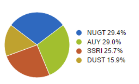
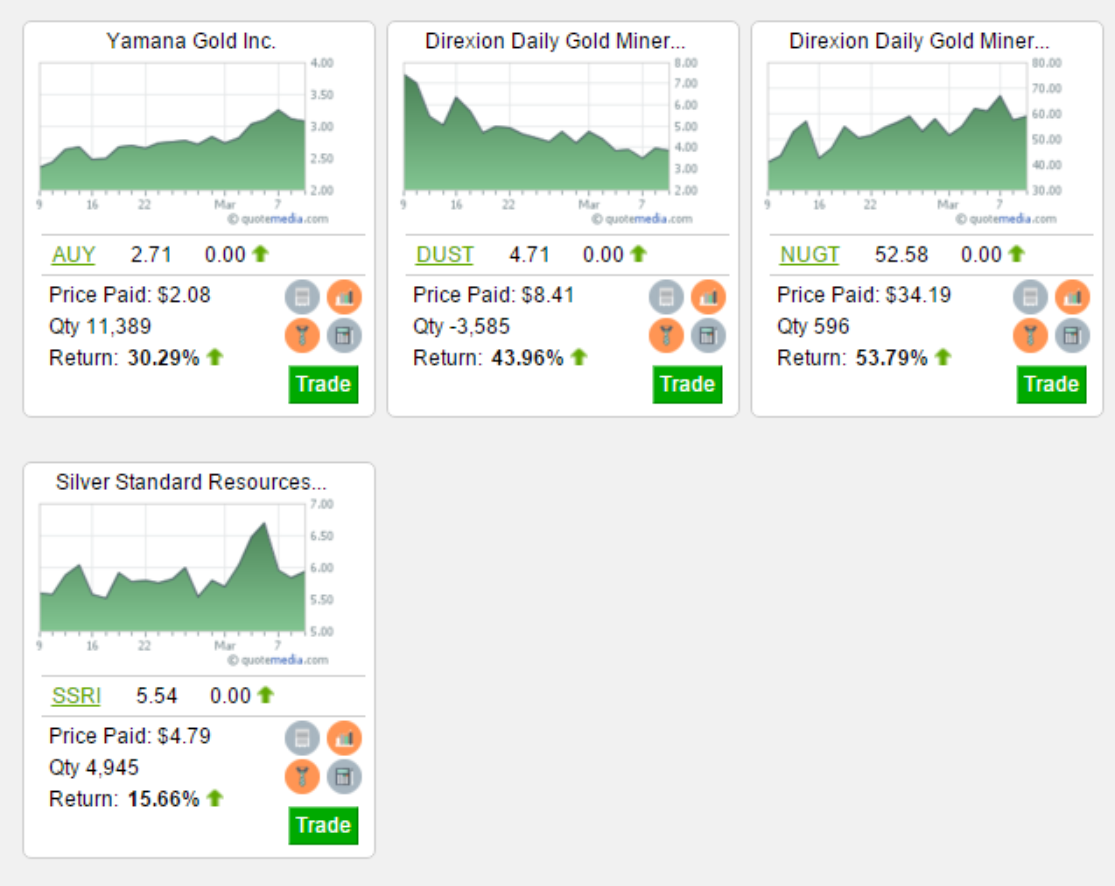
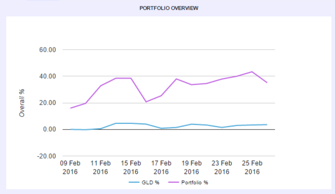
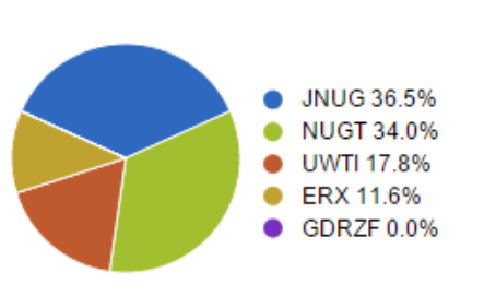
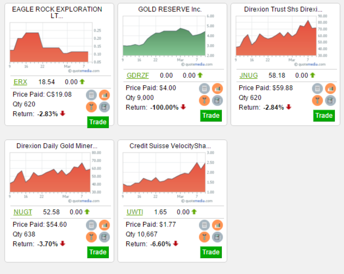
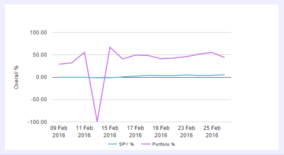


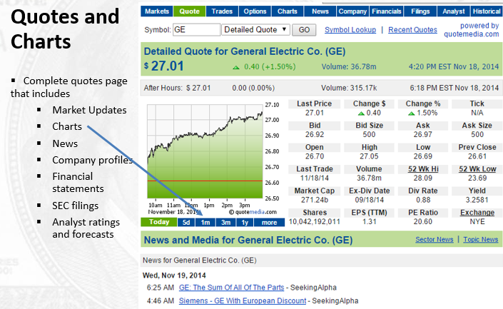
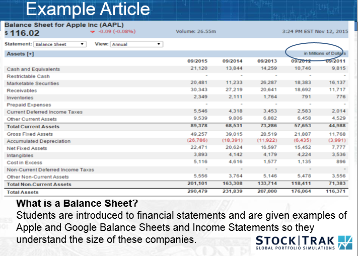
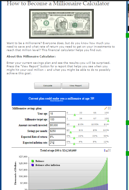
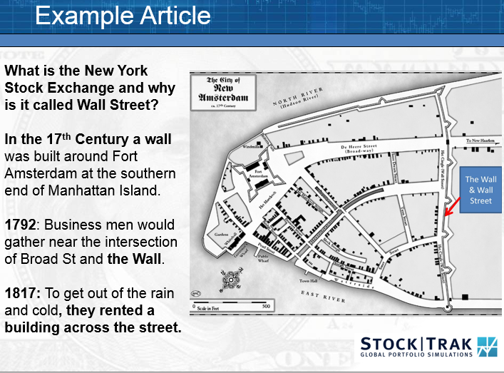
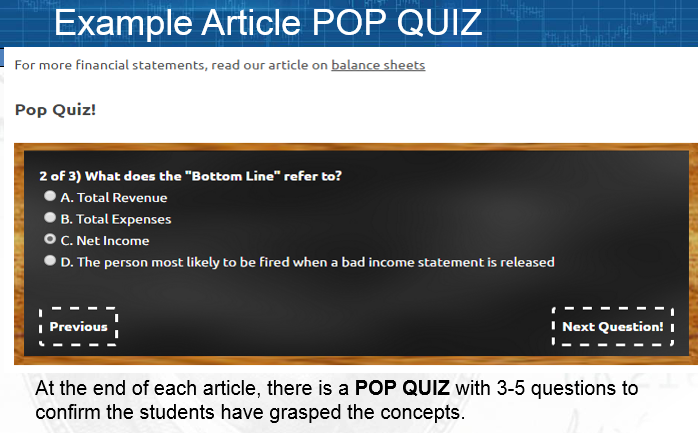
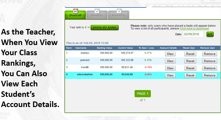

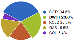
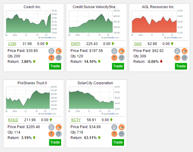
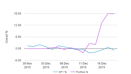

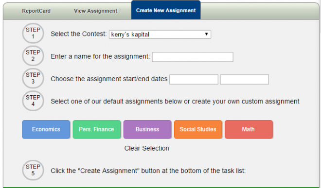

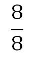

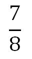

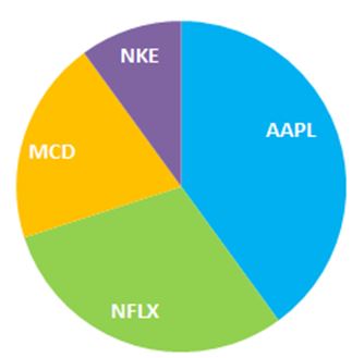
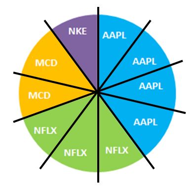
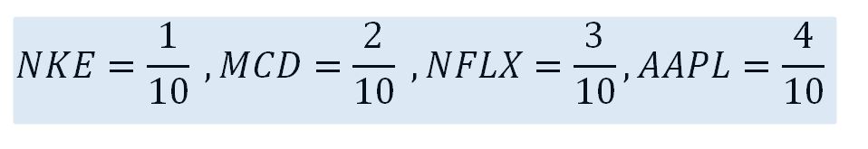
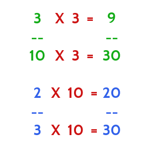
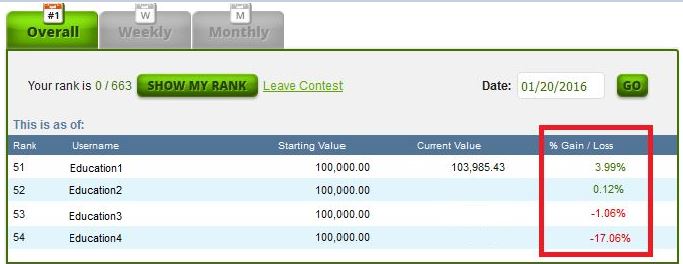
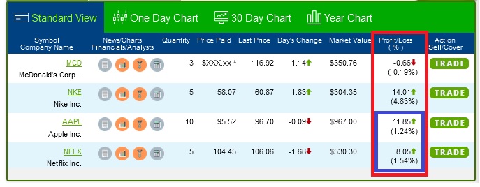
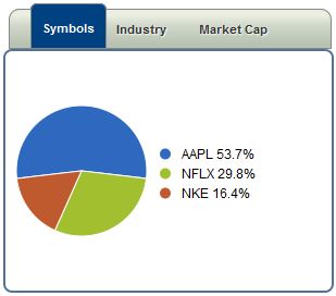
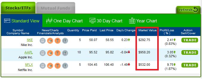
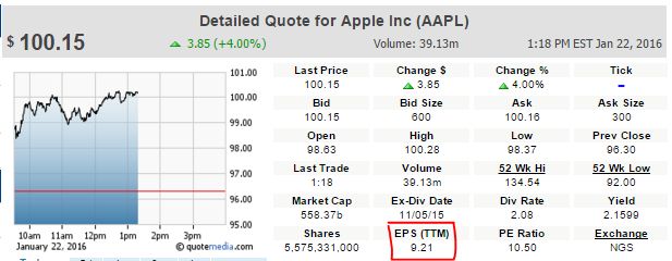
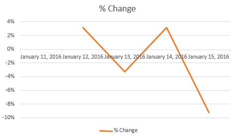
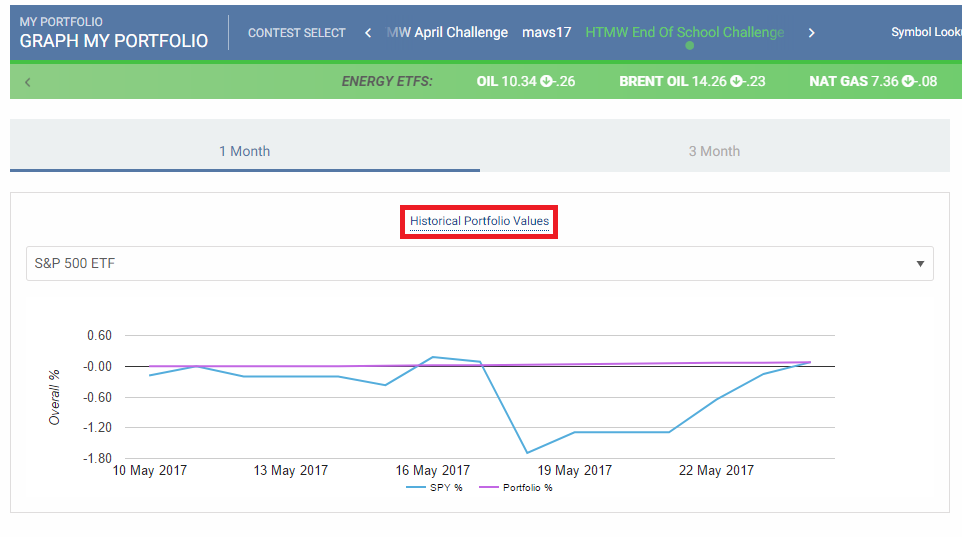
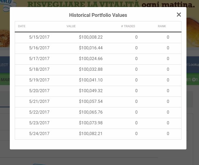
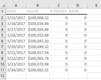
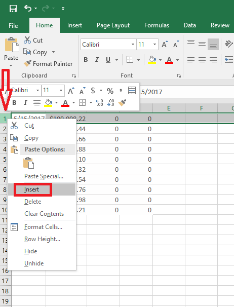
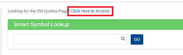
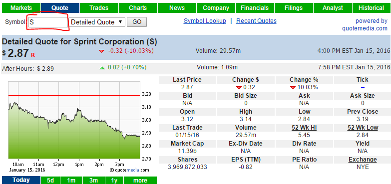
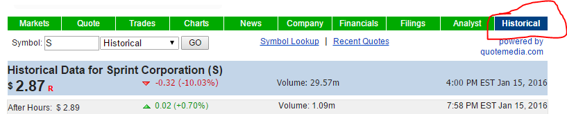
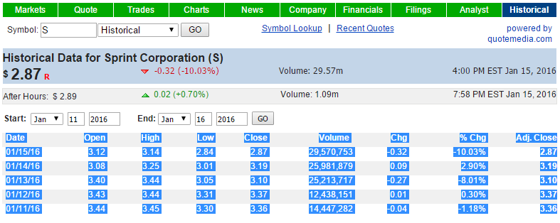
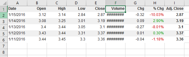
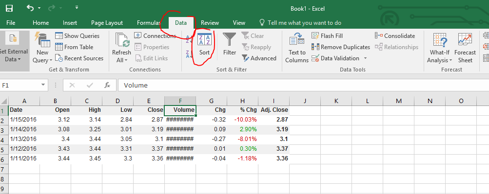
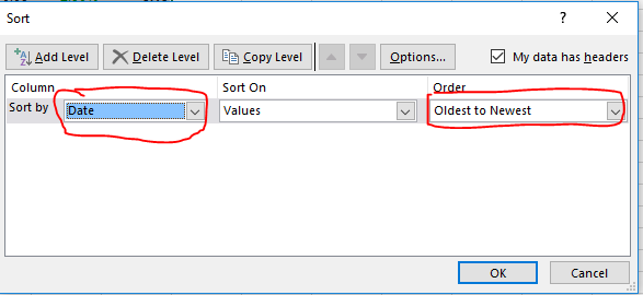
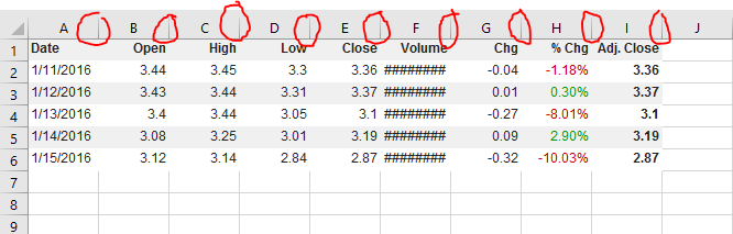
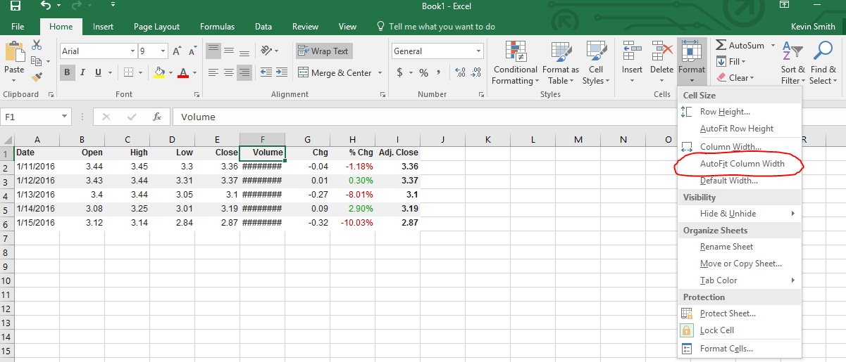
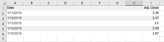
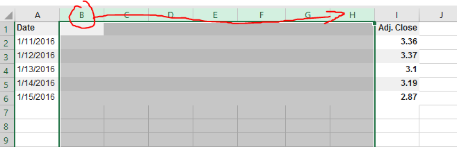

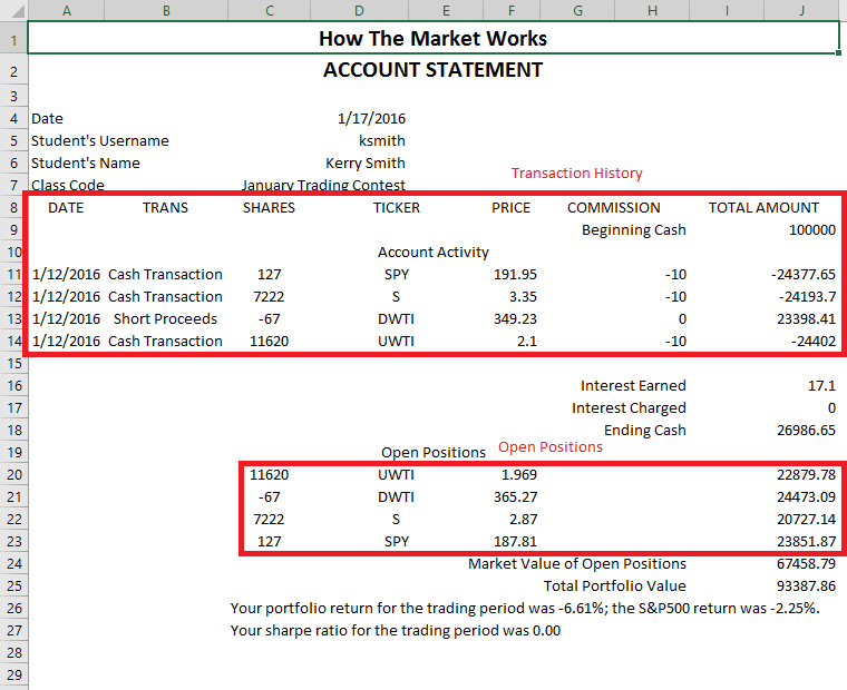
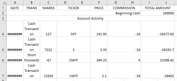

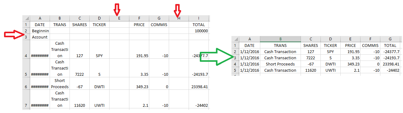
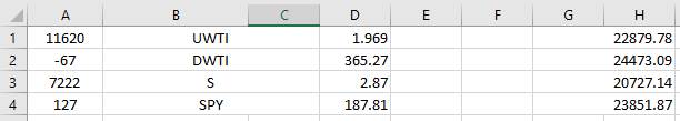
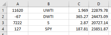

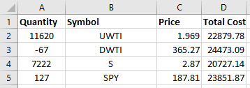
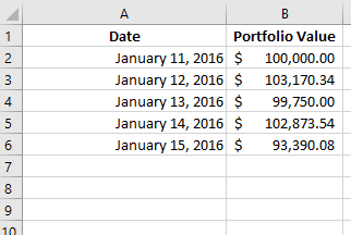
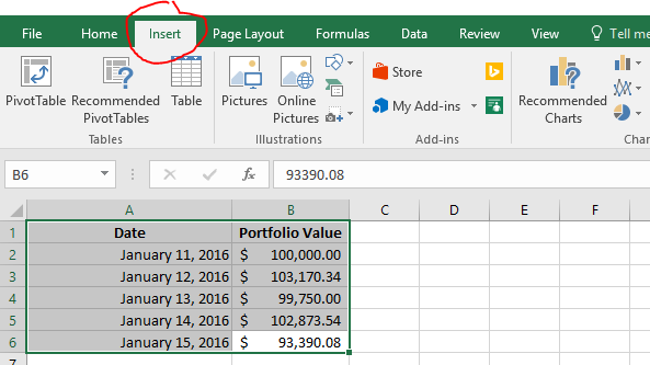
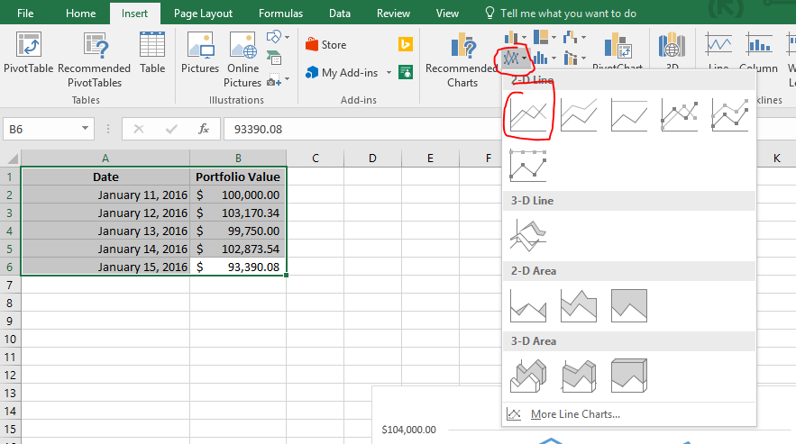
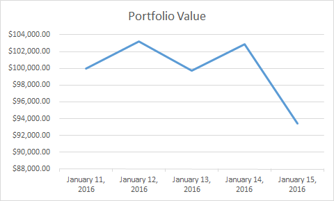
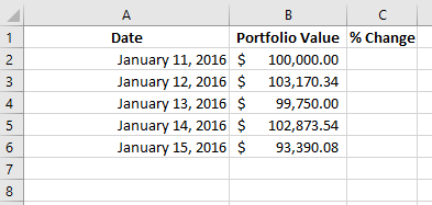
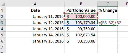
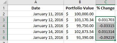
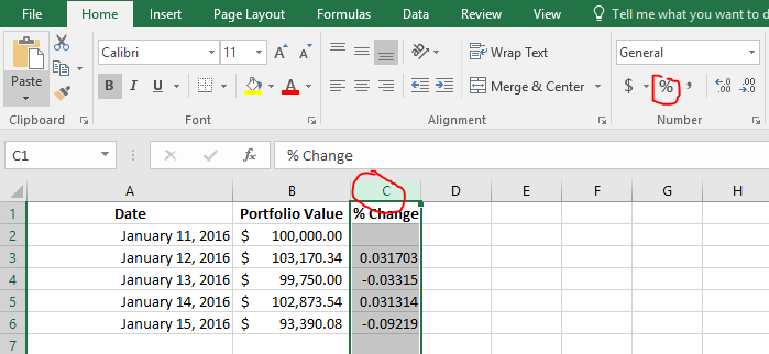
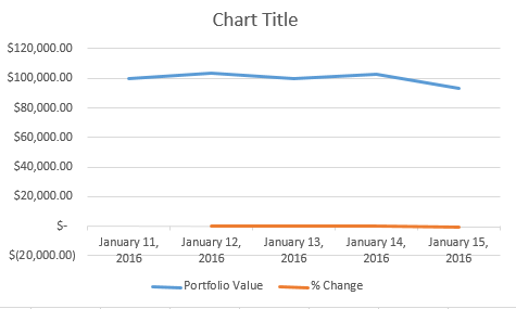
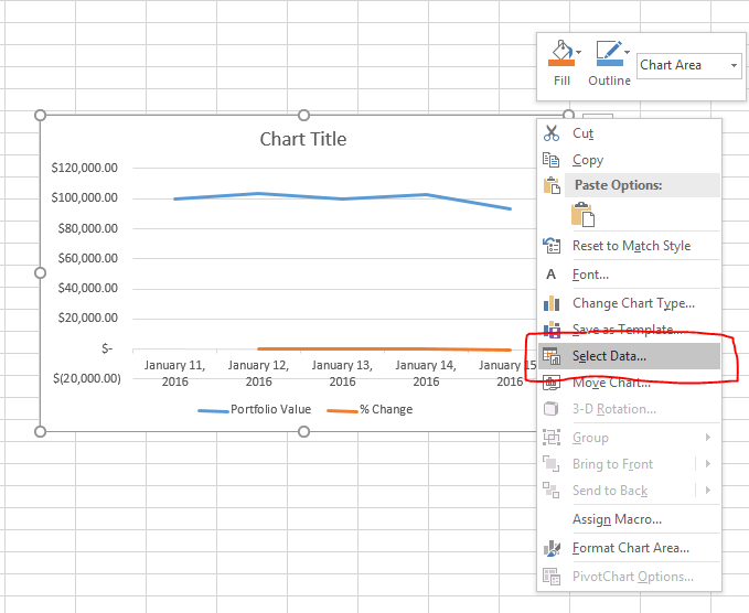
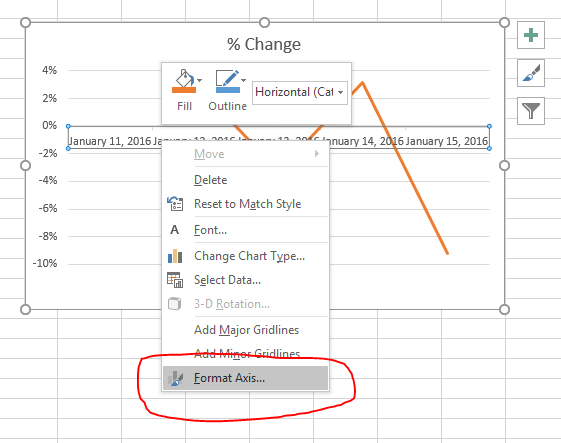
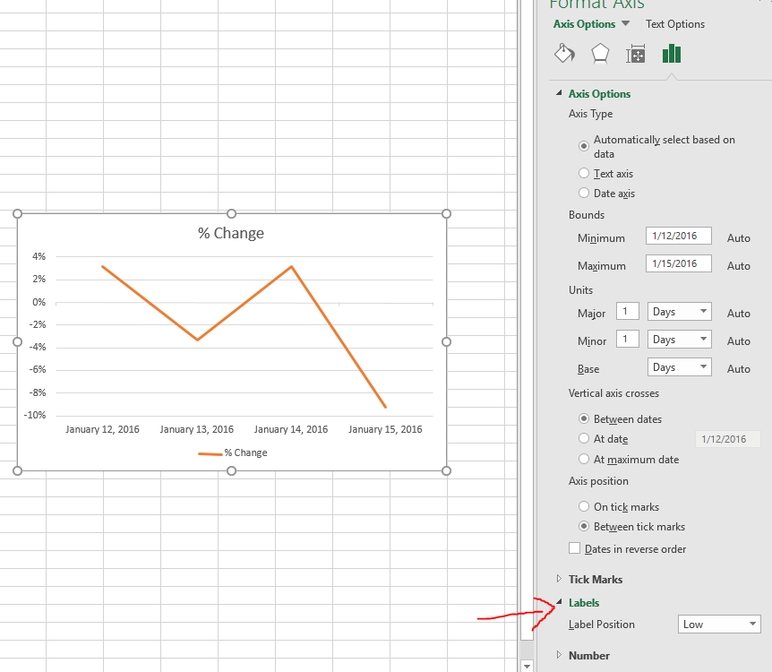
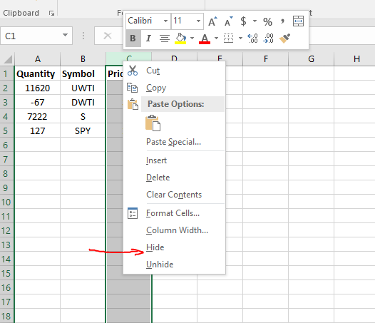
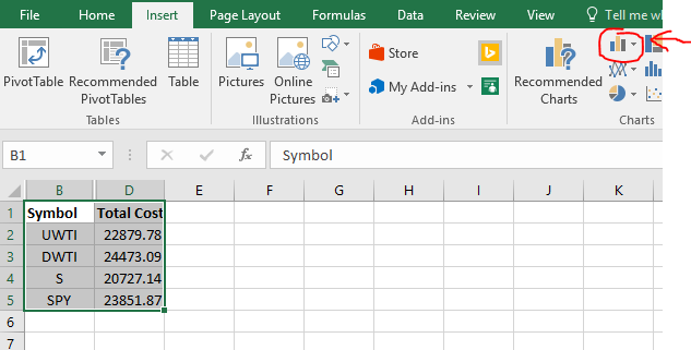
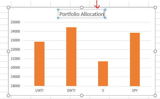
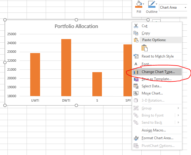
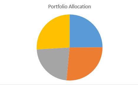
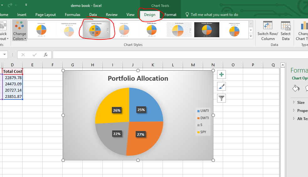

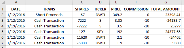
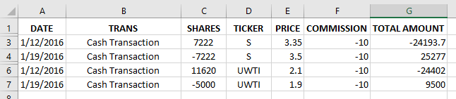
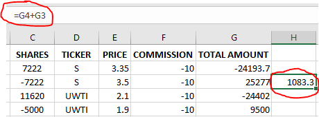

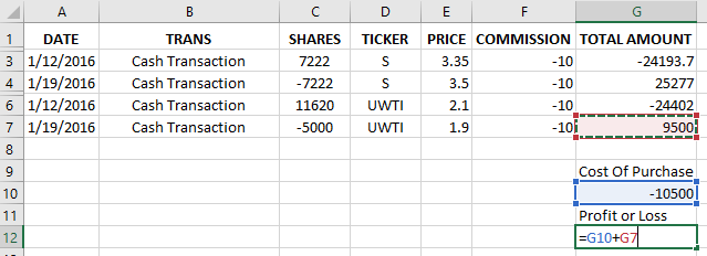

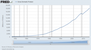
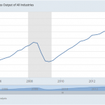

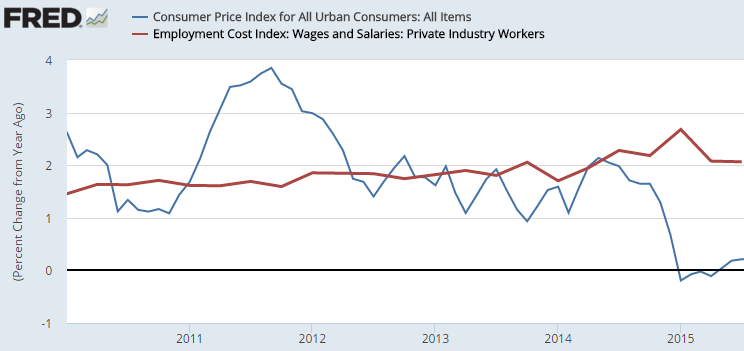
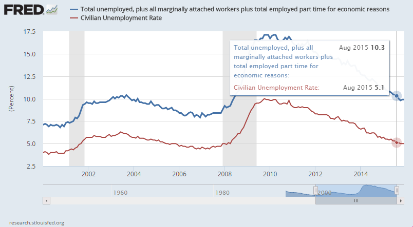
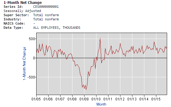
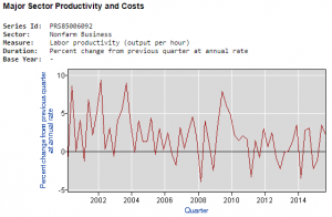
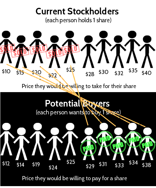
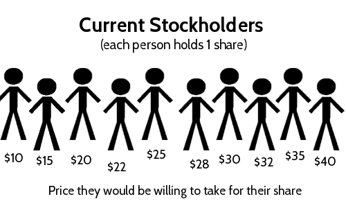
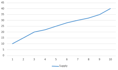
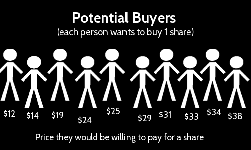
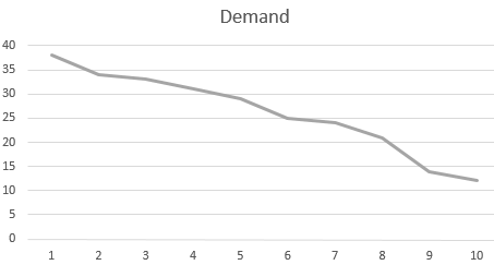
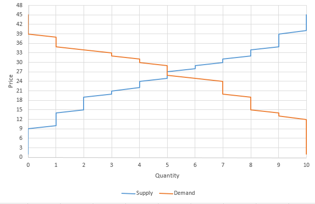
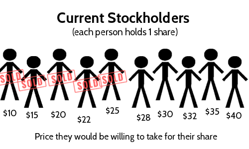
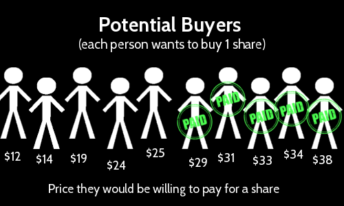
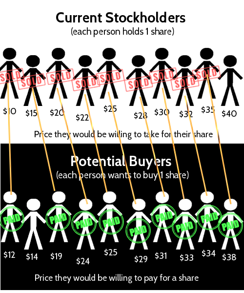
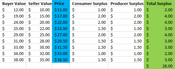
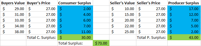
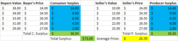
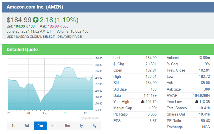

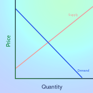
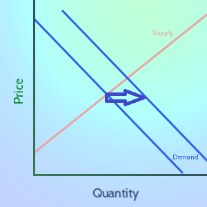
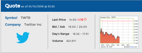
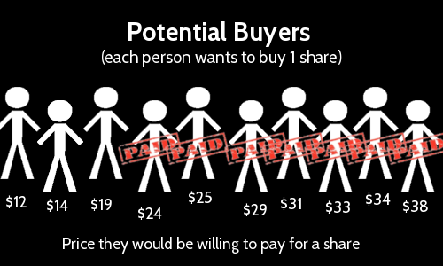
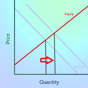
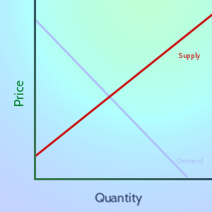
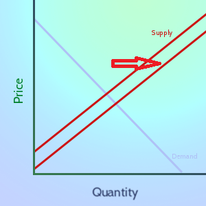

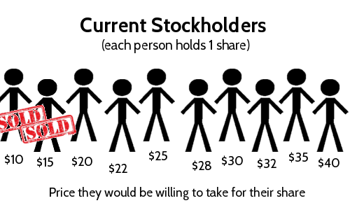


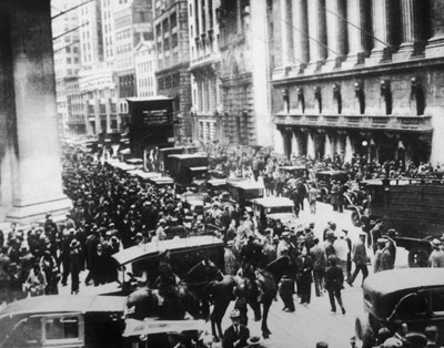
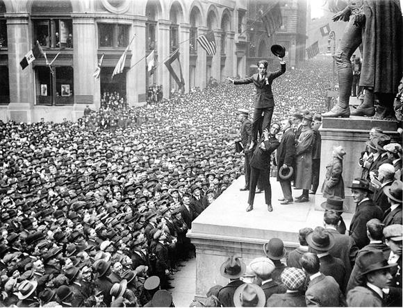
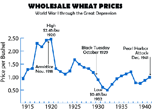

